PARKS: The Art in Kickstarter #5
A commercial artist isn't in the field just to execute someone else's vision. We like to approach the series as a collaboration and most feedback starts or ends with "what do you think?". That's because we value each artist's insights and ideas. Artists also work incredibly hard on their craft…
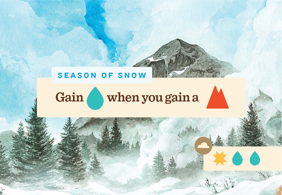
EDITORS NOTE: Hello and welcome to my first interview of 2019! Today I’m talking to JP Boneyard one of founders of the Fifty-Nine Parks print series, as together with Keymaster Games they have created PARKS: The Board Game. PARKS is currently on Kickstarter and smashing their funding goal. As soon as I saw this game I wanted to know more and I’m incredibly grateful JP took the time to talk to me about it. On to the interview!
Hi JP, thanks for joining me! For our readers who aren't aware of your work could you tell us a bit about yourself and what you do?
Thank you for making the time! I provide creative direction for The Fifty-Nine Parks Print Series. The series is a celebration of National Parks, design, and printmaking. Our origins are tied to DIY music, screen printed posters, and a love of the parks. During high school friends and I set up all ages art and music events in our small town. 100 of those shows took place in a backyard shed and we hosted bands from all over the world. As a necessity to promote those events friends and I developed a love for design and printmaking. Little did we know we'd later have a career in both!
In the early 2000's we spent a lot of time touring the country in bands and on road trips. This is where we developed an awareness of and appreciation for the parks. Being from a small isolated town in Massachusetts we couldn't believe some the awe inspiring natural wonders out there! 18 years and 350+ events later we've combined all of our favorite things into our full time focus. We still tour often but now it's with a traveling collection of gig posters and parks prints!
You helped found the Fifty-Nine Parks Print Series, so what can you tell us about it and what were some of the biggest challenges in bringing it all together?
The parks series began shortly after I moved to Austin, TX for a design job in 2015. One of the biggest challenges is finding the combination of the right artist with the right park. It's really important to find a scene that really represents the park, too. We're incredibly mindful about each artists strengths and interests. That often informs which park folks work on. Another challenge has to do with time. Since each posters costs about $3,500 to produce we have to be intentional and strategic about which park we release and when. Especially since we can only afford to release two posters a month. We know some parks only have a few thousand visitors each year. Since we've committed to making a poster of every park we know we won't recoup that initial investment for a year or two — and that's okay. But since each new release essentially kickstarts the next we have to be savvy about our release schedule. The first two years were pretty lean for us. Fortunately it feels like we're starting to gain some momentum now that we have almost every park represented.
In terms of cohesion we rely on the beautiful typeface Riley Cran designed and a simple but effective poster template. The rest is curation, some art direction, and careful color choices.
You're now working with Keymaster Games on the upcoming card game PARKS. How did this collaboration happen and what made you want to get involved?
We've loved Keymasters work for a few years now and we often travel with a copy of Campy Creatures on road trips — it's one of our favorite games we own! We were in touch with Keymaster after meeting Josh Emrich who did most of (or all of?!) the design work for Campy. The quality of the products, the game mechanics, and the appreciation for solid design really makes them stand out. I have a philosophy that basically says "swing at everything" and don't fear rejection. It was a long shot but we talked with Mattox at Keymaster and it turned out they were aware of the series! Shortly after a few enthusiastic conversations we began collaborating on PARKS! We're stoked to work together!
What kind of research goes into finding those scenes that really represent the parks? Do you have guiding principles or is it more instinctive than that?
We research every scene with each artist. Sometimes this is easier if we've been to the park ourselves. Some parks — like the ones in Alaska — are tougher to get to so we often reach out to friends or other artists who may have been. We also do as much visual and historical research as possible via the internet. We prefer basing each composition on our personal photos and experiences whenever possible though. When picking a scene we like to play to an artists strengths and choose something iconic enough to represent the park. We also like to include a loose narrative in each poster — that's often why you'll see hikers or wildlife in each poster.
Let's talk more about colour. Where do these palette choices come from and how do you use colour to communicate more about the parks themselves?
We use color to represent each park in the best light. In most cases we're being pretty faithful to the natural colors found within the parks. Some artists take a more stylistic approach to their work so we may have a color palette that is stylized but somewhat representative. We also have constraints with the number of colors we can use since each poster is a 6-8 color screen print. That in itself is a fun challenge. Showing the parks in the best light possible often means leaning towards vibrant scenes that evoke a sense of wonder and awe. This is largely conveyed through the rendering of each park and the scene we choose — the color palettes help drive this home though.
How do you go about translating the larger prints of the Fifty-Nine Parks project into the much more scaled down version we see here in the game?
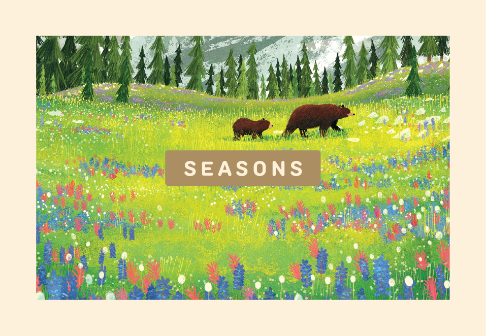
Most of the illustrations were designed to look great large and still read well somewhat small. That's because we're considering what the images look like as a print and what they look like (smaller) online. The only snag we really hit was with longer park names. In some instances we had to make some tweaks to park name or the background of an image. Otherwise the illustrations felt like they worked pretty well within the context of the board game!
How has your perception of the board game industry changed whilst working on this game?
We had no idea how much play testing went into board games. It's brilliant! Usability testing exists in so many other fields, why not here!? I'm not sure why this was a surprise to us but it really speaks to the dedication of both game publishers and players!
With this project you’ve collaborated with a lot of different creatives, so what advice would you give to anyone wanting to work with artists?
I'd say the biggest consideration is respect. A commercial artist isn't in the field just to execute someone else's vision. We like to approach the series as a collaboration and most feedback starts or ends with "what do you think?". That's because we value each artist's insights and ideas. Artists also work incredibly hard on their craft. Respect in communicating what may not be working and acknowledgement of what is, is crucial. Almost every email exchange ends with "thank you". That's because I really do appreciate that someone made the time to work with us — and in many cases — made something pretty remarkable in the process.
Additionally, what advice would you give to anyone who wanted to work as an artist?
Stick with it. Practice. No matter what. And don't take design feedback or rejection personally — it's all in the interest of refining your craft. If you really do goof up on something, own it, learn from it, and move forward. At the same time be mindful of who you listen to. Message boards and comment sections are filled with critics who haven't put in the work themselves. Art is subjective and your worth as an artist — or as a human — isn't derived from other peoples approval. It's derived from loving what you do and doing your best at this moment in time. If your best doesn't feel like enough continue to work and refine your craft — you'll get there eventually!
What are you currently reading, listening to or looking at to fuel your work?
Art directing the series means I'm working closely with dozens of artists at once. For books anything by basketball coach John Wooden, NBA legend Bill Russell, mythologist Joseph Campbell, or anything on stoicism. This is often where I go for insight into working with others or finding more inspiration to enjoy this whole experience — meaning my work but also being alive! Music is all over the place but Minutemen, Kendrick Lamar, Sam Cooke, Aaliyah always do the trick. Instagram is a great resource for inspiring images of parks and finding new artists to work with.
Finally, if we’d like to see more of you and your work, where can we find you?
You can find us on Instagram at @fiftynineparks and online at 59parks.net. 5% of each poster sale is donated to the National Park Service and we screen print every poster here in the USA! Thank you for making time to talk with us!
PARKS: The Board Game, a game about exploring and discovering the US National Parks is on Kickstarter until 20th Feb!
(All images courtesy and copyright of Keymaster Games and the Fifty Nine Parks project).
If this is your first time visiting the site then why not stick around a while! I’d really recommend checking out the communities Top 10 Best Art of 2018 to see some absolutely gorgeous games and then head to my interview archive, as there are a wealth of wonderful stories in there.


