
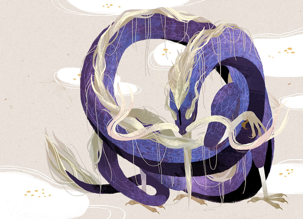
Cinyee Chiu: Art in Board Games #43
I'll look for lots of references, in 2 ways. One is to look for existing works with similar topics, to see how people approach this topic, and to find a way to demonstrate that in a fresh way so it can stand out. Another way is to grab whatever I feel is interesting visually, which can be illustration…
EDITORS NOTE: I love discovering new illustrators in this industry. I was absolutely delighted to witness a visual style very different from what I was accustomed to in popular board games and had to know more.
Hi Cinyee, thanks for joining me! For our readers who aren't aware of your work could you tell us a bit about yourself and what you do?
Hello people! I'm Cinyee Chiu, I'm a freelance illustrator from Taiwan and now traveling the world with my husband. I draw for books, products, animations, packages and more. We started the trip in September 2017, and have finished time in South America, stayed a few months in Colombia with my husband's family, and a few months in Taiwan with my family. Now we’ve been in Europe for 3 months already, staying in Spain, Portugal, France, and Germany. We are going to visit the rest of Europe and Africa in the following 6 months. The trip won't last forever, it probably will finish in 2019, then we might try to stay in Canada.
Could you tell us a bit more about your education in the arts? How did you learn to illustrate and how have you developed as you've gained experience as a professional artist?
Sure! I went to the US to study illustration and got my MFA degree in 2016 from the Maryland Institute College of Art. Before that, I had worked in the game industry for 3 years in a Taiwanese indie game company, where I mainly did character design. I actually didn't study art before that, my undergrad major was economics but I always enjoyed drawing since I was a kid.


I mostly learned drawing by myself, with tutorials online, from Pinterest, Youtube, and some drawing forums, etc. I started with digital painting (I thought it's less costly since you don't need to constantly buy paper and drawing materials) but then I started to draw more and more with traditional media, especially after I graduated from MFA in 2016. I’ve had a rather stable art style since 2017, but I believe it's still developing, I want to have more freedom in my work.
When beginning to work on a new project what are the first few things that you do?
I'll look for lots of references, in 2 ways. One is to look for existing works with similar topics, to see how people approach this topic, and to find a way to demonstrate that in a fresh way so it can stand out. Another way is to grab whatever I feel is interesting visually, which can be illustration, photo, product design, or something else. I collect the references into a mood board, and from that, I jot down the ideas that pop into my mind.


You've got a couple of board game projects under your belt now, so how did you first get involved in making games?
The first game came to me was Harvest Island in 2016, I believe they saw my 24 terms animal series so they decided to contact me. The game was actually about fruits and harvest, but they decided to make me draw animal and fruit combinations. I was always dreaming of drawing for a board game and they gave me all the freedom I needed, even letting me pick which animals to draw. The topic was something I really feel attached to, so it was a happy experience working with them.
I discovered your work from the gorgeous Dragon Castle, could you tell us a bit more about the game and your collaborative process working on it?
It was actually a longer process than I expected when signing the contract. When they approached me, they actually were asking for some "Chinese infused visual style" art maybe with a tone of ink wash painting somehow? I thought it could be interesting to explore a bit on the styles, but when the project keep moving after a few style test back and forth they decided to go with a very digital direction. The content I needed to draw also changed because they'd been developing and fixing the game mechanics, from drawing lots more symbolic spots, to 36 animal and dragon character cards. In the end, I was very tired of drawing characters and I decided I'm not drawing for board games that have more than 12 cards anymore, haha.


The dragons in Dragon Castle are all based around virtues. What were the challenges in trying to portray these and how did you approach illustrating them?
Some virtues are easier, some others took a longer amount of time. For example, for the Wisdom virtue I thought of an old man with a long beard immediately, and for Loyalty, I thought of dog and chain/lock. The challenging ones are those somehow similar in concept, like Fortitude and Perseverance, Power and Majesty....actually many were challenging.
I tried to illustrate them as differently as possible, in color and in the posture. So I decided the color for the easier ones first, like a cold color for Tranquility, or a transparent/white for Honesty. For the rest, I just picked a color I hadn't used, like red for Perseverance. The postures were difficult and it was hard to get them all different but I tried my best.
I love your use of colour so I’m curious what draws you to certain ones and where the inspiration comes from?
I think I do have some preferences toward earthy and warm colors, I find myself enjoying using rust orange, olive green, denim blue, etc. When I'm working on a new project, I first build the mood board, and one way I often use to set the color palette is to find an abstract art piece which gives the emotion that fits the project. From the abstract art piece, I gather the colors and make some adjustments from that if it feels right.
Based on your experiences so far, how should a client best approach work with an illustrator and what are some key things they can do within that relationship to improve the process?
For a board game, it's best if the game designing part is already complete, which means the game mechanics are done and the requirements for the illustrations are not going to change.
I have worked with 2 types of clients, one comes with a clear idea what they want, how many illustrations in which size they need, we sign the contract and I draw exactly what the contract mentioned I need to draw, within the deadline in the contract.
Another type of client comes to me when the game is maybe 70% developed, and it might either turn out later that I need to draw something different from what we agreed because they decided to change the mechanisms (I gave the quote based on the request), or they took longer than they planned to finish the designing part and that then affects the schedule I might have planned for other tasks once they are ready.
So I think it'll make the process easier for both if the client knows clearly what they want when they approach the illustrator. For the visuals, it'll help if client prepares some references to show what they wanted (eg: we want some floral frames like this), and which works from the illustrator's profile makes them think he/she is the good fit (eg: we like your illustrations for the XXX series..).


Do you have any advice for anyone trying to get into the industry or find work as a professional graphic designer?
The purpose of the portfolio is to show the client what you can do and how they can use you, so make it easy for this purpose. You should only present what you want to do. If you'd like to work on character design then make sure you have it in your portfolio with a clear category. Make it so the client doesn't need to dig through the whole portfolio to find what they are interested in among illustration for books, package design, or other distracting works. Save their time, they'll appreciate that. Also, just present your best works and presenting 15 great works is better than 15 great works + 10 so-so works, the later one shows your instability. The last thing, remember to add your email.
What are you currently reading, listening to or looking at to fuel your work?
When I work, I mostly listen to ambient yoga/meditation music, I find it less distracting but sometimes it also puts me to sleep, but I don't mind when that happens. For reading materials, I enjoy the references and researching process. So I'll dive into the related knowledge and expand it to other fields, for example from 24 solar terms to Wu Xing system, I enjoy learning new things. I also enjoy reading fiction, for this year I want more literary works in my reading list and to maybe work on my writing. I suppose writing and drawing skills would complement each other.
Finally, if we’d like to see more of you and your work, where can we find you?
You can find my website here: cinyeechiu.com. I’m also on Facebook, Instagram and Behance.
(All illustrations supplied by Cinyee Chiu, 2019)
If this is your first time visiting the site then why not stick around a while! I’d really recommend checking out the communities Top 10 Best Art of 2018 to see some absolutely gorgeous games and then head to my interview archive, as there are a wealth of wonderful stories in there.

PARKS: The Art in Kickstarter #5
A commercial artist isn't in the field just to execute someone else's vision. We like to approach the series as a collaboration and most feedback starts or ends with "what do you think?". That's because we value each artist's insights and ideas. Artists also work incredibly hard on their craft…
EDITORS NOTE: Hello and welcome to my first interview of 2019! Today I’m talking to JP Boneyard one of founders of the Fifty-Nine Parks print series, as together with Keymaster Games they have created PARKS: The Board Game. PARKS is currently on Kickstarter and smashing their funding goal. As soon as I saw this game I wanted to know more and I’m incredibly grateful JP took the time to talk to me about it. On to the interview!
Hi JP, thanks for joining me! For our readers who aren't aware of your work could you tell us a bit about yourself and what you do?
Thank you for making the time! I provide creative direction for The Fifty-Nine Parks Print Series. The series is a celebration of National Parks, design, and printmaking. Our origins are tied to DIY music, screen printed posters, and a love of the parks. During high school friends and I set up all ages art and music events in our small town. 100 of those shows took place in a backyard shed and we hosted bands from all over the world. As a necessity to promote those events friends and I developed a love for design and printmaking. Little did we know we'd later have a career in both!
In the early 2000's we spent a lot of time touring the country in bands and on road trips. This is where we developed an awareness of and appreciation for the parks. Being from a small isolated town in Massachusetts we couldn't believe some the awe inspiring natural wonders out there! 18 years and 350+ events later we've combined all of our favorite things into our full time focus. We still tour often but now it's with a traveling collection of gig posters and parks prints!
You helped found the Fifty-Nine Parks Print Series, so what can you tell us about it and what were some of the biggest challenges in bringing it all together?
The parks series began shortly after I moved to Austin, TX for a design job in 2015. One of the biggest challenges is finding the combination of the right artist with the right park. It's really important to find a scene that really represents the park, too. We're incredibly mindful about each artists strengths and interests. That often informs which park folks work on. Another challenge has to do with time. Since each posters costs about $3,500 to produce we have to be intentional and strategic about which park we release and when. Especially since we can only afford to release two posters a month. We know some parks only have a few thousand visitors each year. Since we've committed to making a poster of every park we know we won't recoup that initial investment for a year or two — and that's okay. But since each new release essentially kickstarts the next we have to be savvy about our release schedule. The first two years were pretty lean for us. Fortunately it feels like we're starting to gain some momentum now that we have almost every park represented.
In terms of cohesion we rely on the beautiful typeface Riley Cran designed and a simple but effective poster template. The rest is curation, some art direction, and careful color choices.
You're now working with Keymaster Games on the upcoming card game PARKS. How did this collaboration happen and what made you want to get involved?
We've loved Keymasters work for a few years now and we often travel with a copy of Campy Creatures on road trips — it's one of our favorite games we own! We were in touch with Keymaster after meeting Josh Emrich who did most of (or all of?!) the design work for Campy. The quality of the products, the game mechanics, and the appreciation for solid design really makes them stand out. I have a philosophy that basically says "swing at everything" and don't fear rejection. It was a long shot but we talked with Mattox at Keymaster and it turned out they were aware of the series! Shortly after a few enthusiastic conversations we began collaborating on PARKS! We're stoked to work together!
What kind of research goes into finding those scenes that really represent the parks? Do you have guiding principles or is it more instinctive than that?
We research every scene with each artist. Sometimes this is easier if we've been to the park ourselves. Some parks — like the ones in Alaska — are tougher to get to so we often reach out to friends or other artists who may have been. We also do as much visual and historical research as possible via the internet. We prefer basing each composition on our personal photos and experiences whenever possible though. When picking a scene we like to play to an artists strengths and choose something iconic enough to represent the park. We also like to include a loose narrative in each poster — that's often why you'll see hikers or wildlife in each poster.


Let's talk more about colour. Where do these palette choices come from and how do you use colour to communicate more about the parks themselves?
We use color to represent each park in the best light. In most cases we're being pretty faithful to the natural colors found within the parks. Some artists take a more stylistic approach to their work so we may have a color palette that is stylized but somewhat representative. We also have constraints with the number of colors we can use since each poster is a 6-8 color screen print. That in itself is a fun challenge. Showing the parks in the best light possible often means leaning towards vibrant scenes that evoke a sense of wonder and awe. This is largely conveyed through the rendering of each park and the scene we choose — the color palettes help drive this home though.


How do you go about translating the larger prints of the Fifty-Nine Parks project into the much more scaled down version we see here in the game?
Most of the illustrations were designed to look great large and still read well somewhat small. That's because we're considering what the images look like as a print and what they look like (smaller) online. The only snag we really hit was with longer park names. In some instances we had to make some tweaks to park name or the background of an image. Otherwise the illustrations felt like they worked pretty well within the context of the board game!


How has your perception of the board game industry changed whilst working on this game?
We had no idea how much play testing went into board games. It's brilliant! Usability testing exists in so many other fields, why not here!? I'm not sure why this was a surprise to us but it really speaks to the dedication of both game publishers and players!
With this project you’ve collaborated with a lot of different creatives, so what advice would you give to anyone wanting to work with artists?
I'd say the biggest consideration is respect. A commercial artist isn't in the field just to execute someone else's vision. We like to approach the series as a collaboration and most feedback starts or ends with "what do you think?". That's because we value each artist's insights and ideas. Artists also work incredibly hard on their craft. Respect in communicating what may not be working and acknowledgement of what is, is crucial. Almost every email exchange ends with "thank you". That's because I really do appreciate that someone made the time to work with us — and in many cases — made something pretty remarkable in the process.


Additionally, what advice would you give to anyone who wanted to work as an artist?
Stick with it. Practice. No matter what. And don't take design feedback or rejection personally — it's all in the interest of refining your craft. If you really do goof up on something, own it, learn from it, and move forward. At the same time be mindful of who you listen to. Message boards and comment sections are filled with critics who haven't put in the work themselves. Art is subjective and your worth as an artist — or as a human — isn't derived from other peoples approval. It's derived from loving what you do and doing your best at this moment in time. If your best doesn't feel like enough continue to work and refine your craft — you'll get there eventually!
What are you currently reading, listening to or looking at to fuel your work?
Art directing the series means I'm working closely with dozens of artists at once. For books anything by basketball coach John Wooden, NBA legend Bill Russell, mythologist Joseph Campbell, or anything on stoicism. This is often where I go for insight into working with others or finding more inspiration to enjoy this whole experience — meaning my work but also being alive! Music is all over the place but Minutemen, Kendrick Lamar, Sam Cooke, Aaliyah always do the trick. Instagram is a great resource for inspiring images of parks and finding new artists to work with.
Finally, if we’d like to see more of you and your work, where can we find you?
You can find us on Instagram at @fiftynineparks and online at 59parks.net. 5% of each poster sale is donated to the National Park Service and we screen print every poster here in the USA! Thank you for making time to talk with us!

PARKS: The Board Game, a game about exploring and discovering the US National Parks is on Kickstarter until 20th Feb!
(All images courtesy and copyright of Keymaster Games and the Fifty Nine Parks project).
If this is your first time visiting the site then why not stick around a while! I’d really recommend checking out the communities Top 10 Best Art of 2018 to see some absolutely gorgeous games and then head to my interview archive, as there are a wealth of wonderful stories in there.

Fireball Island: Cover Story #1
Just as in any artwork, an artist's most valuable tools are composition, scale, contrast, tone, color and pose. When dealing with large, detailed scenes with complete background and many characters it's very easy to become overloaded..
EDITORS NOTE: This interview is with talented artist George Doutsiopoulos, who joined me on the site last year (you can see that interview here). I’ve long wanted to take a closer look into how box art is created and George was kind enough to let me interview him about his work on Fireball Island and it’s expansions. I hope to do more of these cover story interviews next year so if you have any suggestions for games, let me know in the comments or on social media.
Hi George, great to have you back on the site! Since we last spoke you've been working on the wonderful remake of Fireball Island. Can you tell us how you got involved in that project and what was your role?
Hi Ross, I'm really happy to be back, thanks for having me for a second time! Back in October 2017 I was approached by Jason Taylor, the art director from Restoration Games, who was looking for artists for the new Fireball Island board game. There was lots of art that needed to be done: boxtop art, card art, etc and the styles of the participating artists had to look good together and not clash with each other, so that part took time. Jason was very considerate and let us propose what kind of art we would rather take on. I felt I was a better fit for the boxtop art and Jason assigned it to me.
Fireball Island box cover - Initial sketch concept art
When creating the cover art for the Fireball Island base game box, what kind of mood or style were you looking to create and how did you try to achieve it?
Thankfully, the brief I received was great, as was the communication with the art director: detailed, thorough, concrete and fun. There were very specific comments regarding the color palette and the elements of the illustration (for example the burning tree, collapsing bridge, cut off rushing rapids were there from the beginning). Regarding style, Restoration games wanted to go for something that was epic but with healthy doses of slapstick and fun. Something with toon sensibilities but not childish, and detailed enough to attract all ages. That was really amazing because this artistic style that is part realism and part cartoon comes very natural to me.
Fireball Island box cover - Second sketch concept art
We also wanted an illustration where the island itself is prominent (mainly, Vul-Kar the volcano) and wanted distinct levels (foreground, midground, background). At first, as you can see in the sketches, I focused too much on the epic and slapstick aspects and created a concept that was fun but very busy. With the valuable guidance of Jason, we finally came up with a composition that had fewer characters but was more powerful.
Fireball Island box cover - Final sketch concept art
You also worked on the box art for the expansions, 'Wreck of Crimson Cutlass', 'The Last Adventurer' and 'Crouching Tiger, Hidden Bees'. The artwork on the box for the last two made up a greater image when combined so how did you manage to make both boxes interesting, yet work together in this way?
That idea was entirely Jason's (Editor: Jason contacted me to state the idea originally came from designer Rob Daviau) and I loved it as soon as he mentioned it. I hadn't done something like this before but I welcomed the challenge. Of course, creating a composition that needed to work as a simple illustration AND as two standalone illustrations sounded difficult at first, but it turns out it was easier than I feared. I worked with a lot of quick drafts, first focusing on the separate boxes without minding myself with the larger composition yet, to make sure the separate compositions were interesting by themselves.
Fireball Island - The Last Adventurer Expansion box art
Fireball Island - Crouching Tiger, Hidden Bees Expansion box art
When sketching I kept the Fireball Island logo in place because it's a very prominent visual element of the box and I wanted to take it into account from the beginning. When I came up with drafts I was satisfied with I combined the ones that worked into the larger composition, made any revisions necessary and was ready to start sketching and painting. I painted the final artwork as a single illustration, mainly to make sure the separate boxes join perfectly when standing next to each other.
Fireball Island - The Last Adventurer and Crouching Tiger, Hidden Bees Expansions complete box art
The box covers are packed full of energy, so what are some ways an artist can inject that into their creations?
Just as in any artwork, an artist's most valuable tools are composition, scale, contrast, tone, color and pose. When dealing with large, detailed scenes with complete background and many characters it's very easy to become overloaded, so I keep my approach as simple as possible: start from the big and overall and end with the small and detailed. That means that during the sketching phase I was at first concerned with the overall volumes and shapes (very important for the impression of movement and speed), with focal points and compositional axes (to create an appealing composition that helps guide the viewer's eye), with scale (to create the illusion of depth and perspective) and with pose (to create dramatic poses and expressions that further help create the illusion of action and movement). Then I experimented with color drafts, before moving on to painting the actual illustration. For me, making all the colors work in very large compositions is probably the hardest part so I spend as much time as I need to figure my palettes out.
Fireball Island - Crimson Cutlass Expansion box art
Choosing the local colors is not enough, not by far. I need a chromatic theme for consistency and character (Fireball has a lot of warm colours, for obvious reasons) and I needed to separate areas of primary, secondary and tertiary interest using warm and cool colors, contrasting and complementary hues and tonal contrast. I'm still getting the hang of this and feel I have a lot of room for improvement!
Fireball Island - Final product shot
Before you leave us again, what are you working on next?
Right now I'm working on a few different projects, the most fun and interesting one being the work I am doing for Arkhane Asylum Publishing in France. They are a classic role-playing game publishing company and I am currently illustrating the characters for their upcoming game "Malefices", set in Paris of the 1900s. They reached out after seeing some vintage ink illustrations in my portfolio which they felt were right for their book. It's a style quite different from Fireball Island but one I also really love working in!
EDITOR: You can find George’s portfolio here and see more about Fireball Island on Restoration Games website here.

(All illustrations copyright of George Doutsiopoulos, product shot by Restoration Games)

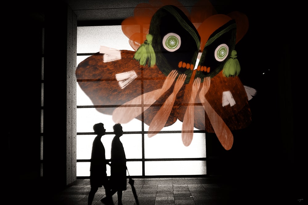
Up to 4 Players: Art Outside Board Games #2
From the illustration side, it takes about 10 hours to produce a page (back when we did short strips it was more like 3-4 hours). I wish I could reduce it somehow, but I wouldn't want to sacrifice either the style and level of detail we established, or the "amount" of plot we manage to get into every page; since we post a new page only once a week, we want each update to be worth the wait.
EDITORS NOTE: Hello there readers! It’s been a while since the last interview so I couldn’t be happier to be back and speaking with the two creative minds behind, Up to 4 Players, a weekly web comic that tells the story of a group of friends playing an RPG together. We’ll be covering what makes this so special in the interview but seriously, go check it out, you won’t be disappointed.
Also, they’ve created a roleplaying game based on the Crystal Heart comic strip, on Kickstarter from November 20th so click the link to find out more.
Now on to the interview!
Hello Aviv and Eran, thanks for taking the time to speak to us. Firstly, could you tell us a little bit about yourselves?
Aviv: Hi Ross! Thank you for having us on, even though we don't technically do art in board games. I am a freelance illustrator, specialising in character art and comics. My passion for drawing started with the animated X-Men series from the 90s (of course I created my own super-hero group that was almost, but not quite, EXACTLY like the X-Men), so action, fantasy, and colourful, bigger-than-life characters have always been my cup of super-powered tea. Later, thanks to Eran, I got into the amazing hobby of roleplaying games, and that has become a major inspiration too. I've lived in Israel most of my life, and thanks to the internet I was able to expand my knowledge, skills, and social network, especially around those hobbies that were (and still are, although to a lesser extent) somewhat fringe in our small country. I moved to London 5 years ago because I've always LOVED this city, and I'm so happy to find it's just as lovely to live in as it is to visit and watch on screen.
Eran: Heyo, I'm Eran, and I'm definitely the writer, because when I do art, people cry. I've been a roleplayer ever since I discovered the D&D Red Box around 1990, and it quickly became a passion, then a career. I've worked as a game translator, a professional game master for social skill development, gaming store owner, and probably a few other things, all with "game" in the title. Like Aviv, I'm from Israel originally but I moved to London around 2012 following my wife's career - she has a PhD in English literature, specialising in "London and the Fantastic". Yeah! I love nothing more than to explore new worlds, even though I'm usually the game master, which means my players get to do most of the exploration. Aviv and I share a love for high-action, light-hearted fun, and so we got to create a few octane-fulled narratives over the years, trying out various approaches and concepts.
Tell us more about Up to 4 Players! What inspired you to start it and what have been some of the highlights for you so far?
Aviv: Eran and I first joined forces about 13 years ago on V-Squared, a webcomic for the online video game magazine he was writing for and editing at the time. I'm still kind of amazed to remember that I actually got paid for drawing comics back when I was 21! We had a really good connection working together, a mutual sense of humour and very compatible way of looking at things. At some point, though, V-Squared had run its course and ended. Years later, we both itched to work on something similar again, and the idea for Up to Players was born. (It actually originated as a Stretch Goal for a crowdfunding campaign Eran ran for his roleplaying podcast, On the Shoulders of Dwarfs.)
We had a couple of brain-storm meetings, thinking about the structure of the comic and the main characters, and we decided to combine jokes about board games - a hobby we both share - and anecdotes about Israelis moving to London - which we both are. It was great fun to do a steady 3-panel (more or less...) comic together again, but after almost 150 strips we wanted to try some longer-form storytelling, and talk about our even bigger mutual hobby - roleplaying games. Thus Crystal Heart was born.
Eran: Since Aviv covered the history, I'll cover some of the highlights. Several of our strips got some global attention, thanks to being shared by the likes of Blizzard's Heroes of the Storm, Fantasy Flight Games, Czech Games Edition, and others. That was always exciting, watching the next-day figures in our analytics, but most of the time, they didn't translate to tens of hundreds of new followers - most people enjoy what they enjoy, and have no interest in next week's joke, which will be about some other game. Discovering that despite this we have a large enough fan base to allow us to open and maintain a successful Patreon page, THAT was awesome. We have nothing but respect to the people that seem to have respect for us, and I think that's a good relationship between creator and consumer. The next step was having a table at UK conventions, which is what we've been doing for the past year, and also definitely going to continue doing in the foreseeable future.
I have to say the illustrations in your webcomic are absolutely gorgeous, where did the look and feel come from and how has this developed over time?
Aviv: Thank you! A huge inspiration on my style back when I did V-Squared - and still today - was the webcomic Penny Arcade. I've always loved Mike Krahulik's character designs, extreme expressions and smooth line work, and it's been a highlight in my career when I recently got to work with Penny Arcade on Thornwatch! In Crystal Heart there is also a lot of inspiration from animated shows like Gravity Falls and Steven Universe: I am awed by how much atmosphere and personality they create with very simple, minimalist lines and beautifully balanced colours, both in characters and in environments. And always in my art there are Disney influences, because I spent my childhood mesmerised by all the old and new classics.
Eran: Aviv mentioned a lot of cartoons, and for a good reason. We not only use a cartoon-inspired art style, we also have cartoon-inspired character personalities, humour, and storylines. High-action, light-hearted fun! Also, in order to publish weekly instalments (first strips, now pages), the art style HAD to be simple. Even though we nowadays have a Patreon and sell some merch at conventions, we mostly use this money to pay for what we need to maintain the webcomic. Aviv is still doing this in her spare time!
In regards to time, how long would you say each comic takes to produce, considering both illustrations and writing?
Aviv: From the illustration side, it takes about 10 hours to produce a page (back when we did short strips it was more like 3-4 hours). I wish I could reduce it somehow, but I wouldn't want to sacrifice either the style and level of detail we established, or the "amount" of plot we manage to get into every page; since we post a new page only once a week, we want each update to be worth the wait. As far as burn-out goes, I think the fact that this is a weekly webcomic helps tremendously: every week we get to hear readers' feedback and know that there are people out there who enjoy what we do. It makes it much easier to keep going, rather than if we had to draw page after page and keep them under wraps for future publication.
Eran: Writing-wise, we both decide on the main plot for the current storyline, and then I start turning it into pages. I already have a feel for how much panels/pages each plot point is going to take, but it's a fluid estimation that changes as we progress into the story. Each page is pretty straightforward, taking about 45 minutes, with lots of revisions and some research (mostly into our own archive, to maintain consistency). I decide what plot and dialog we should have in every page, and then provide a general storyboard which Aviv then develops into the final layout. The work process between us includes several back-and-forths and has been tried and tested to perfection, which is insanely important in this kind of creative endeavour.
Of course, I couldn't interview you without talking about Crystal Heart. Elevator pitch time, what is it and why should we be interested?
Aviv: Eran, I'll let you answer that one fully because OMG I really need to get on Monday's page!
Eran: Crystal Heart is our ongoing storyline, a webcomic about four players (exactly!) playing a roleplaying game. We show what's happening in the imaginary world, with all the special effects, crazy shenanigans and cool characters that should be there, but we also show what's happening around the table, between the players themselves. We want to cover the full experience of an RPG, and that means in-play action but also off-play remarks, misunderstandings, and problems that arise naturally in these kinds of games.
The world of Crystal Heart is one in which people have stones for hearts, in a very literal sense. Some people can replace their heart with a Crystal, ancient artifacts from before recorded history, and thus gain superpowers! But also get a bit deranged. You see, the Crystal influences your personality, giving you strange quirks or new thought patterns. It's meant as a fun exercise for the players - remember, this is a setting for an RPG, not just "a fantasy world"; It must have RPG sensibilities. The player characters are Agents of the powerful organisation Syn, scouring the world in search of new Crystals.
When we switched our webcomic style and started telling an ongoing story about roleplayers, we obviously lost some of our readership, who liked our focus on board games. However, we didn't actually lose that many people, and at the same time, we gained lots of new ones, making Crystal Heart popular enough to have us consider publishing it as an actual game you can play. So that's what we're doing!
The concept of turning a webcomic about people playing an RPG into an RPG people can play is so meta. I love it. Let's talk about the game itself, when did this idea come about and in broad terms what is it?
Eran: We created CH for our own gaming group, many years ago, and played several awesome sessions in it. Ever since then it remained in our hearts, pardon the pun; I actually started considered making it into a Savage Worlds setting several years before we even had the comic. There's a ton of roleplaying potential in the basic concept, of having interchangeable superpowers that also influence your personality, and also, I never got to tell the REAL STORY, the secret history that will eventually be revealed in the comics, so I was keen on finding a way to publish it in some form. Then the comic came, and now, the game follows suit.
In CH you play as Agents working for the powerful organisation Syn, sent to find and retrieve the ancient Crystals that are scattered all over the continent. If this feels like the plot for an anime-inspired video game - good! In the wild, the Crystals are feral and unpredictable, creating various dangerous magical effects. Syn developed a method that allows its Agents to implant "tamed" Crystals, and turn these effects into tools and weapons. The only problem is, the Agent has to give up their own heart, and the Crystal which replaces it comes with some emotional baggage. This concept, while unique, is also pretty straightforward, which is very important to us - we wanted the comic to be approachable and we want the game to be accessible, which is why we've released a free Starter Set with most everything one needs to play.
You've chosen to power the world of Crystal Heart with the Savage World ruleset. Why is this ruleset special and what makes it the perfect fit for your RPG?
Eran: Savage Worlds is advertised as being Fast, Furious Fun, and it really is. That's the kind of comic we wanted to have, full of quick actions and pulp-inspired twists and turns. SW works very well with unusual settings - it has about a dozen official settings, all of them weird in some way! Also, and that's super important, it's an easy system to explain and understand - you just roll a die and need to get a 4 - because we had to explain the rules as we were telling the story. It's a story about people playing a game, so the game is one of the main characters.
Originally we were thinking of using a more narrative-based system, like Fate, or a Powered by the Apocalypse game. These systems help the players create an awesome story simply through the process of being played. After some consideration though, we realise that WE are the ones that need to have control of the story, not the rules - what works around the table doesn't necessarily work for stories being told ABOUT what's going on around the table. We also have only good things to say about the owners of Savage Worlds, the people at Pinnacle Entertainment Group, who support their community (and us) very well.
The webcomic has built a rich narrative story, so what were some of the most important things you wanted to bring across into this game?
Eran: Oh, what a question! Most of the things we now bring into the game were established during the first few months of the comic, because Nadav, the game master, had to make some decisions when creating the campaign he's running (that is, we had to make these decisions, so that his game will be realistic). So, for example, the fact everyone is working for a powerful, mysterious organisation is a big deal both in the comic and in the actual game. We've replaced money with Requisition, meaning that if you want something, Syn will provide it, but you need to prove yourself (raise your Req points!). We created a reputation table, to help game masters decide on how people react to the player characters; it's called Everyone Has an Opinion About Syn. We add rules for special teamwork, training, rival Agents, Syn facilities, and more.
The second important aspect we import from the comic is the themes. Each Crystal has a theme, each Land has a theme, campaigns should have a theme. Themes help keep a tight narrative, they guide you toward a specific path and keep you from wandering off, and that's a powerful tool in any improv environment and especially roleplaying games. We explain all the themes and also give some guidelines and rules as to how to use them.
Finally, we wanted to bring the colourfulness of the comic, both literally - the book is going to be very colourful, I mean, just look at the cover art - and figuratively, by having rich, diverse populations. The entry for each Land, for example, focuses on what makes it different from the others. Everyone has politicians, sure, but in what way are Bogovian politicians different from Zingamaian? (the former lie to the public, the latter poison their enemies). We'll also have characters from many colours of the rainbow, many genders and races and whatnot. It might seem like a game about Crystals, but it's actually a game about people; and there sure are a LOT of kinds of people in the world, so we'll have them in the game as well.
A big part of the world you've built is shown through the art. How does the game continue that and what differences are there if any?
Aviv: We plan for the book to have A LOT of art in it. Probably more than the average Savage Worlds setting book, because as you said - that's a big part of the world. The main difference to what we've been doing so far is that it's not going to be sequential art, but individual illustrations that support and illuminate the lore, mechanics, and world building; so I am free to invest more time and energy in design, concepts and making every bit of this world as awesome as possible, because I don't have to worry about re-drawing these things for the next 30 comics pages! In terms of style, I think we've established a pretty strong artistic language through the comic and several other pieces of content we've created for our patrons (some of which would become available during the Kickstarter), so I don't see it change much for the setting book. It's also fairly unique in the world of RPG art, which I'm quite happy about!
Your Kickstarter for Crystal Heart launched on November 20th, so finally for anyone still on the fence why should they back?
Aviv: For those who enjoy Savage Worlds for its pulpy, fast, furious and fun adventures, I think Crystal Heart does all of that with a nice shiny crystalline gleam! It's a setting full of colour where so many settings nowadays go for the dark and gritty. There's plenty of drama and darkness to be found in Crystal Heart for sure, but you can also play it super lighthearted and fun (I have recently GMed a short one-shot where everyone ended up dancing to the beat of a disco-ball Crystal in the middle of a jungle).
For people who haven't played Savage Worlds, it's a fun, fairly simple system to learn (we actually explain the basic rules to it in a 2-page comic), and it's just finished very successfully Kickstarting its newest edition, so it's a good jumping-on point. And Crystal Heart is one of the first settings that will be be available for the new edition, so - join Syn, exchange your heart for a superpowered Crystal, and get adventurin'!

Josh Emrich: Art in Board Games #42
A memorable color signature can really help a game stand out. Like any design decision, color should always point towards the story or experience you think will engage the audience. I always want to find colors that are unexpected and complex, but functional and serve the story and setting.
Editors Note: The following artist caught my eye due to their work on the successful Kickstarter game Campy Creatures and as my site was launching they were one of the very first people I contacted. Late last year I asked you what you considered to be the Best Board Game Art of 2017 and you were impressed enough to vote Campy Creatures into the top 10. They've been kind enough to make time to speak to me so I hope you enjoy the below interview and the work of Emrich Office, I really think they're making something special at the moment.
Hi Josh, thanks for joining me! For our readers who aren't aware of your work could you tell us a bit about yourself and what you do?
For as long as I can remember, I always wanted to be an artist who made things other people could enjoy. Which is crazy because I grew up in a blue-collar family in the industrial midwest USA. My parents had no artistic background and I had to explain to them what makes good art and why I was doing a particular thing. Many artists aren’t great at articulating their ideas, so I credit my parents in helping me develop this skill.
When I went to study art at university, I had a hard time picking one thing — I loved it all — but ultimately studied visual communication design because it touches multiple disciplines — graphic design, industrial design, illustration, etc — with a commercial or strategic purpose. I have since worked as a creative director, designer and illustrator at brand design agencies, eventually becoming a founding partner at a design firm. Eventually, running a firm became a strain on my family, and I got burned out. My wife Katie is also an artist and together, we have four artistic kids. We decided to simplify and make design and illustration the family business. In 2013 we created Emrich Office, a brand design agency that specializes in creating identities and packaging for craft beer and spirit brands. We work from home in a 1000-sq-ft studio filled with vintage action figures and midcentury furniture.
Because we work with a lot of craft breweries, these clients can’t all look the same, so we have had the opportunity to develop and master new art styles with every project. This unique skillset is what brought us to the game industry.


When beginning to work on any new project what are the first few things that you do?
As a movie buff, I like to think about my projects like a film director thinks about a film — the story is the most important thing. If you don’t have an interesting story, you don’t have much to stand on. It’s something I really try to draw out of my clients. The first step is identifying the audience and crafting a unique message that’s engaging. The next step is fleshing out our guiding principles: what world this story takes place in, who are the characters, and what will the experience be? Like a method actor, I have an obsessive personality and will get really immersed in the research — watching any relevant films, reading books, studying history, finding forgotten illustrators, listening to music, etc. Because most of the story is told visually, Pinterest has become a great resource for collecting inspiration and sharing it with my clients.
This creates a foundation of intentional and well-articulated rationale for everything I do. It shows my clients that my creative decisions are focused and not arbitrary, ensuring that I’m delivering something that fulfills their purpose.


Your first board game project was the absolutely gorgeous Campy Creatures. So how did you get involved in that and what do you remember about it all?
Let me start off by saying I’m new to the board game industry. The first things that struck me is that much of the game art (in the industry) shares a similar formula and style. There’s a large emphasis placed on illustration, but often the graphic design is not very well integrated or well executed. Much of it is not very sophisticated. This creates an opportunity for game publishers and artists to break some stereotypes and attract new people who are normally turned off by board games into the fold.
I put a lot of work into research and understanding the project before I dive in. I don’t like presenting tons of options. I think that’s a cop out — like throwing a dart at the wall. I want to have everything worked out before I present anything and nail it on the first go. So I watched tons of the old Universal and Hammer horror films and collected vintage posters in Pinterest. I wanted to honor those films and characters while making Campy Creatures it’s own thing — knowing the exact right points to adhere and deviate.
Keymaster Games, the publisher of Campy Creatures, is run by two graphic designers, Mattox Shuler and Kyle Key, who really understand what it takes to create a game with street cred and still have a broader appeal. They are willing to take risks and invest in production details. They also encouraged me to share my in-progress work on social media to help generate interest in the game, which is a different experience for me. Usually, my clients want me to keep things tight-lipped until the beer is released. It became a little focus group and the reaction was really positive so it gave me a lot of confidence in my approach.
From this experience, I am now hooked on board games and I’ve found a great partner in Keymaster.


You make a good point about board game visuals largely playing it safe. When you talk about taking risks, what stylistic risks did you take with this game?
I guess I don’t see it as taking risks as much as finding ways of differentiating to stand out. Before I started working in board games, I was a brand consultant. Coming from that perspective, it’s a bigger risk to blend in. For Campy Creatures, we could have made it look either very cartoony or like the standard concept art style that pervades the game industry now. Instead, we really embraced the classic horror movie poster vibe, not only with pulpy illustration but also with the type.
Campy Creatures was Keymaster's second game and they really wanted to capture the feeling of classic monster films. Many of the original movie posters from this era were created by commercial artists who could not only illustrate but could also integrate lettering and type. These days, illustrators and designers tend to be more specialized and often work separately under an art director. This can lead to some mixed results where the illustration and type are not working together. In order for Campy Creatures to feel authentic, Keymaster needed an artist who could work like an old-school commercial artist integrating both illustration and type. Mattox had seen some pulpy, b-movie-inspired beer labels that I had designed and illustrated and thought that I could pull it off.


You also mentioned the need to inject a distinct character into the creatures you drew. So what is the trick to creating memorable and captivating characters in your work?
One of the major points of deviation was that many of the original horror monsters tended to be male, so we reinterpreted several of the creatures as female. I always try to push past a general trope by adding a humorous detail or element that allows the viewer to start imagining a larger story around the creatures. For instance, the Invisible Man in Campy Creatures has a Film Noir vibe and is in the process putting on leather gloves. Not only does this create a threatening posture, but it implies that he’s about to commit a crime. Hopefully this sparks the viewer’s imagination and they begin to fill in the rest of the story.
The only creature that received any major revision was the blob. A blob by nature doesn’t have any defining features, which creates a difficult problem when it needs to be a distinct character. My initial thought was to feature a melted victim within the blob to give it some structure, but that was a little too scary for younger players. We ultimately decided to give the blob an eye and to suggest a more defined character.


One aspect I love about your games is the very distinct color palettes you use. How do you use these colors to set the tone in these games?
A memorable color signature can really help a game stand out. Like any design decision, color should always point towards the story or experience you think will engage the audience. The colors for Campy Creatures are rooted in classic movie posters and pulpy lighting, while the colors for Caper are inspired early 1960s European fashion and interior design. Some things that I think stand out in our work is our use of color on Caper. It’s offbeat and sophisticated, using pink, mint, and metallic gold, evoking a Wes Anderson aesthetic. I never want to use a “standard” color palette — basic red, blue, green, etc. I always want to find colors that are unexpected and complex, but functional and serve the story and setting.


Speaking of Caper, can you tell us a bit about its theme and how that developed?
Caper was designed by Unai Rubio and was originally published as “It’s Mine” by Mont Taber in Europe. When Keymaster approached me about helping bring this game to U.S. audiences, I had two suggestions. First, there are a lot of games set in Europe, but if we pick a specific time period, that will help build an interesting world and refine our design choices. We decided 1960-something Europe would be a fun place for players to visit, evoking the great heist films from that era like Pink Panther, To Catch a Thief, or The Italian Job. Second, the characters and gear really help set the tone, so they need to be eccentric, humorous and interesting. The best way I could describe what my approach would be to Keymaster was “what if Wes Anderson directed a Pixar-animated heist film?”


Did your experience working on Campy Creatures change your approach when it came to Caper?
Not really. The two games are completely different, which is refreshing for me. I get bored easy, so I really like charting new territory. The characters in Caper were less defined so I had an opportunity to explore my own ideas. There’s also a lot more art in Caper — 24 thieves, 24 gear items, and 23 locations — so I had to work quickly, which helped inform the vintage gouache style I used to render the illustrations.


What advice would you give to anyone wanting to work as an artist?
Art is not just copying something you see or letting your imagination run aimlessly. To me, it's visual communication and the best artists are able to cut through the clutter and deliver an engaging message. Obviously, you need to develop your skill and technique through constant learning, experimentation and practice. But the most important thing is being able to empathize with others so that you can speak to them. Lastly, you can’t be drawing all the time — you must have your own experiences too so that you have something of value to share.


What are you currently reading, listening to or looking at to fuel your work?
I’m sort of between major projects at the moment, but I’ve been reading the Wildwood book series to my kids during their summer break. The series is written by Colin Meloy of the Decemberists and illustrated by Carson Ellis — part of the same team that developed the beautiful game Illimat with Keith Baker. It’s inspiring to see other artists and storytellers that do not confine themselves to one discipline!
Do you have any current projects underway, or coming up that you’d like (or are able) to tell us about?
Umm…I hear there are more Campy Creatures in the works! And Emrich Office, the brand design and illustration practice that I run with my wife, Katie, is turning 5 years old. We are going to partner with one my favorite collaborators, Bottle Logic Brewing, to produce a limited release beer to celebrate. We hope to raffle the bottles off in the Fall to help raise money for arts education.

Finally, if we’d like to see more of you and your work, where can we find you?
Instagram is where I post my most recent collaborations. You can follow me @emrichoffice.
(All images courtesy and copyright of Emrich Office, 2018)

Ryan Laukat: Art in Board Games #41
There's an inner child in me that guides almost everything I work on. The sense of wonder I had when experiencing new worlds when I was young is one of my biggest reasons for creating games and settings.
Hi Ryan, thanks for joining me! For our readers who aren't aware of your work could you tell us a bit about yourself and what you do?
Hello! I'm a board game designer and illustrator. I've been lucky enough to work in this industry for around ten years. I started as an illustrator and then founded Red Raven Games so that I could publish my own designs. Some of my games include Above and Below, Near and Far, and Eight-Minute Empire. I live with my wife, Malorie, in Salt Lake City, Utah, right up against some beautiful, snowy mountains, and within two miles of where I grew up! We have a daughter and two sons.
Red Raven Games has become synonymous in the industry for combining great art with captivating worlds and stories. When you're creating a game what is your general thought process? Where do you start?
My obsession with creating games started when I began inventing tabletop role-playing games as a teenager. I loved to create worlds to explore and creatures to inhabit them. So naturally, that influences how I approach most of my board game designs today. When creating a game, my motivation is usually to build a world and use the game mechanisms to allow players to explore it and experience it. I think about who the players will get to be in the game, and where they will go, and start there. I think it helps create a more immersive experience.


Last year you successfully kickstarted Empires of the Void 2 the follow up the 2012 original. What can you remember about that time (2012) and what made you want to return to this project?
I'd wanted to revisit the game for many years. I actually made many redesigns of the original game but never published any of them. I wanted another shot at the setting because I felt my skills as an illustrator and game designer had improved. Of course, Empires of the Void was my first published game. I'm proud of what I accomplished, but there certainly were things that I didn't do quite right. The rule book in that first game was not sufficiently clear and left too many things unexplained. The trading did not pan out as well as I had hoped. Some players left the game with a frustrated feeling because of a multiplayer direct conflict problem where two players can gang up against a third, leaving no way to catch up. I wanted to solve these and many other problems, and so I attempted it in Empires of the Void II.
In terms of the illustration, when you worked on Empires of the Void 2, how did you aim to develop the originals aesthetics into this sequel? What have you learned about graphic design and art since the original and how did that impact your choices?
My goal this time around was to create something a little more on the realistic side when compared with, say, Near and Far, and indeed, the original Empires of the Void. I wanted to make a beautiful space map like the original had, and of course many of the of the original aliens and planets, but with an updated vision that I felt would be more immersive. I looked at a lot of hard sci-fi art, especially the covers of books from the 60s and 70s. This meant painting with more subdued tones than usual and experimenting with new brushes.


You are arguably best known for your work on Above and Below and it's sequel, Near and Far. So starting with the original, how did you create this world and was there any inspiration you drew from in developing it?
When creating Above and Below, I actually sketched the cover before I even designed the game. That sketch worked as a compass for me, and I designed the rest of the look and the game mechanics around it. I was trying to pin down the feelings and memories that I had playing Super Nintendo games as a child, and that helped me build the friendly, colorful setting. At the time I was also very interested in making my games look as natural as possible, letting the art easily incorporate symbols or information, rather than have obvious graphic design boxes to keep art and information separate.

So thinking about that first sketch of the box cover, how did you get from that initial idea to the game we see today?
I took that sketch and taped it to my computer monitor, hoping to get the same sort of feeling that was in the sketch. Sometimes it's hard to replicate the feeling that is present in a thumbnail or sketch, and it can be pretty frustrating. Thankfully, this time, I threw down the colors quickly and it was like a seed sprouting into a huge, blossoming tree. The Above and Below cover took around four hours, and it didn't change too much after that. Sometimes I repaint the covers for my games multiple times (like with Near and Far), but this time, it felt right pretty much from the get-go.
I used a lot of blue and green, especially on the box, as a message to players that the game is pleasant and inviting. Just as important is the chalky brushwork and painterly style, which is meant to remind the viewer of a children's book. It says, "There's a story in this game."
I paint using a Wacom tablet, but I've learned to watch the monitor so I don't have to use the tablet's screen (it's much faster and more efficient for me if I don't have my hand in the way of the painting). My method has changed over time, but it's been pretty consistent for the past five years, besides updated brushes and the way I choose colors. I paint exclusively with Photoshop, and I'm pretty particular about having the right brushes, shortcut keys, and layout.
When you came to work on Near and Far, how did you aim to base it in the same world (as Above and Below) yet still take the player new places?
I made sure to keep the painterly style and chalky brushwork, but the yellow and orange tones are more associated with risk, exploration, and adventure. Western movies and art were a big influence on the look of the game. At the same time, people need to know that this is in the same universe, so animal races play a big part in the setting! I also decided to include some inked drawings instead of detailed renders on some components, such as the World Cards and the Treasure Cards. I feel like this matches the "wild frontier" feel I was going for.
You talked about nostalgia towards childhood games, so how important has it been when illustrating your games to create worlds that are inviting for all ages?
There's an inner child in me that guides almost everything I work on. The sense of wonder I had when experiencing new worlds when I was young is one of my biggest reasons for creating games and settings. And with my kids, it's like I get to experience that sense of wonder all over again as they dive into books and games. A common inner thought I have is: Would 10-year-old me get excited about this?
As someone who has experience working in all areas of a games production what advice do you have for designers, publishers and illustrators to help them successfully collaborate?
Good illustrators are in this business not only because of their skill with a brush and their time spent honing their craft, but also because of their imagination and ideas. A good publisher and designer will give some creative liberty to the illustrator and not be too picky about how every little thing should look. Of course, for me as an illustrator, I want tons of creative freedom and it's hard for me to get interested in a project if I don't have it. Any good collaboration is going to require some give and take on everybody's part though. One thing I'm still learning is that I need to listen to all suggestions and know how to look through another person's eyes to see the project in a different light. What I might prefer personally might not be the best thing for the game.


Upcoming release from Red Raven Games, Megaland, is the first to have your partner Malorie as co-designer with yourself. Can you tell us a bit more about how this came about and what effect that had on the creation of the game?
It was a lot of fun designing a game together, but truth be told, Malorie has always been very involved in my game design projects, so it was only a slight change in dynamic. It didn't start out as a co-design. I was trying to design a light, push-your-luck game, but nothing was really working out. Malorie helped me solve mechanical problems with new ideas. We both have strong opinions about what works and what we like, so there were moments when we had some strong disagreements about this design. But I think that kind of thing is the forge fire that gets the design where it needs to be. I'm sure we'll do another co-design in the future.


What are you currently reading, listening to or looking at to fuel your work?
I've been reading Homer's Odyssey and The Count of Monte Cristo by Alexandre Dumas. Reading the Odyssey has been especially eye-opening and enlightening. It has an amazingly timeless quality. I've also been playing Pillars of Eternity, an excellent successor to the Infinity Engine games I enjoyed so much as a teenager.
Finally, if we’d like to see more of you and your work, where can we find you?
You can follow me on Twitter @ryanlaukat. We also post lots of photos of our games on Instagram @redravengames.
(All images provided by and copyright of Ryan Laukat and Red Raven Games)

Ian O'Toole: Art in Board Games #40
From the perspective of the work that I produce, the gaming industry allows the rare opportunity for me to create a complete product. For most of the games I work on, everything in the box, and the box itself, is designed by me (apart from the game itself of course!), and that level of ownership is pretty rare.
Editors note: This week I'm joined by one of my favorites in the industry and in fact one of the first people I contacted when launching this site. He's been involved in some of the best looking games out there, proven when he grabbed the top 2 places of my Best Board Game Art of 2017 public vote. I hope you enjoy hearing more from the man himself and if you have any questions just drop them in the comments below.
Hello Ian, thanks for taking the time to speak to us. Firstly, could you tell us a little bit about yourself?
Sure! I was born in Ireland, where I grew up, received my education and met my wife, Sarah. We moved to Perth in Western Australia a little over a decade ago and have since had two children. I still have not acclimatized to the heat.
I read a lot of comics growing up, and my artistic development was always directed by that. I can’t remember entertaining the idea of doing anything else. When it came time to go to college I decided on Graphic Design because I knew there was a clear career path there, I could leave college and get a job. Fine Art was a little more nebulous, which didn’t entice me at all. I’ve worked as a graphic designer/illustrator for my entire professional life, in a wide variety of roles and industries, including marketing, advertising, packaging design, publication and spatial design.
Mysterium Poster - part of the BoardGameGeek Artist Series
For the past five years I’ve worked for myself, and board games have grown to occupy almost the entirety of my workload. This allows me to work at home which is ideal for me, giving me flexibility as well as the opportunity to see my kids more during the week.
I’ve always been a gamer to some degree, and played a lot of Dungeons and Dragons when I was a kid, as well as Games Workshop 40K games. I started playing modern board games about 9 years ago, when a friend bought me Catan, and shortly afterwards Dominion. I found a local gaming association and my interest in the hobby exploded from there.
As regards other hobbies, I really have very little time. I read when I can, and play guitar intermittently, but it’s mostly gaming.
The Gallerist
So how did you first get involved in making board games?
When I decided to work for myself, I reached out to the community on Boardgamegeek.com in an effort to diversify my client base. At the time I was working mainly in designing exhibit booths for petroleum companies, so I was hoping for something a little more fulfilling to work on. That got a bit of interest, and I ended up working on a few games. Some were very small Kickstarters, like Mage Tower, for which I only created a small part of the artwork, and others were full board games such as Fool’s Gold.
I quickly realised that having skills as both a graphic designer and illustrator set me apart from a lot of others in the industry. Publishers were very happy to hear that I had years of experience working with printers and manufacturers, so I already knew all of the ins and outs of setting up punchboards, box dielines etc.
Escape Plan box art
At some stage early on I wrote to Vital Lacerda, one of my favourite designers, about some of his upcoming games, as I was considering dabbling in publishing at the time. That didn’t work out but he did need artwork created quickly for The Gallerist, and asked if I’d like to take a look at it. The Gallerist ended up being one of the games that most people know me for, so that was really down to luck, and being proactive in trying to create opportunities. It has led to a very fruitful working relationship with Vital, and we are just now completing our fifth game together, Escape Plan.


Another such lucky opportunity was meeting Martin Wallace at PAX Australia, and joining him for a playtest of Ships. During the game we chatted and I told him about some of the work I’d been doing, and he asked if I’d be interested in working on the second edition of A Study in Emerald, to which I quickly said yes!
Working in games professionally also afforded me the opportunity to attend the Spiel in Essen in 2015, which would otherwise have been prohibitively expensive. That was the year that I got to see most of my games for the first time, as coincidence saw a few of them being released there. It was the first time I saw The Gallerist, A Study in Emerald and Fool’s Gold in the flesh, and also got the opportunity to meet a lot of designers and publishers, so that was a big year for me.
A Study in Emerald
Having stepped into the board gaming industry from a different background, what do you think the key differences are in how the work is created?
From the perspective of the work that I produce, the gaming industry allows the rare opportunity for me to create a complete product. For most of the games I work on, everything in the box, and the box itself, is designed by me (apart from the game itself of course!), and that level of ownership is pretty rare. It’s also the perfect industry for my particular blend of skills, which have struggled to find equal footing in other projects. Here, graphic design and illustration are both of very high importance.
Looking more widely at the industry itself, there really are no standards of any sort because it’s so young. Every publisher handles things differently. This can be especially apparent when it comes to discussions about licensing and contracts. It very much feels like it’s driven by passion rather than profit at the moment, and I think there are some growing pains on the horizon as the mean profitability of the industry creeps upwards due to its growth.
Miskatonic University
What is your creative process when working on a board game? Can you talk us through it?
The first thing I always do is play the game. I’ll make a prototype, or sometimes the publisher will provide one, and I’ll get some people together and play it. During this I’m thinking about how the players interact with the pieces and the board. Is there a more elegant solution? Do we need all of those counters, or can we use a track instead? Is there a clearer way to present the information that will help players learn and play easier?
Then I start sketching ideas for each element, all rough thumbnails on paper. This is time for all of the big ideas. Do we need a board at all? Should the layout be portrait instead?

Depending on the game, there is sometimes a period of research involved at this point. For historical games I’ll look into the style of visual communication that was prevalent at the time, things like fabric patterns, building materials, costumes etc. Lisboa is a good example of this, as the artwork is very much rooted in the time period. Nemo’s War is another example of a game that needed a LOT of research, as I decided to find a reference for all 100+ ships depicted in the game.
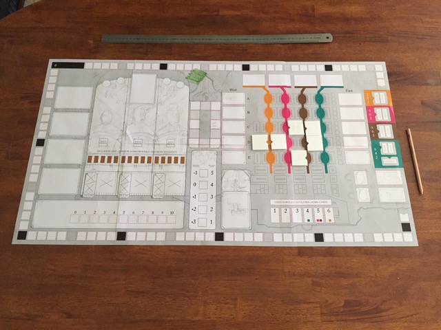
After that I start to make a very rudimentary layout, using only boxes and circles to denote spaces etc. No “artwork” whatsoever. Depending on the complexity of the game I’ll usually make another prototype at this stage. The game should be fully playable, and this gives me a sense of the changes I’ve made to the ergonomics of the prototype.
Lisboa in progress overview
If I’m happy with that, then it’s just a case of tackling the finished artwork in the most logical way. Sometimes that’s iconography first, or card layouts, or maybe the board. I tend to vary my style a lot for each game, so there’s always a stage of visual development and experimentation as well. I don’t tend to submit options on style or layout, preferring to commit and put my effort behind the solution I think will work best. The other reason for this is that the style often emerges during the first few hours of development, so creating a sketch in advance is often impossible, as I myself don’t know what it will end up looking like.
Once the game is almost finished, I’ll make another prototype and play it again, to catch little things that only become apparent when you ask people to play it.
Vinhos Deluxe
As regards tools, I use a pen and sketchbook a lot. Once I move to the computer I use the Adobe Creative Suite, primarily Photoshop, Illustrator and InDesign. I also do some 3D work in Cinema 4D. I typically build a 3D version of the game as I’m developing it, as I like to see how each element looks as part of the whole.
If you want to read more about the process of creating Lisboa, I’ve written a post on boardgamegeek detailing the development of the visual style, as well as the changes that were made to gameplay as a result of graphical solutions. You can find that here.
Nemo's War - Ship Counters
You mentioned finding references for all the ships in Nemo’s War, so in broad terms how much of a project do you spend on research, and how important is this phase in shaping what you create?
Reference is really important to me, if it’s available. For any game that even dips its toe in the real world I want to look at as much relevant reference as possible. Design styles of the time, common pattern forms, fashionable colours etc. Sometimes that reference becomes the heart of the visual identity of the project (Lisboa is the obvious example of this). Sometimes I will mix it with other anachronistic elements, such as in The Scarlet Pimpernel. It all depends on how important I feel that authenticity is to the game experience itself.
For Nemo’s War, it’s not enormously important that each ship is 100% accurate to its real-life counterpart, but what is important is that the seas are populated by ships that are unique, so that the narrative of the game comes to life that little bit more. Given that all of the ships did exist in real life though, it seemed obvious that seeking real reference was the thing to do.


You’ve been working on Stephenson’s Rocket recently so could you tell us a little bit more about it?
Stephenson’s Rocket was an interesting project for me, because the game already existed, fully formed. So it was easy enough for me to play it and assess the game very quickly. The very first thing that occurred to me was that the game felt old fashioned. This was mostly down to the fiddly nature of using paper money and stock cards, which kept the banker very busy. It became clear very quickly that the money was entirely unneeded, as players never spent it during the course of the game, it was simply points, so my first suggestion was to ditch it and move to a points track on the board.
Stephenson's Rocket overview
Another feature that bugged me was constantly having to visually check, or ask for, the number of shares in each company that a player was currently holding, so that was also removed for share tracks on the board, making all of that information easy to access and track.
The last, and somewhat more tricky part of the puzzle was the industry markers. In the original game, every city has three industry markers, each depicting one of a number of industries. The markers are small cardboards tokens, with the colour of the city and its name in very small writing. During setup, all of these need to be sorted and placed out on the board, it’s a big pain, and feels really clunky. After a bit of experimentation, I came up with a table system that lives on the main board, onto which players place their cubes instead of claiming markers. This has many benefits for gameplay. Firstly, it completely eliminates setup entirely. Secondly, the players can very easily see which cities provide which industry, and lastly, it allows the assessments of majorities in each of the industry types (for which points are awarded at the end of the game) very quick. The other benefit that this solution offers is that, as more maps are created for Stephenson’s Rocket, new industry markers are not required to maintain thematic accuracy (this is also true for currency).


The last element that was added was a player board, featuring an iconographic guide to the various scoring methods of the game, which can be a little tricky to remember at first. Other interesting elements to the project included creating a miniature for the famous locomotive, and coming up with a wooden design for the stations that could be placed on a hex at the same time as a locomotive. I also designed a pair of custom passenger meeples, replacing the tokens of the original game, which I think add a nice element of character to the overall presentation. We also added track joiner tiles as an aesthetic upgrade.
Stephenson's Rocket
All of these changes leads to Stephenson’s Rocket feeling a lot more modern without actually changing any rules (only the expression of them). Overall Stephenson’s Rocket was very enjoyable to work on, and Grail Games were very supportive of me taking a wrecking ball to a much-loved game.
This interview isn't the first time you've been featured on my site, gaining the top two places for my best Board Game Art of 2017 public vote. Without votes like these, how easy is it to gauge the feeling towards your work in the community? Also, how important is that feedback to you and are there any ways you seek it out yourself?
I’m fairly active on Twitter, so I usually get pretty immediate feedback when my work is released. Users on Boardgamegeek are also never shy about sharing their feelings! Good feedback is always really important. I’m pretty isolated over here in Australia, and only get to travel and meet most of my gaming contacts once a year at Spiel, so keeping in touch online is essential.
Nemo's War - box art
Hearing players get excited about the games I’m working on is also really gratifying, and of course, seeing them being played all around the world is really rewarding as well. I subscribe to all of my games on BGG, and do keep an eye on the threads. As long as feedback comes from a good place, and is respectful, I’m always happy to engage with players.
Certainly awards such as the ones you’ve created provide a nice opportunity for me to stop and reflect on the fact that players are enjoying my work, so that’s really great.
What are you currently reading, listening to or looking at to fuel your work?
I’m reading Authority, the second book of Jeff VanderMeer's Southern Reach trilogy, which I’ve only just started. I liked Annihilation a lot (and also loved the film). Before that I had just finished the Red Rising trilogy by Pierce Brown, which I enjoyed a lot. I’ve also just finished reading The Hobbit to my kids, which was a big deal for me.
Red Scare
What advice would you give to anyone wanting to work in the board game industry?
Get to know as many people as you can, don’t be afraid to ask questions. Try to help other people as much as possible and support what they’re doing. Engage with content creators, designers, other artists. Not just about work but about the games they’re playing and the things they create. That’s how opportunities are made. And speaking of opportunities, don’t wait for them to come knocking, you have to go out and make them happen.


Do you have any current projects underway, or coming up that you’d like (or are able) to tell us about?
Yes! Stephenson’s Rocket should be going into distribution very soon. Also hitting distribution soon is Smiths of Winterforge, from Rule & Make and Passport Games, for whom I’m also wrapping up on Hand of Fate. I’m almost done with Escape Plan, Vital Lacerda’s newest game about escaping a city after a bank heist gone wrong. The last game I worked on with Vital, CO2: Second Chance, should be going into production very soon. I’ve also finished up The Scarlet Pimpernel, by Brian Kelley and Eagle Gryphon Games. Victoriana is a cooperative game from Games Afoot that was funded on Kickstarter that I’m also finishing up, after completing many many card illustrations.


I’ve just wrapped on the graphic design for The Reckoners, an adaptation of the book series by Brandon Sanderson, by Nauvoo Games. Miskatonic University: The Restricted Collection is a light push-your-luck game from Reiner Knizia and Chaosium that’s wrapping up its crowdfunding campaign soon. I’m right in the middle of Black Angel, the spiritual successor to Troyes, coming from Pearl Games. As well as all that there are about six other games I can’t talk about! Some of which will be announced soon I believe, others are more long term.
Phew deep breath, that was a lot of games. Finally, if we’d like to see more of you and your work, where can we find you?
Twitter is probably the best place to find me, I’m @ianotooletweets.
My website is www.ianotoole.com.
If you have any questions about the above don’t hesitate in contacting me.
(All images supplied by and copyright of Ian O'Toole)

Christine Alcouffe: Art in Board Games #39
Working freelance isn’t for everybody. You have to manage your time and your workload as well as deal with crunch periods (or self-doubt in the opposite situation). It’s often a good idea to go for projects for which you don’t necessarily think you’d fit, as they often are a good opportunity to try out some new things.
Editors Note: This week I am joined by the talented Christine Alcouffe, an artist who worked on the gorgeous Paper Tales boardgames from Catch Up Games.
Hi Christine, thanks for joining me! For our readers who aren't aware of your work could you tell us a bit about yourself and what you do?
Hi Ross! Thanks for suggesting that we do this interview. I’m an illustrator in Lyon, France and for those who don’t know, Lyon is a city where people LOVE food. There’s a ludicrous number restaurants. Also there’s an art school, called Émile Cohl, where I graduated in 2010. I’ve been working as a freelance illustrator since then for various clients. I worked on 2D art for video games, a whole bunch of activity books for children (with stickers, coloring pages, games and the like), some school books recently, and also the board game, Paper Tales.


Paper Tales, was your first board game project so how did you get involved and what can you remember about it?
It’s a combination of various factors really. I’ve known Sébastien (who is one half of Catch Up Games) for some time, and a while back I ended up spending an evening with him, Clément (the other half) and my boyfriend Maël playing Vorpals, which is the original Japanese version of Paper Tales.
I really liked the game, and later that night we started talking about how it could be adapted to the French and European markets. I also ended up mentioning how it can be difficult to get work proposals with enough ‘creative wiggle room’ for me to experiment new things or just shake my habits. They must have liked the ideas we’d come up with that night because they contacted me a few days later to see if I could send them some tests for the game.


Could you talk us through your process when you were creating the distinctive and layered style?
There was some fairly extensive visual research to get to the style used in Paper Tales. We had to factor in a bunch of things to strike a good balance. It had to be both varied enough to be used on 42 different Unit cards without feeling tired and stylized enough to be easily identifiable and stand out from the crowd. We spent quite some time experimenting with various degrees of textures and motifs before we settled on what became the final result. The idea of using a style reminiscent of papercutting or collage was mentioned during that first evening, and the various tests led us to what you can now see on the cards.
Regarding the production of the illustrations, I always start with a pencil sketch, which I then send to the publisher so that they can tell me whether this fits their idea of the character. Once I have their approval, I can then move on to the colorization using Photoshop, first by applying flat tints to distinguish the characters while making sure I coherently arrange the different layers. After that I add cast shadows in various colors and degrees of intensity depending on the layer so that if looks as if the illustrations are made of superimposed paper cuts. Finally I add some texture/grain to the various layers.


Is there anything in particular that inspires you in your work?
I mostly draw my inspiration from artists I like! For instance Ben Wiseman and Malika Favre who both draw using flat tints, or, on the paper cutting/pop-up books side of things, Princes and Princesses by Michel Ocelot and Alina Chau.
Editors note: See the work of Ben Wiseman, Malika Favre, Michel Ocelot and Alina Chau, in order below.


I like a lot of artists in who work in various fields, with various styles, but these are probably the ones that influenced me the most considering our artistic choices that time.


You mentioned it being difficult to get creative wiggle room in work proposals, how important is artistic freedom on a job and how can the client allow this whilst ensuring a brief is met?
I usually don’t have a lot of creative leeway in my work. Most of the time, the publisher (be it of books, activity books or board games) comes to me with a set of specifications, the exact number of images I will have to produce as well as a style-- usually because of an illustration they liked in my book. It’s not necessarily an issue, however it explains how one can end up doing the same thing over and over again and become a bit rusty.
When Clément, Seb and I started talking about Paper Tales, however, they hadn’t settled on anything regarding the style. That’s what allowed us to discuss it together, explore some ideas that ultimately led me to something very different from what I had done before… so now people can get it touch with me for the whole “paper cut” technique. Hopefully they will also contact me for new styles entirely!
From the publisher’s point of view, I think it’s pretty simple. When they have a precise idea of what they want, they can put it in the brief. Obviously, if they are still searching for a style, they can mention it as well. There are several validation steps to check whether everything is going the right way. I usually create an illustration (or a series of illustrations) from the ground up, possibly with composition sketches so they can have a broad idea of the style they should expect. During these various steps, the publisher can validate, guide or ask for modifications on the work that’s being done, both on technical and artistic aspects. Ideally, the artist and the publisher can discuss freely, as equals. This is when it gets really interesting, because it makes the visual aspect of a project even better thanks to that back and forth.


When projects dictate that you stick to one particular style what do you think you can do to expand your portfolio and keep yourself artistically fulfilled?
First and foremost, even when working with a style you think you’ve seen from all sides, there’s always something to learn. For instance, I’m currently working on a board game aimed at children. The style my client asked for is something I’m used to doing, however it has a superhero theme, which I had never really thought about for my work. It brings me to consider the visual codes of superheroes and work on the postures as well as my compositions. I’m sure some of that dynamism will carry over in my future work!
When I feel like I’m stagnating, working for myself is usually a good way to shake things up a bit. I can make illustrations for my book with a specific purpose in mind, whether in style or in substance (this one would be nice for a board game publisher, that one for a schoolbook, that other one simply for my Facebook page…), but I can also get more creative and experiment with a new technique. I have to say I often have trouble with the latter though, as it’s not necessarily natural to go down the ‘disinterested’ road when you work freelance.


This year an expansion to Paper Tales, called Beyond the Gates is released. What did you learn working on the original and how did that influence your work on this expansion?
Working on the expansion was a very different process from the base game. The visual style was already set, so no additional research was necessary. On the contrary, I had to immerse myself in the base game to make sure there wasn’t going to be any discernible technical difference between it and the expansion.
A novel aspect for me, however, was the “fresco” on the cards for the single player mode. For the first time, I had to illustrate several cards destined to be placed one after the other, and that gave me a lot of creative freedom. I drew several characters, several layers, with architectural elements and some tidbits that added atmosphere to whole thing. I also had to arrange the illustrations on the various cards so that each one of them could remain interesting on its own but still provide more and more intensity up to the last card for the end of the game.
It turns up I’m pretty happy with how it turned out, and I really enjoyed doing this!


What advice would you give to anyone wanting to work as an artist?
That’s a huge question. Maybe I’d start by warning people that working freelance isn’t for everybody. You have to manage your time and your workload as well as deal with crunch periods (or self-doubt in the opposite situation). I would also suggest being adaptable and upright. It’s often a good idea to go for projects for which you don’t necessarily think you’d fit, as they often are a good opportunity to try out some new things. However, unacceptable work conditions and unrealistic deadlines shouldn’t be tolerated.
One last thing: during our whole life we’re always getting better. When I think back on what I did when I graduated, eight years ago, I can’t help but notice how much I evolved! Both in my relations with book and game publishers (since my professional network is much bigger now) and in my technical and artistic skills. It’s pretty reassuring when you think about it!


What are you currently reading, listening to or looking at to fuel your work?
My work is influenced by a lot of other artists. I follow a lot of illustrators on social networks, such as Benjamin Lacombe, Pénélope Bagieu, Amandine Piu, Pernille Orum or Yrgane Ramon. I really love what they do. I have a folder on my computer where I save a lot of images from various artists and in various styles. Whenever I face an artistic or technical issue I can’t quite solve by myself, I browse that folder to find solutions that other people have found for similar problems they may have encountered.
I also read a lot, mostly fantasy. It’s usually more for entertainment purposes rather than inspiration, but there are some books I recently read which make me feel like maybe I should start working on more personal projects, possibly as an author this time. Right off the top of my head I’m thinking about The Mirror Visitor Quartet, by Christelle Dabos (which will apparently start being published in English in september), which is an absolutely stunning series of novels.
Regarding the audio background, whenever I’m laying down some concept art or sketches, I don’t listen to anything. I need to focus and I’m afraid even instrumental music would push me toward a specific (and possibly unwanted) atmosphere. Once I’m done with preliminary sketches, however, I often listen to the TV. I’m aware it must sound weird, however since this is a very solitary line of work, I tend to like hearing people chat... Makes me feel like as if I’m part of the outside world! Which I know is pretty pathetic obviously.
So I basically have this daily routine where I listen to—more than watch—my favorite shows. I also watch a bunch of Netflix series. But I don’t think either of those really “inspire” me.


Do you have any current projects underway, or coming up that you’d like (or are able) to tell us about?
I recently signed two contracts for two additional games! One is a board game for kids, and it’s a very interesting and informative project for me (it’s the first time I have to draw an actual board, and I’ve been wanting to do this for a while now), and the other one is a regular card game, but with very stylized monsters I’m really going to love imagining. It will probably be my most creative project to date, I can’t wait to get started!
Apart from that I’m still working on another activity book for kids, one with a lot of sceneries. It’s a good challenge for me since I usually work on characters above all else. Here’s to hoping my client likes it!
Finally, if we’d like to see more of you and your work, where can we find you?
I have an online portfolio where I post my finished drawings.
I also have a Facebook page and an Instagram account where I post things my regularly, not just final drawings but also work in progress, informal messages etc.
(All images supplied by Christine Alcouffe)