Campy Creatures - Josh Emrich: Art in Board Games #46
Welcome to Issue 46 in my series sharing the stories behind board game art.
When I created this site, Josh Emrich was among the first people I contacted. Their work is exceptional, and you seem to agree, voting Campy Creatures in the top 10 for the Best Board Game Art of 2017. Enjoy the interview, I can’t wait to see more from this talented studio.
Check out the interview archive for more great insights into board game art.
Hi Josh, thanks for joining me! For our readers who aren't aware of your work could you tell us a bit about yourself and what you do?
For as long as I can remember, I always wanted to be an artist who made things other people could enjoy. Which is crazy because I grew up in a blue-collar family in the industrial midwest USA. My parents had no artistic background and I had to explain to them what makes good art and why I was doing a particular thing. Many artists aren’t great at articulating their ideas, so I credit my parents in helping me develop this skill.
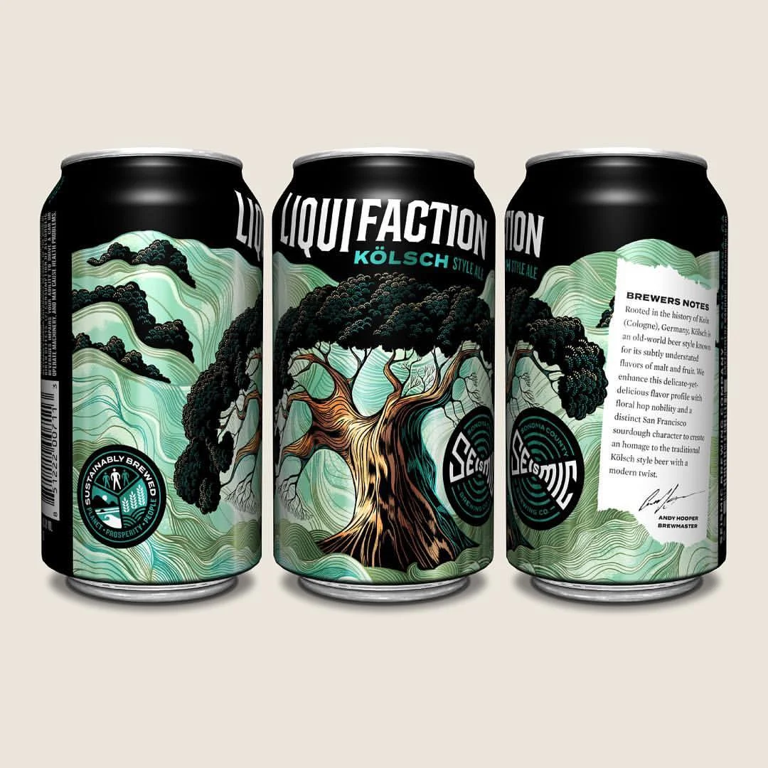
When I went to study art at university, I had a hard time picking one thing — I loved it all — but ultimately studied visual communication design because it touches multiple disciplines — graphic design, industrial design, illustration, etc — with a commercial or strategic purpose. I have since worked as a creative director, designer and illustrator at brand design agencies, eventually becoming a founding partner at a design firm. Eventually, running a firm became a strain on my family, and I got burned out. My wife Katie is also an artist and together, we have four artistic kids. We decided to simplify and make design and illustration the family business. In 2013 we created Emrich Office, a brand design agency that specializes in creating identities and packaging for craft beer and spirit brands. We work from home in a 1000-sq-ft studio filled with vintage action figures and midcentury furniture.
Because we work with a lot of craft breweries, these clients can’t all look the same, so we have had the opportunity to develop and master new art styles with every project. This unique skillset is what brought us to the game industry.
When beginning to work on any new project what are the first few things that you do?
As a movie buff, I like to think about my projects like a film director thinks about a film — the story is the most important thing. If you don’t have an interesting story, you don’t have much to stand on. It’s something I really try to draw out of my clients. The first step is identifying the audience and crafting a unique message that’s engaging. The next step is fleshing out our guiding principles: what world this story takes place in, who are the characters, and what will the experience be? Like a method actor, I have an obsessive personality and will get really immersed in the research — watching any relevant films, reading books, studying history, finding forgotten illustrators, listening to music, etc. Because most of the story is told visually, Pinterest has become a great resource for collecting inspiration and sharing it with my clients.
This creates a foundation of intentional and well-articulated rationale for everything I do. It shows my clients that my creative decisions are focused and not arbitrary, ensuring that I’m delivering something that fulfills their purpose.
Your first board game project was the absolutely gorgeous Campy Creatures. So how did you get involved in that and what do you remember about it all?
Let me start off by saying I’m new to the board game industry. The first things that struck me is that much of the game art (in the industry) shares a similar formula and style. There’s a large emphasis placed on illustration, but often the graphic design is not very well integrated or well executed. Much of it is not very sophisticated. This creates an opportunity for game publishers and artists to break some stereotypes and attract new people who are normally turned off by board games into the fold.
I put a lot of work into research and understanding the project before I dive in. I don’t like presenting tons of options. I think that’s a cop out — like throwing a dart at the wall. I want to have everything worked out before I present anything and nail it on the first go. So I watched tons of the old Universal and Hammer horror films and collected vintage posters in Pinterest. I wanted to honor those films and characters while making Campy Creatures it’s own thing — knowing the exact right points to adhere and deviate.
Keymaster Games, the publisher of Campy Creatures, is run by two graphic designers, Mattox Shuler and Kyle Key, who really understand what it takes to create a game with street cred and still have a broader appeal. They are willing to take risks and invest in production details. They also encouraged me to share my in-progress work on social media to help generate interest in the game, which is a different experience for me. Usually, my clients want me to keep things tight-lipped until the beer is released. It became a little focus group and the reaction was really positive so it gave me a lot of confidence in my approach.
From this experience, I am now hooked on board games and I’ve found a great partner in Keymaster.
You make a good point about board game visuals largely playing it safe. When you talk about taking risks, what stylistic risks did you take with this game?
I guess I don’t see it as taking risks as much as finding ways of differentiating to stand out. Before I started working in board games, I was a brand consultant. Coming from that perspective, it’s a bigger risk to blend in. For Campy Creatures, we could have made it look either very cartoony or like the standard concept art style that pervades the game industry now. Instead, we really embraced the classic horror movie poster vibe, not only with pulpy illustration but also with the type.
Campy Creatures was Keymaster's second game and they really wanted to capture the feeling of classic monster films. Many of the original movie posters from this era were created by commercial artists who could not only illustrate but could also integrate lettering and type. These days, illustrators and designers tend to be more specialized and often work separately under an art director. This can lead to some mixed results where the illustration and type are not working together. In order for Campy Creatures to feel authentic, Keymaster needed an artist who could work like an old-school commercial artist integrating both illustration and type. Mattox had seen some pulpy, b-movie-inspired beer labels that I had designed and illustrated and thought that I could pull it off.
You also mentioned the need to inject a distinct character into the creatures you drew. So what is the trick to creating memorable and captivating characters in your work?
One of the major points of deviation was that many of the original horror monsters tended to be male, so we reinterpreted several of the creatures as female. I always try to push past a general trope by adding a humorous detail or element that allows the viewer to start imagining a larger story around the creatures. For instance, the Invisible Man in Campy Creatures has a Film Noir vibe and is in the process putting on leather gloves. Not only does this create a threatening posture, but it implies that he’s about to commit a crime. Hopefully this sparks the viewer’s imagination and they begin to fill in the rest of the story.
The only creature that received any major revision was the blob. A blob by nature doesn’t have any defining features, which creates a difficult problem when it needs to be a distinct character. My initial thought was to feature a melted victim within the blob to give it some structure, but that was a little too scary for younger players. We ultimately decided to give the blob an eye and to suggest a more defined character.
One aspect I love about your games is the very distinct color palettes you use. How do you use these colors to set the tone in these games?
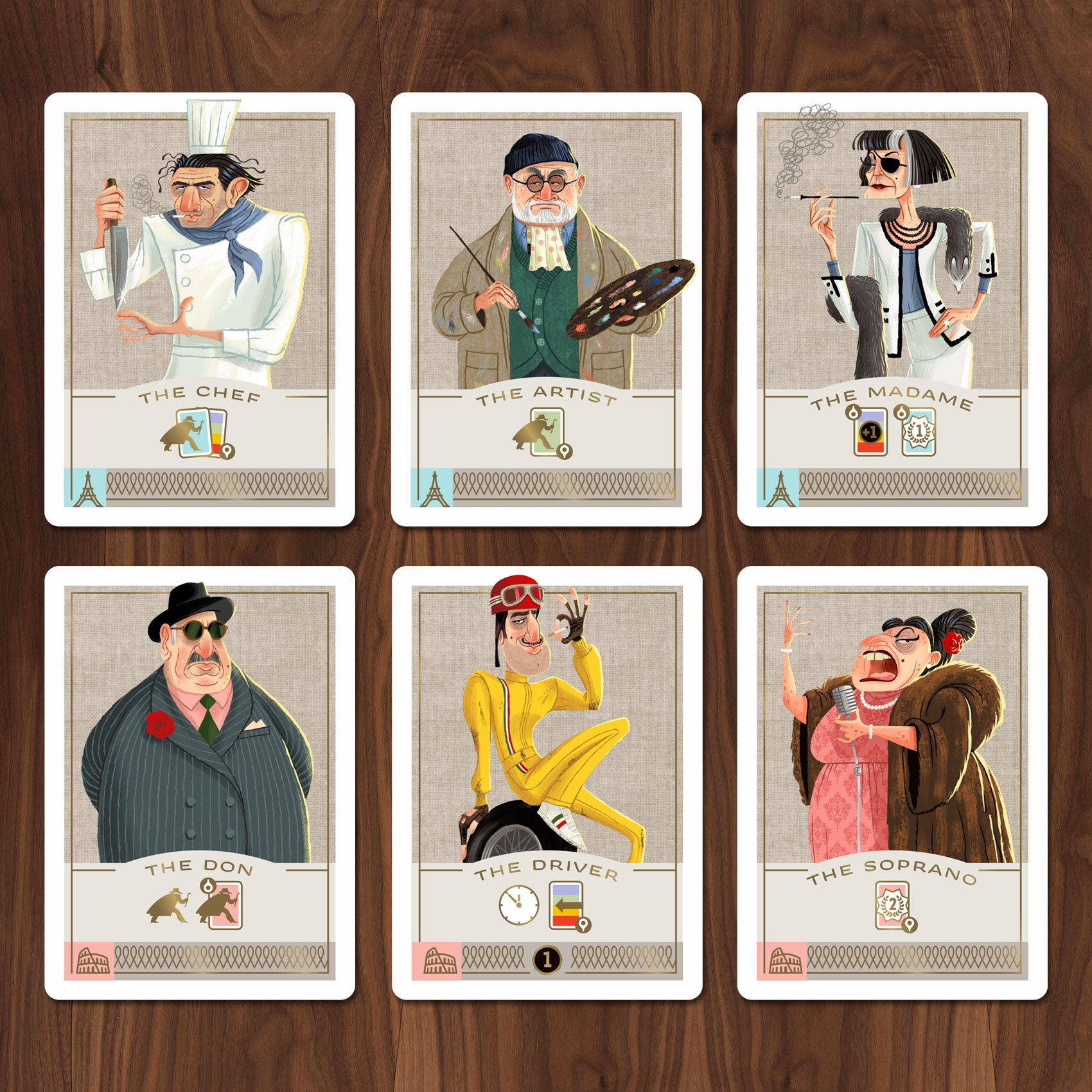
A memorable color signature can really help a game stand out. Like any design decision, color should always point towards the story or experience you think will engage the audience. The colors for Campy Creatures are rooted in classic movie posters and pulpy lighting, while the colors for Caper are inspired early 1960s European fashion and interior design. Some things that I think stand out in our work is our use of color on Caper. It’s offbeat and sophisticated, using pink, mint, and metallic gold, evoking a Wes Anderson aesthetic. I never want to use a “standard” color palette — basic red, blue, green, etc. I always want to find colors that are unexpected and complex, but functional and serve the story and setting.
Speaking of Caper, can you tell us a bit about its theme and how that developed?
Caper was designed by Unai Rubio and was originally published as “It’s Mine” by Mont Taber in Europe. When Keymaster approached me about helping bring this game to U.S. audiences, I had two suggestions. First, there are a lot of games set in Europe, but if we pick a specific time period, that will help build an interesting world and refine our design choices. We decided 1960-something Europe would be a fun place for players to visit, evoking the great heist films from that era like Pink Panther, To Catch a Thief, or The Italian Job. Second, the characters and gear really help set the tone, so they need to be eccentric, humorous and interesting. The best way I could describe what my approach would be to Keymaster was “what if Wes Anderson directed a Pixar-animated heist film?”
Did your experience working on Campy Creatures change your approach when it came to Caper?
Not really. The two games are completely different, which is refreshing for me. I get bored easy, so I really like charting new territory. The characters in Caper were less defined so I had an opportunity to explore my own ideas. There’s also a lot more art in Caper — 24 thieves, 24 gear items, and 23 locations — so I had to work quickly, which helped inform the vintage gouache style I used to render the illustrations.
What advice would you give to anyone wanting to work as an artist?
Art is not just copying something you see or letting your imagination run aimlessly. To me, it's visual communication and the best artists are able to cut through the clutter and deliver an engaging message. Obviously, you need to develop your skill and technique through constant learning, experimentation and practice. But the most important thing is being able to empathize with others so that you can speak to them. Lastly, you can’t be drawing all the time — you must have your own experiences too so that you have something of value to share.
What are you currently reading, listening to or looking at to fuel your work?
I’m sort of between major projects at the moment, but I’ve been reading the Wildwood book series to my kids during their summer break. The series is written by Colin Meloy of the Decemberists and illustrated by Carson Ellis — part of the same team that developed the beautiful game Illimat with Keith Baker. It’s inspiring to see other artists and storytellers that do not confine themselves to one discipline!
Do you have any current projects underway, or coming up that you’d like (or are able) to tell us about?
Umm…I hear there are more Campy Creatures in the works! And Emrich Office, the brand design and illustration practice that I run with my wife, Katie, is turning 5 years old. We are going to partner with one my favorite collaborators, Bottle Logic Brewing, to produce a limited release beer to celebrate. We hope to raffle the bottles off in the Fall to help raise money for arts education.
Finally, if we’d like to see more of you and your work, where can we find you?
Instagram is where I post my most recent collaborations. You can follow me @emrichoffice.
(All images courtesy and copyright of Emrich Office, 2018)


