Steven Preston: Art in Board Games #31
Welcome to Issue 31 in my series sharing the stories behind board game art.
This week I'm joined by Steven Preston, an artist and art director who recently worked on Skyward: The Airborne City (which was voted into your Top 10 Best Board Game Art of 2017) with Rule and Make. Enjoy!
For more great insights into board game art, head to the interview archive.
Hello Steven, thanks for taking the time to speak to us. Firstly, could you tell us a little bit about yourself?
Sure! Well, I currently live in Brisbane Australia and I love comic books, watching Japanese animation like One Piece and I also tend to waste a lot of time playing video games when I should be working on other things. I’ve studied a lot and have a diploma in graphic design and a bachelor’s degree in interactive and visual design.
Now we know a little more about you, I have to ask, as a child what did you want to be when you grew up?
When I was young I was always drawing a lot. Art was one of my favourite subjects in school, but as I got older I wondered if there was a career to be found in being an artist. So I tried some different things; like labourer, kitchen hand and other jobs which I was never really happy with. It wasn’t until I discovered comics that I realised there was a job you could have as an artist, which brought me back to wanting to be one again. I started working on becoming a comic artist, which eventually led to me studying graphic design and being an illustrator.
So how did you first get involved in making board games?
The very first board game I worked on was Robots & Rockets from Rule & Make. I got involved in that by chance really. I’m friends with the game's designer Sye Robertson and I remember they were posting a lot of work in progress (designs of the game) on their Facebook page. Sye was doing all the art and design for the game at the time, so I wasn’t involved at this stage and I remember there wasn’t even a budget at the time for the art, which is why he was doing everything himself. He approached me about creating some art for the game and originally just wanted a single robot done, but as he was happy with what I did it lead to me creating all the artwork.
An interesting part of the design was the need for a variety of head shapes in the robots so they were easily recognisable. Each one shown is busy at a different task, so they’re not all doing the same action. You can also see how the back robot changed from my initial sketch to the final drawing. I made the perspective a lot more prominent in the final just by changing the head angle. One thing Sye wanted with the cards was for the robots not be gendered. So for the card above originally, I was going to do a hat similar to a female air hostess, but that was later removed in the final illustration. The development of that game between myself and Sye was really great and it changed the way the game was originally going to be published. I think it was a real case of being in the right place at the right time.
When you are working on the art of a board game can you give us a quick overview of your creative or thought process and has this changed at all since you first started?
When I first started on Robots & Rockets there was no set template for the design of the cards. I had to design something that was really flexible and what I came up with was the idea of torso type shots and characters with no backgrounds. Another trick was to have a circle in the background and use the circle as a guide for keeping the art centralized.
Now I try and have the template design for the cards done fairly early in the art process, if possible, so I have an idea how much of the art will be covered up by the design. Of course, this template design can evolve as more art is produced and you can see if the design works on multiple cards with different art. As far as my thought process goes with the art itself, I tend to get my ideas fairly quickly just from the name of the cards and what the cards do. I then whip up a bunch of sketches and see if I’m on the right track with what I have in my mind.
You were involved in the creation of Skyward, so could you tell us a little bit about what that involved and what were the biggest challenges you faced?
My original role on the project was to create all the illustration work for the game, but as the game progressed it became evident that if we were going to make the deadline of having all the artwork completed before Kickstarter launch I would need help. This deadline was a big challenge for me since the art style we'd originally planned for Skyward was fairly time intensive. It would have been a struggle to do all the artwork myself as originally planned so the decision was made to bring in more artists to lighten my load and to change the art direction of the project which would also speed up the process.
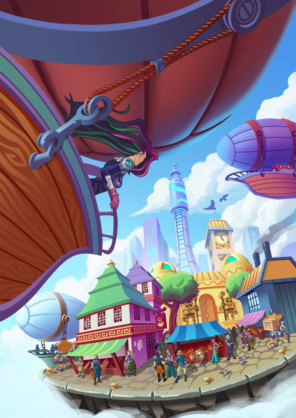
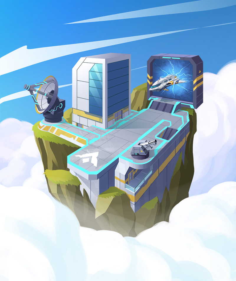
The Skyward cover art was developed from concept to finished piece as a collaborative process. The original sketch and base lines – Steven Preston. Characters – Ellie Jang. Colours – Neil Martin. Final touches – Steven Preston.
My role in the project also changed to Art Director, so I was overseeing the art as well as paint overs and making changes. Even though I felt kind of bad at no longer being the sole artist on the project, I really enjoyed working with other artists, making suggestions which improved the art and hopefully helped them grow as artists as well. I know for myself that Skyward would look very different today if I was the only artist on it.
What was the inspiration or core idea that drove your work on Skyward?
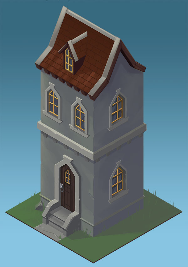
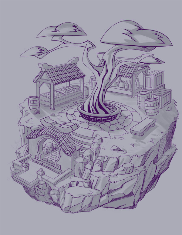
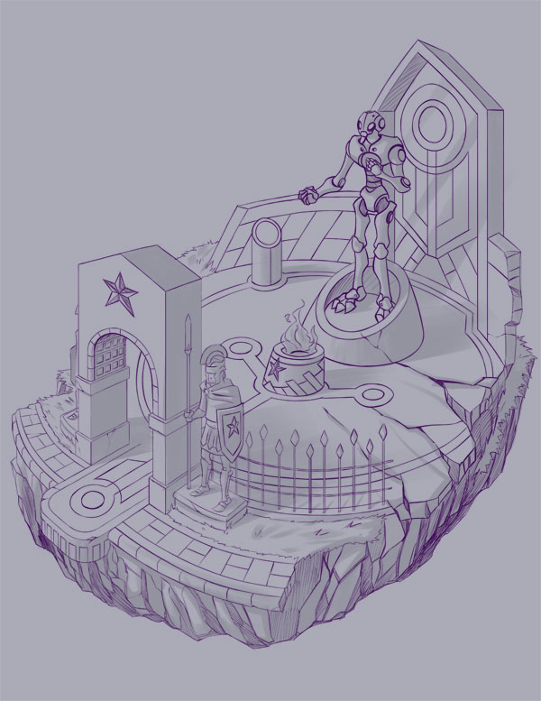
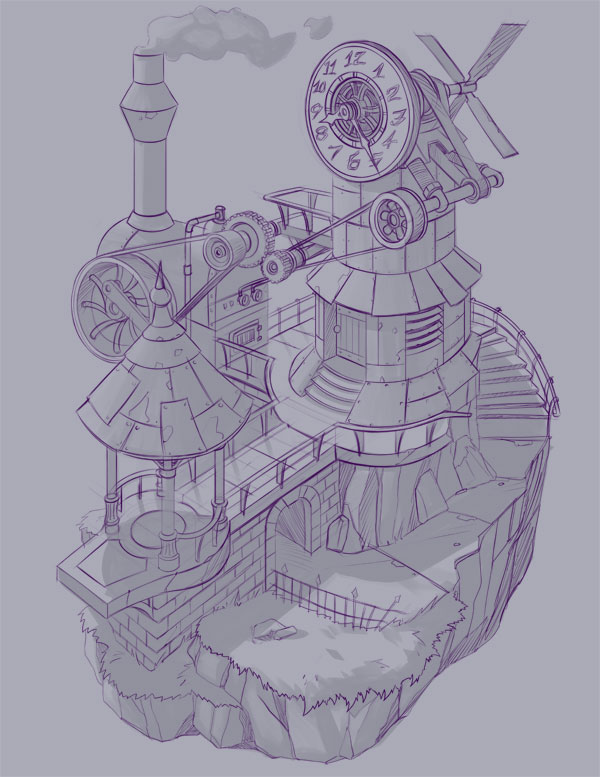
When I first started on Skyward I made an inspiration folder on my hard drive and kept filling it up with artwork I found which I thought was cool to use. Originally it was mostly isometric art from video games, since that was the style it was going to be. As I'd never really drawn any isometric art before, I didn’t know how long it would take or what style to do it in. I did some test pieces in different styles to see what worked.
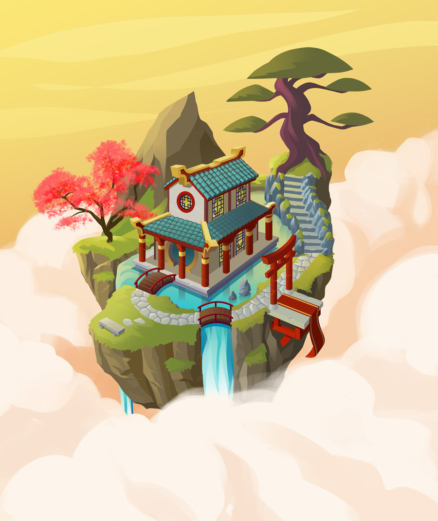
These didn’t really work, so I started looking at more pieces still in an isometric style but with a lot more detail, like something out of an RPG. It wasn’t until I saw a piece by Alex Shatohin that I found the inspiration for the art style of Skyward. I could imagine this small fortress separated from the ground, floating in the sky and people being part of this world which gave it that RPG element that I liked.
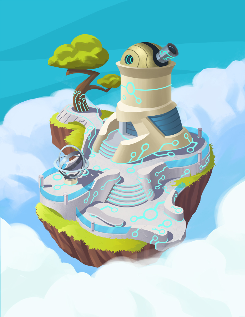
I would have loved to have done all of the Skyward cards like this, but we found that it was just taking too long and had to find a different style that was faster to complete. I was then inspired by a piece of art by Sergi Brosa which was closer in perspective while still having that feeling of being in the clouds. The use of depth of field in the piece was also something that we used in a lot of Skyward art as well.
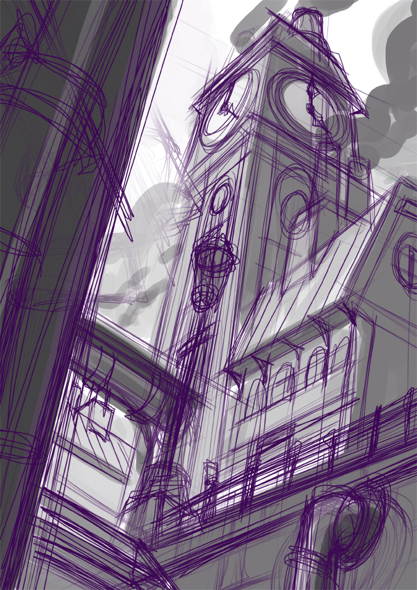
Clock Tower art from Skyward was my first piece for Skyward which ended up in the final version, so this became the template for the style of art used for the rest of the game. You can see the use of depth of field with the buildings in the background.
Once we settled on the art style for the game the next challenge was coming up with the graphic design elements of the card. Originally the plan was to have a ribbon type graphic on them which had some texture to it which I had created. But an issue we found was it was hard to work some of the game elements into that design, for example, the launch costs of the cards. It was also taking up a lot of room which took away a lot of the art. It wasn’t really until most of the card art was finished that Allen Chang came up with the design we have for the cards now, which is more modern with some interesting elements like a vertical strip that changes colours depending on the card faction.
What are you currently reading, listening to or looking at to fuel your work?
I can’t work without music so I’m listening to a lot of EDM when I’m working. Like I said in my intro, I play a lot of video games, so I’m always looking at game art for inspiration especially people like Blizzard. I don’t read much in terms of novels, but I do love reading a lot of webcomics. I especially love reading Stand Still, Stay Silent and Awaken.
What advice would you give to anyone wanting to work in the board game industry?
This is a hard question for me to answer because I kind of fell into working in the game industry from my networking really. But I will say that when Allen Chang from Rule & Make was looking for artists to help me out on Skyward he had a few contacts from people he’s met at conventions. So I say networking at conventions is important. Also using places like Artstation or Deviantart is good since I was also using those sites to look for local artists to help out.
Skyward character designs by Steven Preson. These characters were later redrawn for the game by artist Dmitriy Logunkov.
Do you have any current projects underway, or coming up that you’d like (or are able) to tell us about?
At the moment I’m not involved in any projects, but I’ve been talking with Rule & Make about something which I can’t say at the moment.
Finally, if we’d like to see more of you and your work, where can we find you?
Sure, if you want to see more of my work my main portfolio site is http://designinfusion.com/ but I also have a DeviantArt page which tends to have a lot more work on there, such as sketches.
(All images supplied by Steven Preston, 2018)


