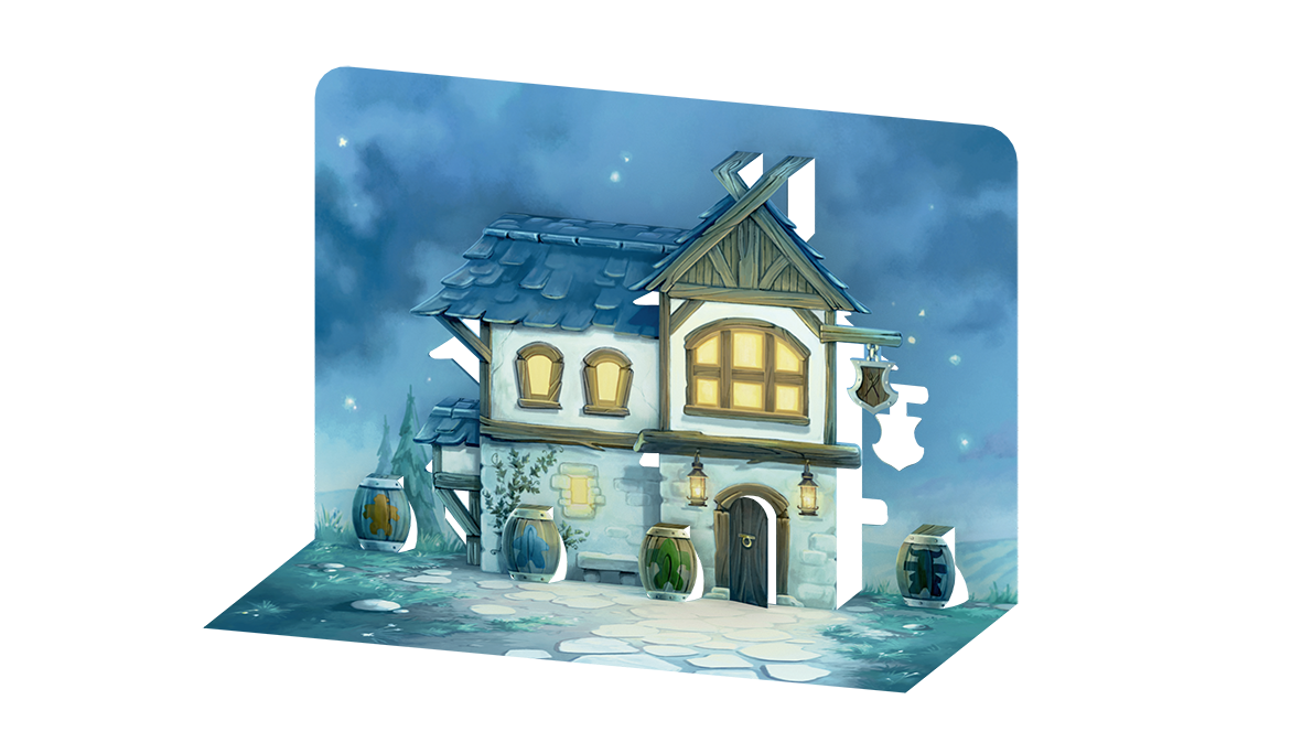
Welcome To Board Game Art - Reversing Gender Norms - Interview with Anne Heidsieck (Issue #66)
Welcome to issue 66 of my series sharing the stories behind board game art. Roll and Write games aren’t always well-known for their gorgeous art, but what struck me Anne’s work on ‘Welcome To’ was how fully realized its theme was. Hearing about Anne’s process on this project and more was fascinating. I hope you enjoy!
For more great insights into board game art, be sure to check out the interview archive.
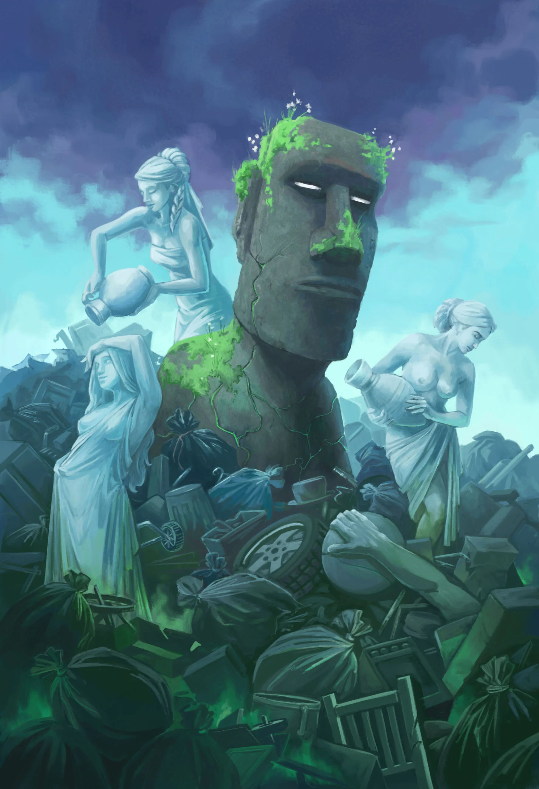
Anne Heidsieck - When I Dream board game card art
Hi Anne, thanks for joining me! For our readers who aren't aware of your work could you tell us a bit about yourself and what you do?
Hi Ross, and thank you very much for writing about the art in board games! I'm a 27 years old illustrator, working since 2012 after my studies in Nantes. Currently, I live in France and more precisely in Lorraine. When I'm not working, not often enough, according to my dog, I like hiking in the mountains and the snow (as much as possible!), reading, playing games of course, and devouring lots of series!
I have worked on several games from Blue Cocker (Welcome To, Argh and Meeple War), on Majesty and Carcassonne Safari of HIG, on some cards for When I Dream of Repos Production and on a game of Haba, Frido's Treasure Trove.
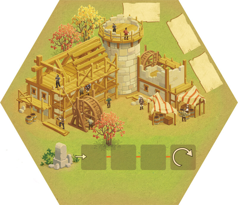
Anne Heidsieck - Frido’s Treasure Trove board game art
So how did you first get involved in making board games?
Soon after finishing my art studies I wanted to make the artwork for games. My sister and brother made a game themselves for our family when I was a kid and maybe that inspired me! So, with my partner, we created a game. We invented the rules, I carried out the illustrations and then we met several editors to present our project. It was quite a failure and the game is somewhere in a box in the cellar now, but it allowed me to meet people who were so nice and gave me the advice that really convinced me to keep trying, but only on the side of the illustrations this time.
Anne Heidsieck - Card Artwork - Frido’s Treasure Trove
I sent emails to many editors and, one day, Alain Balay from BlueCocker answered me. He was looking for an illustrator for his new game, Meeple war! That's how I found my first work on board game designs.
I haven't had the opportunity to work on a lot of things other than games but, from what I’ve seen, the work is really different in-game illustration and book illustration, for example. I think that game design requires even more organization. It can seem too strict because we have a lot of "rules" to respect, for the ergonomy of the game, but it's rather reassuring to me because we don't begin the work with a blank page.
Anne Heidsieck - Save the Meeples cover art
When beginning to work on any new project what are the first few things that you do?
I always begin by researching a looooot of pictures, on Pinterest mostly and also in my art books. I need to figure out the idea of the mood of the game, the color atmosphere, the style, etc. Even if I don't use them later during my work, they help me to find the first ideas. I make some first sketches after that, to be sure that we agree with the editor. When the work begins for real (and after I print a plan and fix it on my wall!), I start working precisely on each illustration. First with a sketch, a definitive drawing, a color rough and finally the definitive coloring, asking the editor for confirmation between each step.
Anne Heidsieck - Meeple War drawing construction
What do you remember about your first board game project Meeple War, and how did you prepare yourself for the job?
As I had already worked on a full project for a game (even if it was personal, it was really formative), I wasn't very surprised by the necessary rigor of work when I started to illustrate Meeple War. The first thing I did was to organize a very strict plan, that I totally exceeded of course. Today when I do planning, I schedule much more time than I estimated at first, to avoid being under too much pressure. I continue to exceed my time limit, but less ;)
What were the most challenging parts of the job?
The newest thing for me was the technique: it was my first project entirely digital, and I have to say that this new way of working wasn't really appreciated by my eyes and my back! The biggest challenge and stress I had were for the cover I think. We kept it for the end, when the art was well fixed on the game elements to be sure to have consistency. I looked into a lot of covers for games and put myself under more and more pressure. Finally, when we validated a rough design with the editor, the final realization was quicker than I thought.
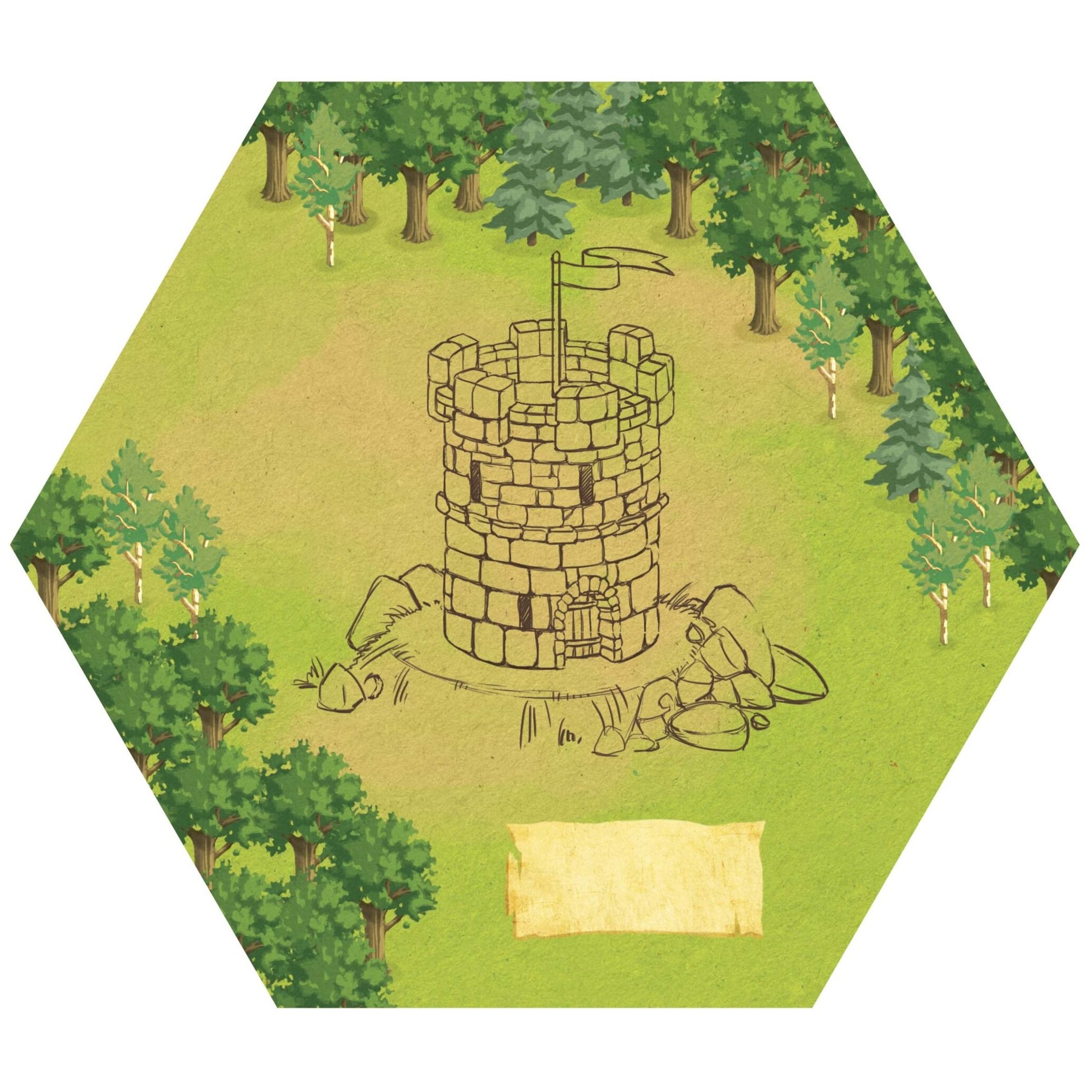
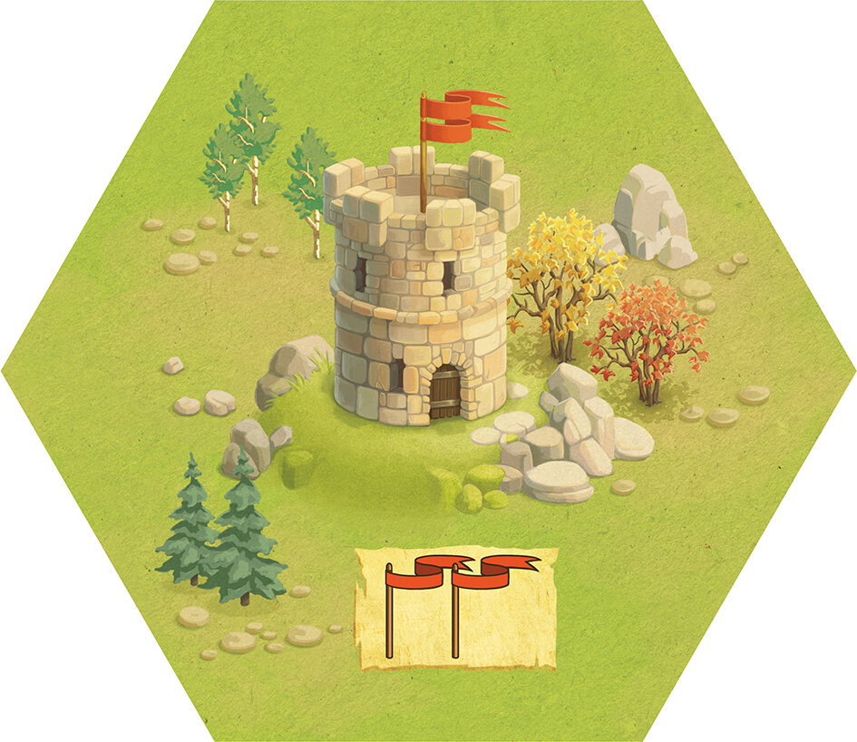
Anne Heidsieck - Meeple War game tile illustration
Other challenges were the setting-up of the punchboard and the cover with the marges, bleeds, cut lines etc, as this was also new for me. I understood nothing at first and hated that. I had to make a lot of searches on forums to know what I had to do. Now I do all the setting-up for Blue Cocker and maybe even like it (sometimes), knowing the characteristics needed for the publisher later, which allows me to gain some time on the art. Moreover, it's rewarding to follow the project from the beginning to its very end. It allows too, amongst others, to check the colors of the first print (which are always very different than on the screen) and to adjust until the production all that must be modified.
I made a big mistake with ‘Meeple War’ when I drew the illustrations for the tiles. I had totally forgotten the bleeds! I had to add on to each file the margins for printing later and remake the forests. I don’t think I’ll ever forget bleeds after that!
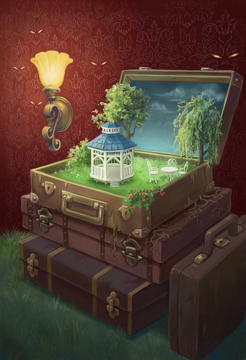
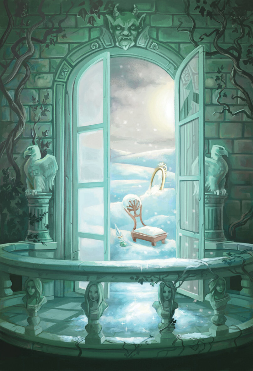
Anne Heidsieck - When I Dream card art
You worked on 'When I Dream' a card game with wonderfully creative artwork. How freeing was it to work on a game with this kind of concept and what were some of the words you created the art around?
[Editor: When I Dream is a guessing game and without focusing too much on the rules I’ll just tell you about the cards that make it up. Each card features two words, one at the top and one at the bottom. Each card illustration represents these two words and can be rotated 180 degrees to focus on either one].
The art brief was wonderful because the artists were so free. We had a list of several words and had to combine them 2 by 2 however we wanted. After that, the only directive was to make a surreal illustration that showed both of these words. We could include other objects and ideas, but they had to be less important in the picture than the 2 chosen words.
The artists involved didn't have to work in a similar style, the common theme was the surrealism for the dreams. I wish I could seize this opportunity to reuse my paintings and brushes, which I miss very much! But traditional painting takes me more time than digital and sadly I couldn’t find the time to make it work.
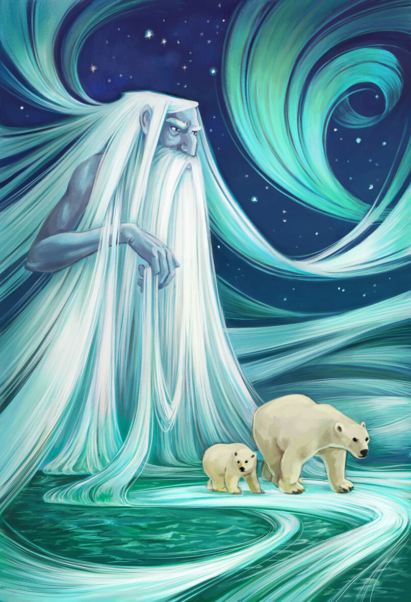
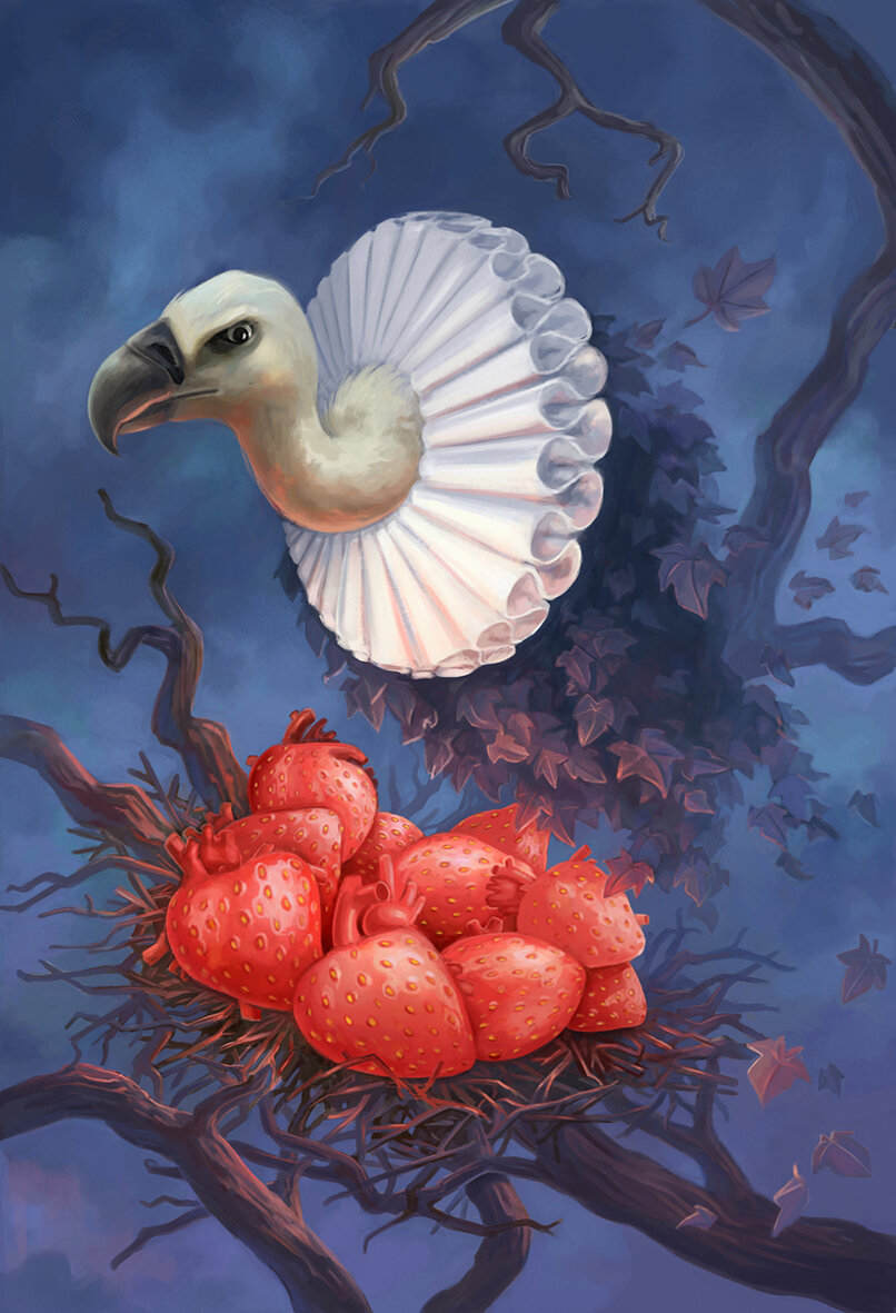
I had some words on my list that I immediately wanted to illustrate. Words like "snow", "vulture", "tunnel", "bear" and I imagined different situations with the others words in order to make, if possible, poetic pictures, and sometimes nightmarish ones. When the project got down to only words that didn't inspire me, I asked for another list of words. I didn't understand at all that we had to deplete most words from our first list before asking for new words but the artistic director still gave me new words, so I was very lucky to have a lot of choices to make my pairs.
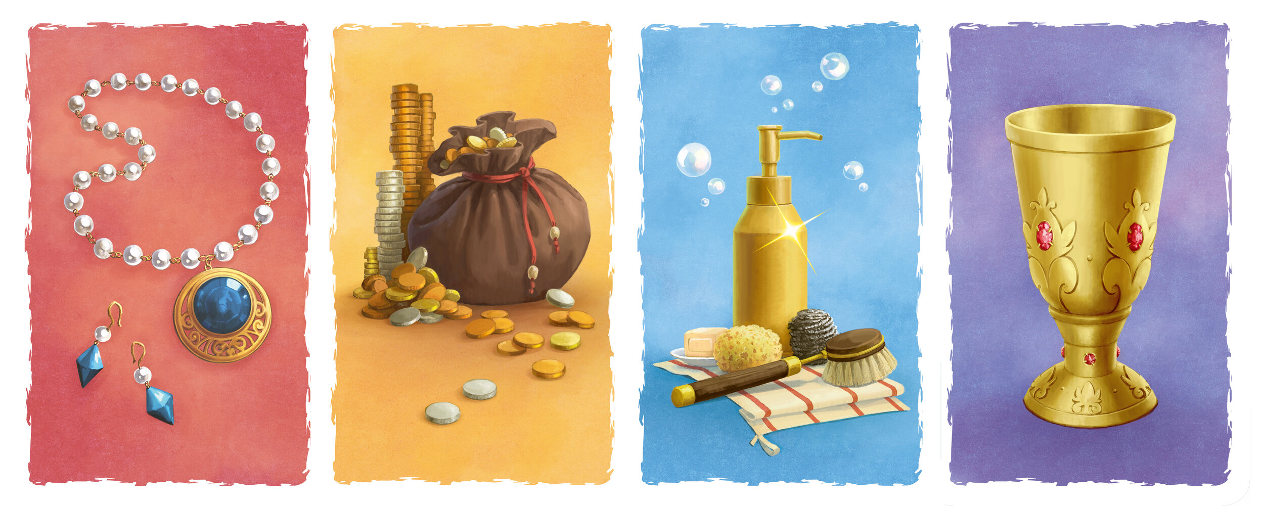
Some pictures refer to books, movies, or universes that I love, and I also often listen to audiobooks when I work, so maybe that influences and inspires me in some ways. The most perfect design brief I ever had was on the goodies card of this game, because I just had to do whatever I wanted with as many elements as I wanted! There are two blanks for writing the words, suggested by the card that the player wants to use.
Anne Heisieck - Welcome To Game Sheet
2018 saw the release of the roll and write game 'Welcome To...' which has been a huge success. The game has a strong 50s vibe to the artwork, so how did that develop and was this look part of the original brief?
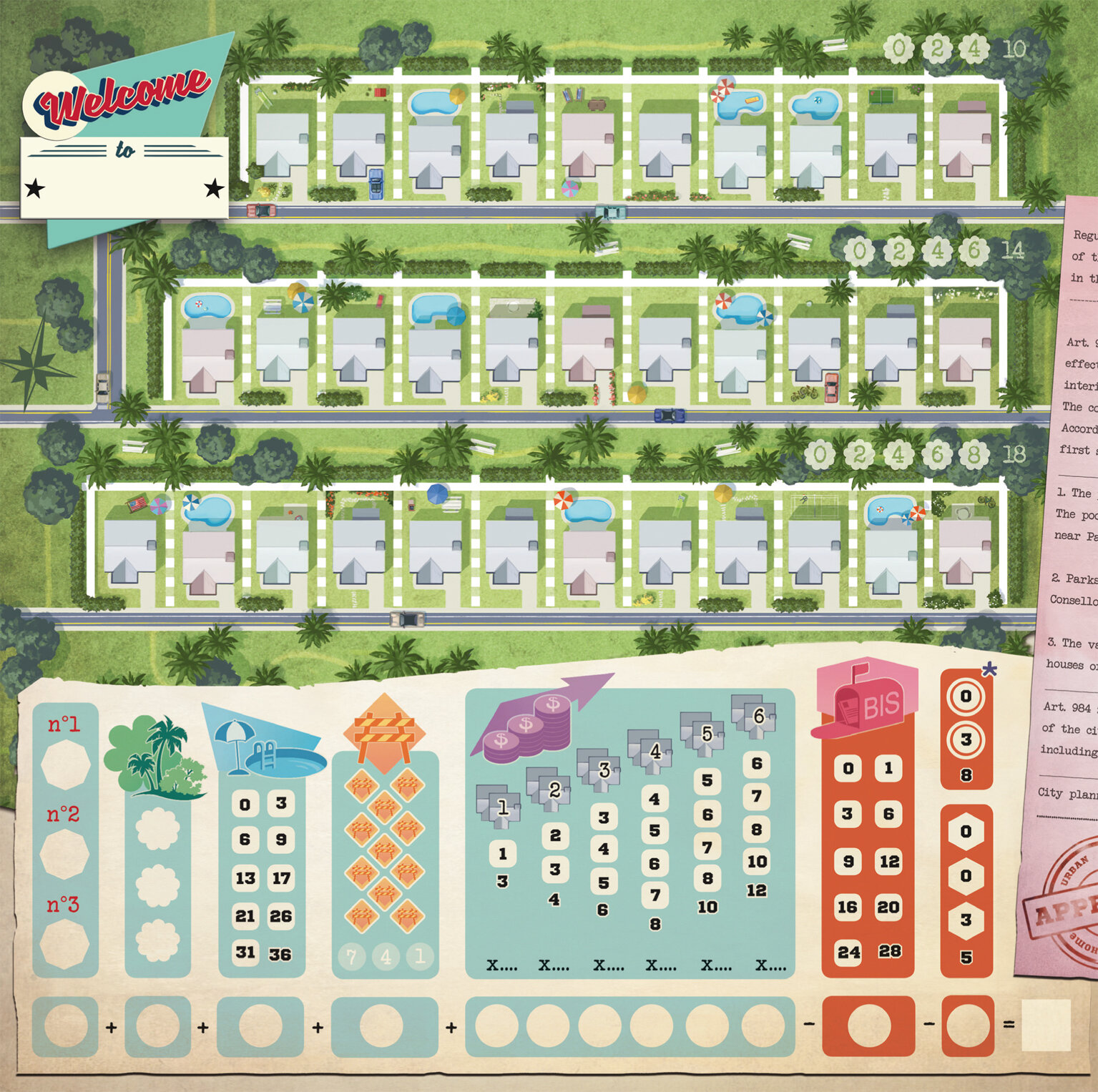
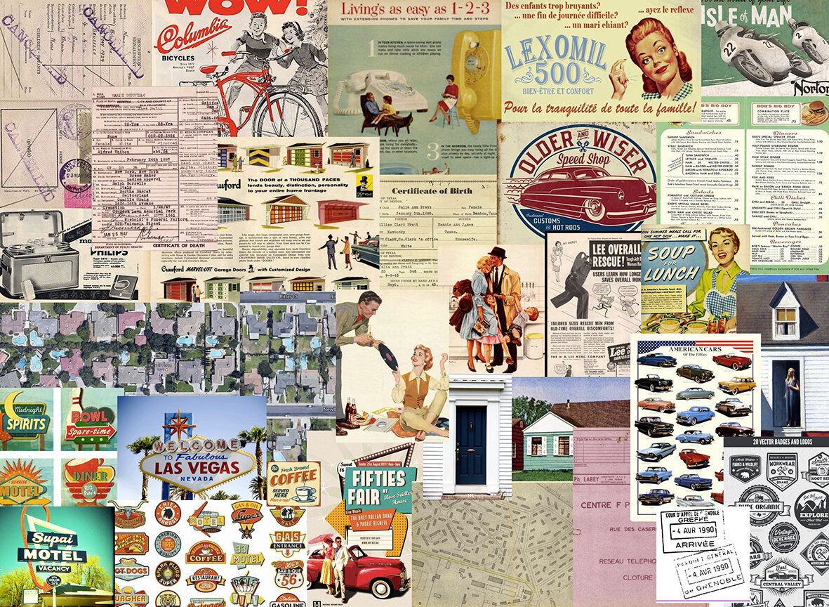
Alain Balaÿ already knew that he wanted the theme "urbanization during the 50s". The graphic style that he wanted was very much in the mindset of American ads from that era. Most of the work was spent on research: ads, maps, real estate documents, aerial views, logos, style, colors... I even listened to 50's rock and roll music and watched a few movies from this period to be completely in the mood! Even with a lot of research, I still think it could have been even more "50s" in my designs. But sadly it's always so different in my head than the end result I manage to create by my illustrations.
Anne Heidsieck - Welcome To - Art style research examples
I spent a lot of time researching the "perfect traditional house" during the 50s. I also viewed a lot of paintings from Hopper for inspiration. By spending time researching 50s advertising, I wanted to make a joke about the omnipresent sexism of the era by reversing the roles on the cover. At first, I imagined a woman in a suit near a sold sign in front of a nice house, giving the key to her nice husband with the kids in his arms. I wanted it to be so we could imagine her saying to her husband "see what I bought for you and the kids darling". This cover idea wasn’t chosen in the end, but that core idea of reversing gender norms pleased the editor and author.
Anne Heidsieck - Welcome To board game fake advertising
An extra detail I love in this game are the adverts on the back of the player reference sheets. How did this come about and where did your ideas come from?
Alain wanted to give me the chance to make more real illustrations. Beyond the cover, I mainly did icons and graphics, so to strengthen the atmosphere of the 50s he decided to add different advertisements on to the back of the player reference sheets.
The illustration of ‘Meeple War’ is a parody of a well-known ad, where a man and his son are playing battleships while the mother and the daughter are behind, doing the dishes. The illustration of Toulouse is inspired by the many tourism advertisements and the editor and the author are both from this town.
Anne Heidieck - Welcome To board game fake adverts
The one of the man in the kitchen is a reference to the countless pictures of housewives with their all-new household products, and the poster ‘le cocker aux trousses’ is a parody of the poster of the movie ‘North by Northwest’, ‘La peur aux trousses’ in french with all the authors and illustrators who worked with Blue Cocker until the release of Welcome to.
You mentioned that you made some early mistakes when it came to things like bleed lines on projects. So when it comes to creating and editing game art with punch boards and print work in mind what are some basic lessons that you could share?
I would recommend always being careful from the very beginning of the creation of a file about several things:
The size of the picture, personally I often work twice the print size
The definition with 300dp minimum for print
The color profile which depends on the manufacturer, but always at least in CMYK for print.
The density of black, as printers cannot print black deeper than a certain density.
To not forget to embed the fonts on a pdf export.
And in anticipation of the print, which always darkens and tarnishes the colors somewhat, to saturate and lighten up a little bit for each of the pictures.
Anne Heidsieck - Raccoon Illustration - Frido’s Treasure Trove
When it comes to resources, I think it's always a good idea to ask other illustrators how they work, as we have a lot to learn from each other! The boardgame manufacturer ‘Panda’ https://pandagm.com/tools makes very good guides for preparing the designs, it’s all in that link!
I also often search on adobe forums when I don't know how to do something in particular.
Anne Heidsieck - Carcassonne Safari board game cover
Last year you illustrated Carcassonne: Safari, so how did you end up working on this game and was it different working on an existing series?
After working on the game Majesty by Marc André with Hans im Glück, (thanks to Gaëtan Beaujannot from Forgenext, the agent of Marc André), Hans im Glück asked me if I was interested in creating the artworks of their next "around the world" expansion of Carcassonne. I couldn't say no! Besides, I love elephants so much! First, as a test, I made one tile with the different main elements (a piece of savannah, one of a forest, a baobab and a road), in order for them (and for me!) to see if I could make something in the spirit of Carcassonne that would fit with their vision. After that, I improved each kind of element separately as well as designing all the animals, plus some additional to give us choices.
Anne Heidsieck - Carcassonne Safari Animal artwork
For example, I made an antelope and a lioness, but the monkey and the lion were chosen instead. When we agreed on everything, they send me the final layout of each tile, with the frame of each element and the animals present on it, and I arranged them one by one, trying to diversify some set elements. It was kind of tedious work!
For the scoring board, I mainly used the frame of another expansion and used some of the same elements from the tiles I’d made as you see in the other Carcassonne games. As it is a collection with a very specific editorial line, the illustrators have to follow a general pattern, so it's not a very free "artistic" project, however, it is really well organized and we know exactly where we are going, which can be nice too!
Anne Heidsieck - Carcassonne Safari scoring track
You've also gone on to illustrate a variety of neighborhood expansion sheet packs for Welcome To. So are there any differences when illustrating an established game series (eg Carcassonne) and how do you look to make the art distinct within the design constraints?
It was my first work on an expansion, and indeed, it could have been a peaceful project by just modifying a little bit the first neighborhood, but we were under a bit of time pressure on these. Our American publisher (Deep Water Games) wanted to present the mini-expansions on their Kickstarter in Autumn, so we had to work fast. I was working on another project at the time, so they helped me by beginning some of the graphic work to have something to show to the backers at the Kickstarter launch, and I reworked it afterward for the final files.
Anne Heidsieck - Welcome To card art
It was nice and easy to create the art for something that I knew already worked for the players. I just had to change the aesthetic, the mood of the season or the event, and not on the games ergonomy. It was pretty relaxing! After searching for the main color for the ambiance, I made new trees and bushes and I felt that it immediately changed everything. Making new decorative files on the right, even if it isn’t important for the game, was fun too, and helps create a richer atmosphere I think.
Welcome to - Expansion Artwork
What are some non-game related creations (books, music, movies, etc) that you’re currently enjoying?
I often read or listen to audiobooks, mostly fantasy, and a bit of horror and science fiction. I'm a huge fan of Harry Potter and read and re-read them very often! I made the illustrations for my school examination about the french book ‘La horde du Contrevent’ by Alain Damasio, a beautiful emotional adventure! I also read the ‘Game of Thrones’, and wait for the next volumes while the internet spoils me every day. One of my recent crushes was for the books " The Gentleman Bastards" by Scott Lynch.
I watch more series than movies, of all kinds. Some of my favorites are ‘Orange is the New Black’, ‘Black Mirror’, ‘Stranger things’, ‘Parks and Recreation’, ‘Kaamelott’, ‘The Marvelous Mrs Maisel’ and of course ‘Buffy the Vampire Slayer’ :) Thinking about movies, I love in particular all the animations by Laika, especially ParaNorman!
Anne Heidsieck - When I Dream board game card artwork
Just as with my taste in books and series, the music I listen to is really diverse. When I work, I tried to adapt as much as possible the kind of music I’m listening to with the mood of the illustration I'm doing but I do listen to audiobooks and podcasts sometimes. Otherwise, I mainly love Nordic Folk music (groups like ‘Garmarna’, ‘Triakel’, ‘Omnia’) and some french artists like Camille, Claire Diterzi, Air, Polo & Pan. And when I'm working on layouts, I can only listen to very soft piano!
Finally, if we’d like to see more of you and your work, where can we find you?
Here is my website: www.anneheidsieck.com
On Facebook : Anne Heidsieck - Illustrations
All images provided by Anne Heidsieck.
If you’re new to the site, why not stick around a while? There are interviews with some of the best artists in the industry and if you’d like to read more you can them by heading over to the Interview Archive!

