

Zak Eidsvoog: Art in Board Games #58
“I got my first couple of board game clients after I did a self-directed fan redesign project where I made new art and graphic design for a game I really love..”
Editors Note: A lot of my joy running this site comes from discovering new (to me) artists. Today, I’m joined by Zak Eidsvoog, whose board game art recently caught my eye. If you love board game art, consider checking out more great interviews and artists in the archive!
Thanks for joining us, Zak! Could you tell us a bit about yourself?
Hi, thanks for having me! I’m a graphic designer, illustrator, and game designer (although I never know which order to put those in, haha). I was born in the Seattle area but grew up mostly in Portland, Oregon, where I now live with my wife and our dog, Kodi.
Pretty much all of my current creative pursuits began in college (in the early 2010s), where, after a couple of years of studying mechanical engineering, I decided to switch majors to graphic design with a minor in visual art. This was also around the time I got into hobby board gaming and started experimenting with game design myself.

A couple of years after graduating, I started freelancing for some indie board game publishers as a graphic designer and illustrator while working on my own game designs on the side. I’ve been doing all that for a little over 10 years now.

I’ve always had a balance of game and non-game-related clients, but at this point, I’ve worked on 20+ client games in some capacity as a graphic designer/illustrator. As for my games, I have a handful that I’ve released myself as print and play games online, as well as my first published game, Confusing Lands, which was released last year.

Do you have any advice for anyone trying to break into the industry?
My advice for anyone trying to break into any creative field is to start making whatever it is you want to be making professionally (art, graphic design, games, music, whatever). Clients will be more likely to hire you if they can see you have done the kind of thing they are looking for.

If you already have good examples of your work, make sure you’re putting it in front of people who are interested in that kind of thing (have a portfolio site that’s easy to find/navigate, post in bgg forums or on reddit, go to conventions or in-person feedback groups, etc.). Make sure that you’re putting yourself out there and making it easy for people to contact you and get a quote if they’re interested in working with you!


I got my first couple of board game clients after I did a self-directed fan redesign project where I made new art and graphic design for a game I really love (Impulse by Carl Chudyk) and then shared images and some of my process on my portfolio site and on BGG.
Game jams can be another great way to get some experience working on game projects and to make connections with other people interested in games. While there are generally more jams geared towards people who make video games, tabletop game jams are also becoming more common.

With such a broad spectrum of clients, do you have a process for starting new projects?
Whenever I’m doing client graphic design/illustration, my first step is always to interview the client and make sure I understand what the goals for the project are and what makes it unique. Sometimes, there’s room for me to bring some out-of-the-box ideas before settling on something and moving forward.

For those kinds of projects, I’ll do brainstorming exercises, gather visual inspiration, and create mood boards & sketches of potential creative directions. Other times, things are pretty locked in, and it’s just important for me to get up to speed and work with what’s already there.


How does your approach change when working on your own projects?
For my personal game designs, I would say that I’m a mechanics & game-feel first person. Usually, the very first test I do with an idea is to take as many blank cards or other components as I think the game will have and practice shuffling and dealing and moving things around, imagining how the game will feel to the players.

I tend to design my early prototypes in a somewhat abstract, themeless style to keep things flexible as I test out ideas. Laying things out this way helps me avoid getting carried away with the visuals before the gameplay is solid. Once I have something I like, I’ll either start showing it to publishers or, if it’s something I’m planning to develop myself, I will do my usual process of brainstorming, moodboarding, and pitching myself art and graphic design styles, as if I were doing a client project.

How important do you think the art is when pitching games?
Unless you’re designing something where the art is a fundamental part of the gameplay mechanics (like Dixit or Mysterium), I don’t think art is all that important when pitching games. I’ve heard from most publishers that I’ve talked to that the most important thing is that prototype components be clearly laid out and easy to understand/play with.

Keep in mind that some publishers may like your game but have a different theme they want to publish it with, or they might have specific artists they like to work with whose art style more closely matches their brand.

With all that being said, because I am an artist and a game designer, I will sometimes have ideas that I choose to develop in a more holistic way (with the art informing the game design and vice versa). When that happens, I think it’s ok to embrace doing both art and design, knowing that things might need to change later or you might end up going more in the direction of self publishing. This was essentially what happened with my game Confusing Lands although I was lucky enough to find a publisher whose vision for the game was pretty aligned with what I had already done myself.

I discovered your work through 'Confusing Lands,' a board game with a whimsical, lighthearted art style. Where did the idea for this game come from?
‘Confusing Lands’ was one of three 18-card games I designed between 2020 and 2022 during the first few years of the Covid 19 pandemic. The other two are ‘Double Date Simulator’ (available as a print-and-play game on my itch page at zak-makes-games.itch.io) and ‘Solitairra’ an as-yet-unreleased solitaire game.
Like most of my games, Confusing Lands started with a very simple, somewhat abstract art style. However, even from the beginning, I imagined a lush landscape with rules that would prompt players to build very different ecosystems from game to game. As I developed the game more, the mechanic of stacking things on top of each other — as well as the random shapes formed by the cards — led me to think it could be a game about wacky floating island chains.

What does Confusing Lands art tell us about its world?
My initial goal for the art in Confusing Lands was to find a style that would look really pretty once players had finished gathering and placing cards to complete their landscapes. I first explored a more painterly style, thinking that it would add to that lush, picturesque feeling I was going for.
However, because the art serves such an important functional purpose in the game (it’s how players tell what type of terrain a given space counts as), I quickly found that I needed an approach that would make each space’s terrain type stand out more clearly.

This led me to the final art style for the game, where each terrain type has a bold outline and a specific color associated with it. After testing out this more cartoonish style, I was pleased to find that the final landscapes still look quite pretty, with the added benefit of being easily readable.
As for the world of Confusing Lands, I knew from the beginning that I wanted the game to depict the harmony between all the different elements within the game’s world (plants, animals, people, etc.). I do think the bright, cartoonish style that I ended up using helps give a sense of positivity and symbiosis to the world which people find appealing.

You’ve mentioned you’re mechanics first when designing games. Did you draw any inspiration from other games when creating Confusing Lands?
Gameplay-wise, Confusing Lands was inspired by a number of tile/card-laying games, most directly Micro Rome, Tiny Islands (digital) and Isle of Skye. All of these give players scoring conditions to influence tile placement but I wanted to see what would happen if the scoring conditions themselves were part of the tiles/cards and therefore a larger part of the players’ decision making process. When I designed Confusing Lands, I was also playing a lot of Lost Cities, and I wanted my game to capture some of the tension of committing to new scoring opportunities in that game.

After testing out several different approaches, I settled on the system where each scoring condition you take subtracts 10 points from your final score. This sometimes means that players will score in the negatives after their first game, but I’ve found that adds to the charm and usually makes them want to try again and improve. The name Confusing Lands is kind of my way of saying, “Don’t feel bad about your first score; it’s supposed to be confusing!”

What are you reading, listening to, or looking at to fuel your work?
I’m currently reading “Masters of Atlantis” by Charles Portis (author of True Grit). It’s a fictional account of a secret society founded in the early 20th century and it has been a super fun read so far. I also recently read the Earthsea books by Ursula K. Le Guin for the first time, which really had an impact on how I think about life and art in general. A couple of great art books I picked up recently are “Umbra” by Jordan Speer and “Houses with a Story” by Seiji Yoshida.

Comics-wise I’ve been following the webcomic “3rd Voice” by Evan Dahm, as well as anything that Simon Roy puts out. Pretty much the only TV show I watch these days is Taskmaster, but as a game designer I find it very inspiring and enjoyable (my wife and I are eagerly awaiting the next season). We’ve also started renting older/foreign movies from the library and two really great ones we saw recently were After Life (1998) and Petite Maman (2021).

Besides all that, I find a lot of inspiration in nature, especially going on hikes in the Columbia River Gorge or along the Oregon coast. My wife is a singer and we have a lot of friends in the performing arts, which I’m super grateful for. Being part of a community of people working to make art always inspires me to keep working on my own projects.

Finally, where can we find you if we’d like to see more of you and your work?
You can find me at zakeidsvoog.com and on pretty much all the socials at @zakeidsvoog, although Bluesky is probably where I’m most active these days. You can also find my personal games that are available for print and play at zak-makes-games.itch.io. Lastly, if newsletters are more your thing, you can sign up for mine at zak-makes-games.beehiiv.com/subscribe for occasional updates on the art and game design stuff I’m working on.

Owen Davey: Fame & Fable - Art in Board Games #57
Fame and Fable draws inspiration from folktales, mythology, classic and modern fantasy, and popular culture. It’s a love letter to all of those influences, but it also keeps things light and approachable.
Editors Note: If you’ve visited my site before, you might notice it’s been a while since my last interview. This site has always been a passion project of mine, and I’m excited to return in 2025 with new interviews. If you love board game art, consider checking more great interviews in the archive!
Today, we’re joined by Owen Davey, the designer and illustrator of Fame & Fable, an upcoming fantasy board game with a gorgeous unique world. If you like what you see, check out Fame & Fable on Kickstarter!
Fame and Fable - Board Game Cover Art
Thanks for joining us, Owen! Could you tell us a bit about yourself?
Thanks for having me. I'm a father of three kids and a freelance illustrator based in Worthing, UK. I've been working professionally as an artist for nearly 16 years now. I work across the whole industry really, regularly working in publishing, advertising, editorial, apps, packaging and teaching.
Where might we have seen your work?
I've worked with clients including Google, Disney, National Geographic, WWF, London Zoo and more. I like the variety it brings to my day-to-day work life. I've also had more than 40 books published, many of which I authored - often non-fiction and focusing on animals and nature.

With such a broad spectrum of clients, do you have a first step for new projects?
Research - it is pretty essential for my process. I have to explore whatever brief I've got, try to understand it in as much depth as I can, and then try to find inspiration within that. Often if I get stuck for ideas, research can dig me out of that hole - the world is a fascinating place with many topics that appeal to me, so I generally just follow my curiosity.

Owen Davey - Fame & Fable - Group Art
One of the things that I love about being an illustrator is that nobody else would create something in the same way as me - all my influences and interests are wrapped up in each project, so my experiences and my life shape a lot of what I create. That research to curiosity to inspiration process pipeline is where a lot of that stems from.
Fame & Fable board game on the table
‘Fame and Fable’ looks gorgeous. What made you want to create your own board game?
I've been a lifelong board game enthusiast, but over the past several years, I’ve fully immersed myself in the hobby side of it. It’s no longer just about the classic family staples or traditional card games; I’ve developed a deep love for in-depth thematic games that can easily steal hours of your time.
After the lockdowns in 2020, I felt an even stronger urge to step away from screens and spend more time with friends. That’s when I started engaging in regular game sessions — sometimes packed with a variety of short games, and other times devoted to tackling one sprawling epic.
Owen Davey - D&D Character Art - Anara
I’ve also started playing more solo games, but my favorite part of the day is still unwinding with my partner in the evening. Once the kids are asleep and the house is tidied up, we dive into a game together — it’s become such an important ritual.
During lockdown, I was also part of a Dungeons & Dragons group and eventually took on the role of Dungeon Master. I poured so much energy into it, homebrewing everything from NPCs and monsters to items and locations.

Fame and Fable Board Game Prototype
I became obsessed with not just describing the world but illustrating it too, so my players could better visualize the adventures. When someone else took over as DM, I found myself left with a treasure trove of artwork and no clear purpose for it all. That’s when I decided to combine my passions for fantasy, board games, and illustration to create something new. Years later, that passion project has grown into Fame and Fable.
Fame and Fable’s world feels unique while paying tribute to classic fantasy tropes. Where did your inspiration come from?
Fame and Fable draws inspiration from folktales, mythology, classic and modern fantasy, and popular culture. It’s a love letter to all of those influences, but it also keeps things light and approachable. The tone is playful, blending the grand, folkloric feel of epic tales with humor and a sense of fun—something that will feel right at home for anyone familiar with the TTRPG space.


What is the central hook for the player’s place within the world?
The game's lore centres on a realm overrun by monsters wreaking havoc across the land. Your mission is to gather allies and items to confront these threats head-on. In solo mode, the game introduces six key locations, each delving into classic terrains often explored in fantasy works. Fame and Fable aims to strike a balance between something familiar and new, offering a fresh perspective on beloved fantasy tropes while remaining rooted in the joy of storytelling.

Fame and Fable - Monsters
Fame and Fable features over 150 unique artworks, which, let's be frank, is a lot. How did that happen?
The game grew in scale over time. I had some artwork from my D&D campaign, but there was so much more I wanted to include. I wanted a wide range of card types and abilities for replayability, and that just kept expanding. No complaints, though—I loved it. I’m still illustrating potential characters and monsters for possible Kickstarter stretch goals and maybe even future expansions.


With a list of illustrations that long, what was your process for creating it all?
With anything this massive, it’s all about taking one step at a time. Thinking about 170 artworks from scratch feels impossible, but aiming for 20 more in a month? That’s doable. Breaking it down into smaller, achievable goals kept it from becoming overwhelming. Logistically, I had spreadsheets constantly updated to keep everything balanced and these big mega-files where all the final artworks were stored. I also have a habit of keeping every old version, so I probably have hundreds of Illustrator files.


My ideas usually come at the most random times—falling asleep, washing up—so I jot them down on my phone and later turn them into research. That research mixes with a healthy dose of imagination before making its way onto the page (or, more recently, the iPad).
Sketching is the easiest part for me—I've made a career out of drawing, so that part feels natural. The iPad lets me be loose with the process. I can swap out heads, try new outfits, or even randomly turn a character into a duck. No rules, just the rule of cool.


This whole project is about play, from how I created it to how it’ll be used, and the artwork reflects that. Once I’m happy with a sketch, I bring it into Illustrator to create the final lines digitally. Then I add colour using a restricted global palette—this keeps everything cohesive while also saving time since I don’t have to build a new palette for each piece. Each artwork takes at least a couple of hours, but some took much longer because they were trickier to get right.


Parents will never admit to having a favorite child, but do you have a favorite piece of art you created for this game?
I really like The Cursed—she’s got these epic muscles, cool braided hair, and a big flaming sword. Total badass. But I also love The Shepherd, who’s the complete opposite—he’s got a wide-brimmed hat and looks kind of like a sheep. I enjoy flipping those roles.
A lot of the cards have little hidden details inspired by research. The Shepherd has only one central eye, which is a nod to The Odyssey—Polyphemus, the cyclops in Homer’s tale, was a shepherd, so that felt like a fun connection.


Mechanically, The Cursed is a fan favourite because she can sacrifice herself to deal massive damage, while The Shepherd is great for annoying your friends since he collects their exhausted cards. My favourite part of this whole process has been designing cards that feel thematic—I really want the storytelling aspect to shine through in the game.
How is creating board games different from your other work?
It's an interesting task having to Art Direct yourself. I love working with my regular clients but it was really fun to allow my creativity to run wild. The difficulty is that there's nobody to sign it off. I have to decide if it's done or not and whether it works. I've definitely leant on friends throughout this process to help me check if things are actually cool, or maybe don't work as well as I thought they did in my head. The game wouldn't exist as it is now without their invaluable insights.
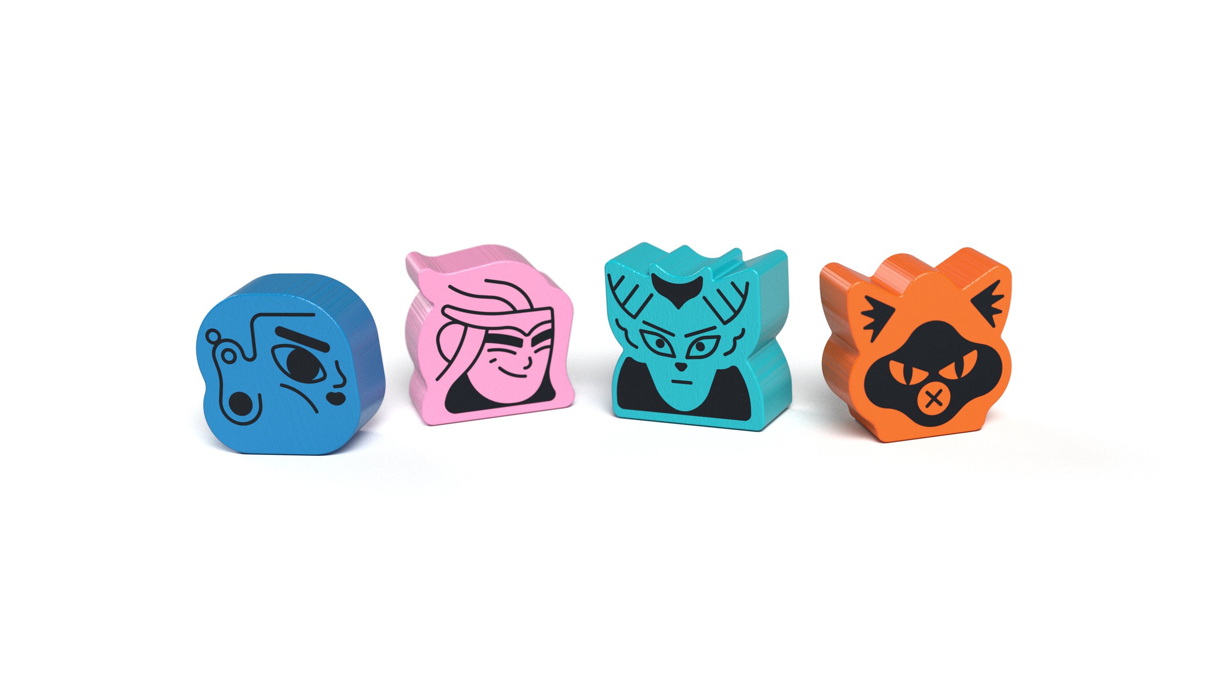
Fame & Fable Meeples
Have there been any particular challenges in creating your first board game?
There was a massive learning curve in figuring out how to design a game. I quickly realised that just because a mechanic works, it doesn't mean it’s fun. And because of the type of game Fame and Fable is, where each card works slightly differently, it meant that a LOT of playtesting was needed.

Owen Davey - Fame and Fable Card Art
Each card has to make sense to multiple people and be as devoid of misinterpretation as possible. I was definitely not aware of how much work it would be to make my own game, but I've genuinely loved every second of it. I can't wait to build expansions for this game and develop other ideas I've had.


What are you reading, listening to, or looking at to fuel your work?
I've just finished rereading another one of the Brain Jacques Redwall books - Martin the Warrior - and now I'm delving into Brandon Sanderson's 'Mistborn' - I'm loving the lore of the Allomancy. I've also been listening to various history podcasts, which often spark me to go research something I'd never known about before, from a certain type of weapon to a war I'd never heard about. I've been watching Hilda and Scavenger's Reign on Netflix - both of these have incredible world-building and just happen to be stunning visually.
Do you have any advice for anyone wanting to work as an artist?
Meet deadlines. Make awesome work. Check contracts. Look after yourself. Get yourself out there and show your work to your audience or the people that might commission you.

Owen Davey - Fame and Fable Board Game
Finally, where can we find you if we’d like to see more of you and your work?
The best place to find more stuff about Fame and Fable is to follow me on Instagram at @fameandfable or sign up to the Kickstarter prelaunch page where you'll be notified about when the game launches - there are some early bird treats, so definitely back early to make the most of them.
All images provided by Owen Davey

Anne Heidsieck: Art in Board Games #55
I wanted to make a joke about the omnipresent sexism of the 50s era by reversing the roles on the cover. At first, I imagined a woman in a suit near a sold sign in front of a nice house, giving the key to her nice husband..
Editors note: Today I’m joined by the Anne Heidsieck, whose work caught my eye via 2018s release Welcome to. Roll and Write games (or flip and fill in this case) aren’t always well known for their gorgeous art, but what struck me about this game was how fully realised its theme was, from the player board itself to the accompanying art. I decided I needed to know more about that game, and the artist, so I got in touch. I hope you enjoy our conversation and if you have any questions, feel free to post them below.
Anne Heidsieck - When I Dream board game card art
Hi Anne, thanks for joining me! For our readers who aren't aware of your work could you tell us a bit about yourself and what you do?
Hi Ross, and thank you very much for writing about the art in board games! I'm a 27 years old illustrator, working since 2012 after my studies in Nantes. Currently, I live in France and more precisely in Lorraine. When I'm not working, not often enough, according to my dog, I like hiking in the mountains and the snow (as much as possible!), reading, playing games of course, and devouring lots of series!
I have worked on several games from Blue Cocker (Welcome To, Argh and Meeple War), on Majesty and Carcassonne Safari of HIG, on some cards for When I Dream of Repos Production and on a game of Haba, Frido's Treasure Trove.

Anne Heidsieck - Frido’s Treasure Trove board game art
So how did you first get involved in making board games?
Soon after finishing my art studies I wanted to make the artwork for games. My sister and brother made a game themselves for our family when I was a kid and maybe that inspired me! So, with my partner, we created a game. We invented the rules, I carried out the illustrations and then we met several editors to present our project. It was quite a failure and the game is somewhere in a box in the cellar now, but it allowed me to meet people who were so nice and gave me the advice that really convinced me to keep trying, but only on the side of the illustrations this time.
Anne Heidsieck - Card Artwork - Frido’s Treasure Trove
I sent emails to many editors and, one day, Alain Balay from BlueCocker answered me. He was looking for an illustrator for his new game, Meeple war! That's how I found my first work on board game designs.
I haven't had the opportunity to work on a lot of things other than games but, from what I’ve seen, the work is really different in-game illustration and book illustration, for example. I think that game design requires even more organization. It can seem too strict because we have a lot of "rules" to respect, for the ergonomy of the game, but it's rather reassuring to me because we don't begin the work with a blank page.

Anne Heidsieck - Save the Meeples cover art
When beginning to work on any new project what are the first few things that you do?
I always begin by researching a looooot of pictures, on Pinterest mostly and also in my art books. I need to figure out the idea of the mood of the game, the color atmosphere, the style, etc. Even if I don't use them later during my work, they help me to find the first ideas. I make some first sketches after that, to be sure that we agree with the editor. When the work begins for real (and after I print a plan and fix it on my wall!), I start working precisely on each illustration. First with a sketch, a definitive drawing, a color rough and finally the definitive coloring, asking the editor for confirmation between each step.

Anne Heidsieck - Meeple War drawing construction
What do you remember about your first board game project Meeple War, and how did you prepare yourself for the job?
As I had already worked on a full project for a game (even if it was personal, it was really formative), I wasn't very surprised by the necessary rigor of work when I started to illustrate Meeple War. The first thing I did was to organize a very strict plan, that I totally exceeded of course. Today when I do planning, I schedule much more time than I estimated at first, to avoid being under too much pressure. I continue to exceed my time limit, but less ;)
What were the most challenging parts of the job?
The newest thing for me was the technique: it was my first project entirely digital, and I have to say that this new way of working wasn't really appreciated by my eyes and my back! The biggest challenge and stress I had were for the cover I think. We kept it for the end, when the art was well fixed on the game elements to be sure to have consistency. I looked into a lot of covers for games and put myself under more and more pressure. Finally, when we validated a rough design with the editor, the final realization was quicker than I thought.
Anne Heidsieck - Meeple War game tile illustration
Other challenges were the setting-up of the punchboard and the cover with the marges, bleeds, cut lines etc, as this was also new for me. I understood nothing at first and hated that. I had to make a lot of searches on forums to know what I had to do. Now I do all the setting-up for Blue Cocker and maybe even like it (sometimes), knowing the characteristics needed for the publisher later, which allows me to gain some time on the art. Moreover, it's rewarding to follow the project from the beginning to its very end. It allows too, amongst others, to check the colors of the first print (which are always very different than on the screen) and to adjust until the production all that must be modified.
I made a big mistake with ‘Meeple War’ when I drew the illustrations for the tiles. I had totally forgotten the bleeds! I had to add on to each file the margins for printing later and remake the forests. I don’t think I’ll ever forget bleeds after that!

Anne Heidsieck - When I Dream card art
You worked on 'When I Dream' a card game with wonderfully creative artwork. How freeing was it to work on a game with this kind of concept and what were some of the words you created the art around?
[Editor: When I Dream is a guessing game and without focusing too much on the rules I’ll just tell you about the cards that make it up. Each card features two words, one at the top and one at the bottom. Each card illustration represents these two words and can be rotated 180 degrees to focus on either one].
The art brief was wonderful because the artists were so free. We had a list of several words and had to combine them 2 by 2 however we wanted. After that, the only directive was to make a surreal illustration that showed both of these words. We could include other objects and ideas, but they had to be less important in the picture than the 2 chosen words.
The artists involved didn't have to work in a similar style, the common theme was the surrealism for the dreams. I wish I could seize this opportunity to reuse my paintings and brushes, which I miss very much! But traditional painting takes me more time than digital and sadly I couldn’t find the time to make it work.
I had some words on my list that I immediately wanted to illustrate. Words like "snow", "vulture", "tunnel", "bear" and I imagined different situations with the others words in order to make, if possible, poetic pictures, and sometimes nightmarish ones. When the project got down to only words that didn't inspire me, I asked for another list of words. I didn't understand at all that we had to deplete most words from our first list before asking for new words but the artistic director still gave me new words, so I was very lucky to have a lot of choices to make my pairs.
Some pictures refer to books, movies, or universes that I love, and I also often listen to audiobooks when I work, so maybe that influences and inspires me in some ways. The most perfect design brief I ever had was on the goodies card of this game, because I just had to do whatever I wanted with as many elements as I wanted! There are two blanks for writing the words, suggested by the card that the player wants to use.
Anne Heisieck - Welcome To Game Sheet
2018 saw the release of the roll and write game 'Welcome To...' which has been a huge success. The game has a strong 50s vibe to the artwork, so how did that develop and was this look part of the original brief?
Alain Balaÿ already knew that he wanted the theme "urbanization during the 50s". The graphic style that he wanted was very much in the mindset of American ads from that era. Most of the work was spent on research: ads, maps, real estate documents, aerial views, logos, style, colors... I even listened to 50's rock and roll music and watched a few movies from this period to be completely in the mood! Even with a lot of research, I still think it could have been even more "50s" in my designs. But sadly it's always so different in my head than the end result I manage to create by my illustrations.
Anne Heidsieck - Welcome To - Art style research examples
I spent a lot of time researching the "perfect traditional house" during the 50s. I also viewed a lot of paintings from Hopper for inspiration. By spending time researching 50s advertising, I wanted to make a joke about the omnipresent sexism of the era by reversing the roles on the cover. At first, I imagined a woman in a suit near a sold sign in front of a nice house, giving the key to her nice husband with the kids in his arms. I wanted it to be so we could imagine her saying to her husband "see what I bought for you and the kids darling". This cover idea wasn’t chosen in the end, but that core idea of reversing gender norms pleased the editor and author.

Anne Heidsieck - Welcome To board game fake advertising
An extra detail I love in this game are the adverts on the back of the player reference sheets. How did this come about and where did your ideas come from?
Alain wanted to give me the chance to make more real illustrations. Beyond the cover, I mainly did icons and graphics, so to strengthen the atmosphere of the 50s he decided to add different advertisements on to the back of the player reference sheets.
The illustration of ‘Meeple War’ is a parody of a well-known ad, where a man and his son are playing battleships while the mother and the daughter are behind, doing the dishes. The illustration of Toulouse is inspired by the many tourism advertisements and the editor and the author are both from this town.

Anne Heidieck - Welcome To board game fake adverts
The one of the man in the kitchen is a reference to the countless pictures of housewives with their all-new household products, and the poster ‘le cocker aux trousses’ is a parody of the poster of the movie ‘North by Northwest’, ‘La peur aux trousses’ in french with all the authors and illustrators who worked with Blue Cocker until the release of Welcome to.
You mentioned that you made some early mistakes when it came to things like bleed lines on projects. So when it comes to creating and editing game art with punch boards and print work in mind what are some basic lessons that you could share?
I would recommend always being careful from the very beginning of the creation of a file about several things:
The size of the picture, personally I often work twice the print size
The definition with 300dp minimum for print
The color profile which depends on the manufacturer, but always at least in CMYK for print.
The density of black, as printers cannot print black deeper than a certain density.
To not forget to embed the fonts on a pdf export.
And in anticipation of the print, which always darkens and tarnishes the colors somewhat, to saturate and lighten up a little bit for each of the pictures.

Anne Heidsieck - Raccoon Illustration - Frido’s Treasure Trove
When it comes to resources, I think it's always a good idea to ask other illustrators how they work, as we have a lot to learn from each other! The boardgame manufacturer ‘Panda’ https://pandagm.com/tools makes very good guides for preparing the designs, it’s all in that link!
I also often search on adobe forums when I don't know how to do something in particular.

Anne Heidsieck - Carcassonne Safari board game cover
Last year you illustrated Carcassonne: Safari, so how did you end up working on this game and was it different working on an existing series?
After working on the game Majesty by Marc André with Hans im Glück, (thanks to Gaëtan Beaujannot from Forgenext, the agent of Marc André), Hans im Glück asked me if I was interested in creating the artworks of their next "around the world" expansion of Carcassonne. I couldn't say no! Besides, I love elephants so much! First, as a test, I made one tile with the different main elements (a piece of savannah, one of a forest, a baobab and a road), in order for them (and for me!) to see if I could make something in the spirit of Carcassonne that would fit with their vision. After that, I improved each kind of element separately as well as designing all the animals, plus some additional to give us choices.

Anne Heidsieck - Carcassonne Safari Animal artwork
For example, I made an antelope and a lioness, but the monkey and the lion were chosen instead. When we agreed on everything, they send me the final layout of each tile, with the frame of each element and the animals present on it, and I arranged them one by one, trying to diversify some set elements. It was kind of tedious work!
For the scoring board, I mainly used the frame of another expansion and used some of the same elements from the tiles I’d made as you see in the other Carcassonne games. As it is a collection with a very specific editorial line, the illustrators have to follow a general pattern, so it's not a very free "artistic" project, however, it is really well organized and we know exactly where we are going, which can be nice too!

Anne Heidsieck - Carcassonne Safari scoring track
You've also gone on to illustrate a variety of neighborhood expansion sheet packs for Welcome To. So are there any differences when illustrating an established game series (eg Carcassonne) and how do you look to make the art distinct within the design constraints?
It was my first work on an expansion, and indeed, it could have been a peaceful project by just modifying a little bit the first neighborhood, but we were under a bit of time pressure on these. Our American publisher (Deep Water Games) wanted to present the mini-expansions on their Kickstarter in Autumn, so we had to work fast. I was working on another project at the time, so they helped me by beginning some of the graphic work to have something to show to the backers at the Kickstarter launch, and I reworked it afterward for the final files.

Anne Heidsieck - Welcome To card art
It was nice and easy to create the art for something that I knew already worked for the players. I just had to change the aesthetic, the mood of the season or the event, and not on the games ergonomy. It was pretty relaxing! After searching for the main color for the ambiance, I made new trees and bushes and I felt that it immediately changed everything. Making new decorative files on the right, even if it isn’t important for the game, was fun too, and helps create a richer atmosphere I think.

Welcome to - Expansion Artwork
What are some non-game related creations (books, music, movies, etc) that you’re currently enjoying?
I often read or listen to audiobooks, mostly fantasy, and a bit of horror and science fiction. I'm a huge fan of Harry Potter and read and re-read them very often! I made the illustrations for my school examination about the french book ‘La horde du Contrevent’ by Alain Damasio, a beautiful emotional adventure! I also read the ‘Game of Thrones’, and wait for the next volumes while the internet spoils me every day. One of my recent crushes was for the books " The Gentleman Bastards" by Scott Lynch.
I watch more series than movies, of all kinds. Some of my favorites are ‘Orange is the New Black’, ‘Black Mirror’, ‘Stranger things’, ‘Parks and Recreation’, ‘Kaamelott’, ‘The Marvelous Mrs Maisel’ and of course ‘Buffy the Vampire Slayer’ :) Thinking about movies, I love in particular all the animations by Laika, especially ParaNorman!

Anne Heidsieck - When I Dream board game card artwork
Just as with my taste in books and series, the music I listen to is really diverse. When I work, I tried to adapt as much as possible the kind of music I’m listening to with the mood of the illustration I'm doing but I do listen to audiobooks and podcasts sometimes. Otherwise, I mainly love Nordic Folk music (groups like ‘Garmarna’, ‘Triakel’, ‘Omnia’) and some french artists like Camille, Claire Diterzi, Air, Polo & Pan. And when I'm working on layouts, I can only listen to very soft piano!
Finally, if we’d like to see more of you and your work, where can we find you?
Here is my website: www.anneheidsieck.com
On Facebook : Anne Heidsieck - Illustrations
All images provided by Anne Heidsieck.
If you’re new to the site, why not stick around a while? There are interviews with some of the best artists in the industry and if you’d like to read more you can them by heading over to the Interview Archive!

Bartłomiej Kordowski: Art in Board Games #51
[..] all these things make sense if there is an art director. Someone who watches over everything and has a vision of how a particular game should look, selecting the right people and paying attention to graphical coherency…
Editors note: This interview was conducted earlier in the year but has taken a while longer than usual to appear on the site. I’m very happy to finally get to share mine and Bartłomiej’s chat. I hope you enjoy and if you have any questions don’t forget to leave them in the comments below.
Hi Bartłomiej, thanks for joining me! For our readers who aren't aware of your work could you tell us a bit about yourself and what you do?
Hello! I'm very glad to share my passions with you. Together with my family, wife Natalia and two little girls, we live in Toruń in Poland. The youngest daughter Eliza is now two years old and the older Lidia is four and a half years old. For over four years my passion is to be a cool dad. My second passion is painting which I've been doing from a young age and I'm currently working as a board games illustrator.
So how did you first get involved in making board games?
During my studies I painted a few illustrations for a collective card game "Veto". It was my first contact with a board game publisher. I had a lot of freedom in this creation so I could practice and develop my skills. At the time I bought my first tablet and I made my switch to digital art. Then after my studies ended, I started working for advertising and illustration agency. I have been working on many different projects from pizzeria leaflets, business cards to book covers and computer game arts.
After a few years I decided to look for my own jobs and I began working as a freelance illustrator. This, which I didn't mention earlier, helped me in my other passion which is board games. I love gaming and this is one of the nicest ways to spend time in good company. This is why I decided to send my portfolio to publishers and I got lucky. I managed to combine work with pleasure. At that time "Rebel" publishing house was looking for a new guy in the industry and it fell to me. I received a work order for my first big project - the Dream Home board game and from the beginning I was in constant contact with Rafał Szczepkowski a Game Development Coordinator at that time. He showed me in from the kitchen (back door) of this game industry and gave me a lot of good advice and tips.


Working on Dream Home took a long time. From the start to the end of the project it had been a year. I've never had to do over a hundred illustrations before, design layouts, box, tokens, the first player marker and so on. It was hard but with the aid of my wife (she is also an illustrator) we finished Dream Home. Many of the details which can be found in rooms were painted by Natalia. Working on this project was a big lesson for me and through this experience I realized how much time every phase of work consumes and also what rules support the visual side of board games.


Did the experience on Dream Home change how you approached your next projects?
In few aspects yes. First of all, I have become more aware of how to spread my time across the work and how fast I need to work too. Knowing how much time to spend on the box cover, how long on components I can therefore more precisely establish when my work will end end. My biggest challenge is the cover art and I'm always stressed because I know how important this is for developers. That's why I try to complete the cover concept first. Everything else is pure pleasure.


You've worked on a number of games released this year which have featured a collection of artists work. What do you think the major differences are when working as a solo artist compared to being part of a team of artists on a board game?
That is true, this year I have been working on a couple of team projects. There were projects where I had to simply adjust my work to the graphics prepared earlier and I had to work on their basis. This is harder but fortunately, that doesn't happen very often. In other projects where I was part of the team, each artist watched over a different aspect of the board game. So it was with the Spy Club board game. I illustrated cards, characters, the box cover and other artists were responsible for layouts, typography, compositions, game visualization, commercial, printing etc.
Of course, all these things make sense if there is an art director. Someone who watches over everything and has a vision of how a particular game should look, selecting the right people and paying attention to graphical coherency. This is very important and in the case of Spy Club, those people were Jason Kingsley and Randy Hoyt. I think that such an approach to the subject is the best way in big and time-consuming projects.
Working as a solo illustrator you have more control over the visual side of a board game. It's a bit more challenging because you need to take care of almost all graphic elements, but personally, I like this way better. I often choose what the board game will look like and this brings me greater satisfaction. In my case, these are typically small games such as Blossoms, Staropolski Wokabularz (Old Polishlexicon), O kocie w kłopocie (Cat in trouble).


One of those collaborative projects was Between Two Castles of Mad King Ludwig, the recent Stonemaier Games, and Bezier Games release. Can you tell us more about your role in this project?
It was a special situation and my role was limited to illustrating the box cover. When Jamey Stegmaier first time contacted me he offered me to join the team working on the art for the room tiles. Unfortunately at that time I was working on Spy Club and our timing didn't fit. However, we made a deal that I would end up working on the front cover and title. I had an insight into all illustrations showing the rooms of castles so I could look at them to get into the atmosphere. Based on the description from Jamey, combined with the room art I started working on the cover and the final illustration is inspired by the game tile themes. I was very happy about this project, it was one of the most interesting jobs I’ve recently had, all the more, I love to paint landscapes.
Having worked on a number of board game box covers are there any key elements you try to include and do you think the box needs to reflect the game inside?
I think that most of all the box cover art should put you into the game vibe. If we also add an interesting style and great colors... it's perfect! That kind of illustration stays in the mind and causes us to want to know more about the game. At least it does for me. Recently I was hypnotized by the box cover and graphic art for Feudum made by Justine Schultz, so much that I decided to buy a game on KS version for the first time. In the case of the illustrations I make, the publishers usually already have some idea of what should be placed on the cover. For example, if I get a brief that it should be a sweet, friendly kitty game but the arrangement of the whole scene belongs to me then I always try to sneak a piece of story in background and details to pull the viewer into the game world.


With Spy Club, you mention the game having strong art direction to hold it together. Could you talk us through the direction you were given and how this helped you to create more cohesive illustrations?
My work on Spy Club began with creating a deck of Clue cards that were shared into six categories: Crime, Motive, Suspect, Location, Object and Distractions. Certainly the subject of the illustrations was important and I was supposed to illustrate each subject but I had a wide margin of discretion with how I did this. The game mechanics and usability were the most important factors and required that the categories should be clearly different from each other.
That point was well tested by the publisher and the same solution was given by the game prototype. Graphics from each category have their own color code (for example the predominant color for locations is green). For the illustrations used on campaign cards there were no restrictions so in that case when layout was put all together it was connected with the main characters and their hobby. The game prototype also outlined the direction of iconography and textures. I think that such preparation of game elements and a good brief make it possible to better understand the game objectives and facilitate the work in graphic arrangements. In my view it is the key to a coherent and attractive product.
What advice would you give to anyone wanting to work as an artist?
Looking at my current work I see that I still have a long way to achieve the level I wish to. It's a little disheartening, but the good thing is that looking at my older works I can see how they are evolving and that there is a progress. So my advice is don't lose your confidence and keep drawing. Creating is the best work ever.
What are some non-game related creations (books, music, movies, etc) that you’re currently enjoying?
I'm a movie fan and I love movie soundtracks, so while working I often turn on a list of different soundtracks, also those from computer games. Most commonly on my list is Bladerunner, music from Gothic series or Machinarium. But recently youtube is successfully giving me a whole gallery of lo-fi hip hop/study/chill/homework music radio that put me in a good mood for the day. From time to time I also listen to the board game video reviews such as Dice Tower, Rhadho, and local things like PoGraMy, GambitTV to find out a little more about new games. After work, in my mind there are only my children.


Do you have any current projects underway, or coming up that you’d like (or are able) to tell us about?
There is one project which me and my wife just finished late last year called Wodny szlak (Waterway) by FoxGames publishing and it should be in store this year in Poland but I believe that in time this will be also released in other countries. It's a family game known as "My first tile drafting game" in which you build a river path, gather resources like wood or wheat and ship them to lumber mills and water mills. We love tile games and it was an obvious fun to illustrate those small landscapes with snaking river. On another recent project we have also had tiles to illustrate but this time it’s about building sandcastles. As part of our research we grabbed a bucket and shovels and moved to the beach.
Finally, if we’d like to see more of you and your work, where can we find you?
You can find my work here at ArtStation website.
Thanks for taking the time to chat to me Bartłomiej Kordowski.
All images supplied by and copyright of Bartłomiej Kordowski.
If you’re new to the site, why not stick around a while? There are interviews with some of the best artists in the industry and if you’d like to read more you can them by heading over to the Interview Archive!

Kwanchai Moriya: Art in Board Games #50
I was turning 30 without a clear path, and absolutely buried in loans paid for private art school, and going through quite a bit in my personal life. I unsuccessfully applied for job after job on my college’s job board for anything art-related…
Editors note: As much as this website is my own personal curation of art in the industry I don’t tend to throw around terms like “favorites” very often. However, Kwanchai is in my humble opinion, one of the absolute best in the industry right now. He was one of the very first people I tried to contact when launching my site and I’m so very glad we’ve finally got this interview to share with you. Enjoy the read and do yourself a favor, go check out his website afterwards, it’s a feast for the eyes.
Today I'm being joined by Kwanchai Moriya. Thanks for joining me! For our readers who aren't aware of your work could you tell us a bit about yourself and what you do?
Hi, thanks for having me! I'm an illustrator and painter, working mainly in board games and children’s books. I was born in New York to a Japanese father and Thai mother, both emigrated from their home countries. But mostly I grew up in the ‘burbs of LA and Chicago, in the 80’s and 90’s. Did some schoolin’ and ended up with a degree in history before sayings ‘oops’ and going for my BFA in illustration in Pasadena, California. I popped out the other side: nine years, lots of debt, and many part-time jobs later. I’ve been freelance illustrating for the past 9 years, though I’d say the last 4 years have been markedly different in terms of the growth and opportunity I’ve had. I currently live in Los Angeles with my wife and like to spice life up with board gaming, backpacking, travel, woodworking, etc.
So how did you first get involved in making board games?
My first real gig illustrating board games was doing 11 half-inch counter illustrations for a little-known wargame called Heroes of the Gap. The publisher contacted me through Boardgamegeek, since I was quite active doing my own fan redesigns of games and posting the art there. In fact, my next two freelance gigs came through BGG’s Geekmail system: Catacombs 3rd edition and a game called Twin Tin Bots. The Catacombs gig I was offered specifically because I had done a fan redesign of the game with my own whimsical art and had posted it to BGG.
In 2010, I also started going to all the big conventions (Essen, Origins, Gen Con) with my portfolio and the widest grin I could muster. Back then, I’d bother every publisher booth on the floor and hopefully fly home with at least a project or two in tow. The first handful of games I illustrated were equal parts, nerve-wracking and thrilling. I feel like I’ve grown a lot as an artist since then, and it’s hard to look at early projects without feeling squirmy. With my scant experience, publishers were apt to pay very little and over direct a project to death. Definitely a lot of stress in those early years was because I was learning the business side of freelancing on the go, while butchering my work/life balance, and flexing relatively weak artistic muscles.
For example, Catacombs 3rd edition was the first time I’d ever done something in that cartoony whimsical style, as I was primarily doing figurative oil paintings at the time. But, one thing that hasn’t changed is how exciting board games are for me, both playing them and being invited into the process of making them. I love being an illustrator in this industry and having a hand in so many varied and interesting projects.
Having worked in the board game industry now for a number of years, how has your relationship with clients changed as your reputation has grown?
It's awesome! In general, I get a very warm reception from folks working in this industry. Sometimes, just wearing my name badge at a convention will get me a sit down with someone important I wasn't even planning on meeting. That's nuts! Compare that to a couple of years ago, when I had to plead with people for a few minutes to look at my pitifully scant portfolio. The warmth I get is definitely attributable to the kind-hearted folks in this business, but I'm sure it also has something to do with the growing list of games I've been a part of. With my clients now, there's more trust that I can get a project wrapped on time and it can look good. Earlier projects did tend to be over-directed, with a lot of hand-holding. But I don’t blame publishers, as choosing an artist is one of the many risks they take on in the process of making a game.
A brand new illustrator thinks they are hot stuff, with a unique style and vision. Or at least, I did! And it takes a few projects to smash that down, and learn how to collaborate well and flow with others. Nowadays, I do get more say on what a project should look like, but of course it varies wildly from project to project. Some clients know exactly what they want, and some take me to the park and just want me to run and run. I like the ones that take me to the park.
The negative side of an increased reputation is an increased expectation from people. Or perhaps I have an increased expectation that other people have an increased expectation? For sure I’m harder on myself now, and more scared to make mistakes. I feel like I have to constantly hit home runs, even though I just learned how to play. Moreover, I feel like I've made a lot of different plays on almost all of my projects, visually, conceptually. Dinosaur Island looks totally different from Flipships, which looks totally different from Catacombs or Capital Lux. So I'm stressed, Ross, I'm stressed all the time.
When you're presented with illustrative work that is outside of your comfort zone and very different from what you've previously created, where do you start?
I love a challenge, though often I end up over-challenging myself. I try to pick one big project a year that I'm going to totally just throw myself off a cliff with. Either something that challenges my command of a medium or trying a new style or type of art. For example, one year that project was the thick paints and stylization in Flipships, another year it was the crazy colors and line art in Dinosaur Island. Those styles I'd never really tried before. I'm also a sucker for weird themes and new concepts.
I have a running 10-item list of themes, or styles or kernels of ideas that I want to try at some point: a bucket list of 'style-cliffs,' if I may.
Tantamount with any project, in or out of my comfort zone, is doing good research. Looking at what's been done before for that particular theme, or making sure there are facts in the factual part of a project. I feel out of my depth all the time, and oftentimes I am. Really being a freelance artist means being in your own head all the time, and a polite nudge or two from the art director or graphic designer is sometimes just the ticket to a solid piece of art.

Alright Kwanchai, you got me, what's currently at the top of that your art creation bucket list and will we see this soon?
Okay, I'll give you a few off my list.
1. Classic Gnomes. I really want to do a project that features little mischievous gnomes in red hats. You know blue shirts and tiny beards, the whole thing. I would just get a kick out of illustrating tons of little gnomes just going about their day, tormenting the house cat, stealing food from the fridge. I don't know why, I love it.
2. Really Creepy Ghosts. Have you seen Nate Hayden's games (Cave Evil, Psycho Raiders)? It's unsettling and weird and I love it. I've been jonesing to do a theme that is about ghosts or some kind of creepy supernatural thing, but not done in a cutesy style at all. Just straight terrifying and dark, with lots of heavy paint and scratchy ink lines. I have a lot of bright colors and friendly themes in my usual work and it'd be fun to throw that out the window.
3. Illustrative Type. So this would be illustrating components using only hand-drawn type and fonts. Like if a card is supposed to have a Man-eating Squirrel on it, I would hand-draw the words 'MAN-EATING SQUIRREL' on the card and illustrate the letters in a way that is thematic and immersive? Hah, I have no idea what this would end up looking like, but I've been thinking about it a lot.
4. Women's Baseball League. "A League of Their Own' the board game, or something akin to that. Love the history there.
On another note, a goal of mine is to design and illustrate my own game. I have two or three game designs that have I've been puttering around with for years. I think it would be really fun to do all the design work, play testing, pitching to publishers, graphic design, and artwork. Of course, everyone and their mom has a game design, and I'm sure anything I design would be mediocre at best. But I think going through the whole process would be a very valuable experience for me, since I've only really experienced one particular side of this industry.
You've illustrated some of the most distinctive and original board game box art in the industry, so tell me, what's your process when you come to work on a game cover and how is it different from creating other art?
Box cover art is usually the priciest line item in a project, and for good reason. It's the thing that wraps around the outside of all this important stuff. That stuff being: the designer's hopes and dreams for their baby, the publisher's investment in components, wrangling printers and scheduling, etc. So yea the cover is a big deal because it needs to speak to all the important things inside in one solid punch.
I usually begin planning a cover by looking at all the covers from any games, comics, or movies that share the genre. Then I try to cut sideways from the norm and try to come up with a concept that feels fresh. Sometimes that means using colors or a composition that atypical to the genre, or maybe using subjects that bend the stereotypes that genre. Most importantly, in my thinking, a cover needs to exude energy and investment. For example, on Bosk, a recent project with the theme of forests and trees, the publisher really wanted the forest itself to be the subject of the box cover. So I thought okay let's make the trees huge, and have a few tiny hikers in the composition just to exaggerate the scale of the trees. Or in Gorus Maximus, a game about gladiators, I wanted to make the covers just bonkers-level of dumb gore: brains popping out of helmets, crocodile sliced up like someone was playing Fruit Ninja. A composition needs to feel full of liveliness and thought. And although I don't always succeed, I think it's a far worse crime to deliver something that looks boring or typical.


As someone who started out as a figurative painter in art school, one of my crutches has always been to just throw a well-painted person on an illustration to give it that 'wow.' Lately I've been trying to get away from that crutch, wanting to see I can still do an awesome cover without a person, front and center. So for example, my recent cover for 'In the Hall of the Mountain King', it's three trolls marching into caverns on it. And I've only ever really drawn really cartoony trolls, like in Catacombs, so trying to do realistic ones was a really scary and I think it really paid off. Or in my redesign of 'The Game' for Pandasaurus, it was all just paper cut-out of shapes and abstract objects, no humans at all. I finished up the cover for Gil Hova's 'High Rise,' which is a cityscape with towering skyscrapers looming in the background. No hoomans, but still much wow I hope!
I've found success when I try to paint towards a feeling. For the cover of Bosk, I tried to assemble reference material and choose colors and a composition that reflected that feeling I get when I pass the trailhead sign on my way into a national park. For the cover of Dinosaur Island and its expansion Totally Liquid, I tried to tap into all my love of dinosaurs and growing up in the 90's: neon-dinosaur toys, Trapper Keepers covers, Capri-Sun, Disneyland, and Saturday morning cartoons. For the cover of Dual Powers, I tried to tap into the sadness of that last scene in Doctor Zhivago, a man drowning against the onward march of history and conflict.
Sensibly, publishers and game designers often want a cover to arithmetically reflect the contents of the game. They want to show every faction type in the game, the landscape, etc. This can crowd out the potential of a well-composed, beautiful piece of art. No publisher is that blunt, but given all the risks that a publisher takes on to make a product, the last thing they need is a cover that doesn't make sense or causes Kickstarter backers to form a mob, etc. But building a box cover illustration by just adding up what’s in the box and the rulebook is a total bummer for me. We poke fun at Euro box covers that have a merchant in the foreground gesturing back at a medieval city, but man there's still a lot of that going around. Just not for me. At least as an internal starting block, I believe it's crucial for an artist to paint towards an emotion, a feeling, a nostalgic moment. What comes out the other end might still end up just looking like a typical genre box cover, but I think those lofty, flamboyant inner goals are what keep me chugging along happily. There's a lot of technical things you can get good at, the longer you work in the biz: like friendly but pointed email writing, nailing deadlines while keeping buffers for personal life, etc. But I feel like the box cover is a tabletop artist's flagship product. It's the ship of the line, the cream of the crop. So you better enjoy it and you better make it sing.
The greatest critic is said to be ourselves so considering how you're always pushing yourself as an artist, are there any projects you previously worked on where you look back now and think you really nailed it?
Let me just point out that I'm not necessarily always pushing myself as an artist, though I would very much like everyone to think I am. I always try to try hard. But any given painting is a mix of blood, sweat, and tears; as well as whatever I ate that afternoon, how full my inbox is that morning, or if I've been outside more than usual that week. Moreover, the final product that sits on shelves is a larger mix of: how tight the project deadlines were, what the graphic designer did with my raw art, and how supportive and/or collaborative the publisher was during the whole process. So I can't really take credit for an amazing looking product, there's often a lot of hands that are in there and they all matter.
Frankly, I always look back on the last three projects I did and am usually the happiest with those. Anything further back, and I tend to cringe at some of the inexperience I can see evident in the artwork. So currently the last three projects are Bosk, High Rise, and In the Hall of the Mountain King. I’m really proud of those, in fact. I think they represent a good jump in my confidence and abilities that wasn't there before. In some past projects, I would approach a piece of art and truly not know if there was light at the end of the tunnel. I don't know if that makes sense, but there were illustrations early in my career, with which I felt like I was drowning near the end and just couldn't get a face or a scene right no matter how hard I tried. I feel more confident in my recent work.
If I had to pick all-time favorite projects, I'd say any of my large-scale figurative paintings are probably the most objectively impressive things to look back on: Overlight RPG cover art, Galaxy Trucker poster, Capital Lux/Rebel Nox, Dual Powers etc. With my history as a figurative oil painter, I tend to lean heavily on those skill sets and the experience has some shine to it. I should mention that I happen to really like my earliest project, Catacombs. I still find the composition and colors of the box cover and components really appealing and fun.
Board game art can often play it a little safe, sticking to known themes or visual styles. So how important do you think diversity is in board game art and how would you like to see the industry change?
That's a big question! I think there’s a lot out there that looks same-y and homogenized, especially your 'European merchant trading something' game, or your 'lots of miniatures in oversized black box' sci-fi game. I am not the artist needed on a game like that, nor do I feel compelled to take on those projects when they show up in my inbox. But that's not to say that those publishers and designers don't know what they're doing. They are mainlining their target audiences with exactly what they want, and it's great that the board game world now has different mini-worlds that can argue and bicker and have opinions about who’s best. When I got into board games years ago, there were maybe a few dozen games you “had to buy” and that was it. So the glut is awesome.
As far as diversity, I think that's an even bigger question that I'm not sure I'm qualified to answer. From an art point of view, I think an easy way to add diversity to a project is to simply represent as many ethnicities, genders, or cultures in the world-building or characters. The more compelling way I've seen diversity approached are in games that delve wholly into specific niches of culture or history. For example, there was a game that came out a few years ago called Navajo Wars from GMT Games, and it was about the historical journey of the Dine (Navajo) peoples, from a specific era in history. I thought that was awesome, shining a light on a lesser-known part of history, rather than just another 101st Airborne game from a war game publisher. I think having a diverse cast of characters in a game is very cool but I think having a whole game be about something specific and unique, elevating something up and shining a light on lesser known corners of our world, is even more compelling. I'm not smart enough to come up with how that would work as a board game, but I'll definitely wax poetic on the subject!
In regards to that last question.. a final extra thought to tie into that. How much do you think Kickstarter has changed the landscape it comes to board game art?
Having worked with both Kickstarter projects and regular distribution publishing, I don't know that it makes much of a difference when it comes to doing the art. I think Kickstarter has given more opportunities for smaller publishers to get products to market, which in turn means that there's more opportunities for illustrators to get projects. So that's always good. A downside to Kickstarter, or any publishing presence on social media or BGG for that matter, is people's propensity to skewer art in a public forum. I mean, even some of the best covers I've seen get a few inane comments like: "eh, hate it" or "liked the old art better." Kickstarter is particularly bad in this regard, where some backers feel empowered to judge the art harshly. As an artist, it's crushing to see comments like that, after spending time and thought on a piece of art. Of course a piece of art should be judged on its discrete face value, especially one that is gracing a product meant to be sold. But, man, sometimes it's hard.
The people behind a lot of awesome games are often just a tiny ragtag team of: publisher, designer, artist, and graphic designer. It's easy to demand a lot from publishers and condemn failures. But I've found that overwhelmingly creators in this industry are thoughtful and emboldened to create fun things, often leaving other careers to do something they feel passionate about. I don't know what my point is there, or what I'm being defensive about. I guess, just please be nice to me all the time, is the moral to learn here.
What advice would you give to anyone wanting to work as an artist?
I went to a traditional art college. Let me be depressing for a moment. When I graduated from Art Center College of Design here in Pasadena, my program (like many other traditional illustration degree programs) was essentially grooming me to be an editorial illustrator. As in covers for books and magazines and the little illustrations in the Op-Ed section of a newspaper. Professors encouraged us to fly to New York and schedule meetings with print media agencies in order to drum up work, which I did twice. I didn’t find success by any metric. One book publisher did give me a pamphlet for their summer intern program. I was also taught to send out mailers using expensive databases of art director info. I sent out hundreds of mailers twice a year, punching out my cards with a corner rounder on the floor of my one-room studio, piles of letters all over my bed. Nothing shook loose for me, and it was very disheartening. I don’t think those methods are wrong, and I do think I had a very weak portfolio. But, those traditional methods now look very antiquated in the current world of illustration. It’s a wider world that includes everything from Pixar to Patreon.
At that point, I was turning 30 without a clear path, and absolutely buried in loans paid for private art school, and going through quite a bit in my personal life. I unsuccessfully applied for job after job on my college’s job board for anything art-related. The last one I tried for was an Archivist position at Yul Brynner's estate, scanning and digitizing photos. "I'm fascinated by the opportunity to work with photos from the Golden Age of Hollywood!" and "Can begin immediately!" I wrote. It was crushing after all the effort and hope I had drummed up in myself and my family and friends.
There were other graduates from my college that got work or hired by studios. They were better artists and made smarter choices during the program. But I gave up trying to be an illustrator and ended up working as a tutor at a Chinese after-school program nearby. They're a dime a dozen here. To go to work, I'd slap a laminated sign on the side of my car (Michael's Fine Art Classes!) and pick up kids from elementary school, and then help them with their homework. There was a ray of light during that time, I had managed to get into a handful of gallery shows in LA and Seattle. So I was still doing some art. They're awesome to be a part of, but I don’t think I was good enough, and it was unsustainable as a single source of income. In fact, I was still working at Michael’s Fine Art Classes two years later when the opportunity to illustrate Catacombs, my first big game, fell in my lap.
My point here is that I feel like I barely made it, and every step of this process has been jumping from one lily pad to the next. I don’t know what I’m doing. I think that’s important to say before I give any sage advice. So here goes, my five-step method to becoming a tabletop illustrator:
Step 1: Get loaded with debt at art college, and then work at a Chinese after-school program for two years.
Step 2: Go to lots of board game conventions and walk around bothering people with your portfolio.
Step 3: Hide your poor grasp of anatomy and perspective by adding tons of color and dialing up the composition to eleven. Empty space on the canvas? Here’s some geometric shapes for no reason! Magenta!
Step 4: Feel guilty about how hard your parents worked their blue-collar jobs and then transform that guilt into valuable energy. Harness energy in a myriad of ways like: trying to stop watching that Youtube video, or not napping at noon.
Step 5: Be old. Your poor choices and bad luck means you don’t have as much runway left as your youthful, smiling competitors.
But less sarcastically:
1. Explore a multitude of paths, and work whatever side jobs you need to. But when it’s go-time, make the jump and bring all your time and resources to bear.
2. Go to where the warm bodies are in this industry. Shake hands, meet people.
3. Bring energy and boldness to your art. Nuance and subtlety easily translate as boring in an industry where shelf appeal and table presence is important. Solid command of composition and values will win the day every time.
4. Treat your freelance job with integrity and respect, suit up and punch in every day.
5. Don’t waste time. A year can pass by and all you’ve done is illustrated two good pieces and checked how many likes they’ve gotten. Move and shake now, when it’s important to carve out a space for yourself.
What are some non-game related creations (books, music, movies, etc) that you’re currently enjoying?
I’ve been reading a lot of RPG books, stuff for Delta Green and OSR RPG stuff specifically. I run two RPG groups and of course a health amount of board gaming, so I’m often reading rulebooks, RPG stuff, and the like. Also, just finished Kazuo Ishiguro’s Buried Giant. Finished “The Caliphate” podcast series, very enlightening. I’ve been re-watching Parks & Rec for the zillionth time when I take breaks, since they’re quick fun bites. None of this necessarily fuels my work. As a freelancer, there’s just a ton of time spent totally alone in a room. So there’s always something I’m doing besides work, little projects, something on in the background.
Do you have any current projects underway, or coming up that you’d like (or are able) to tell us about?
I usually have between 3 to 6 projects running concurrently. And there’s always a handful of wrapped project that haven’t been announced by the publisher yet. Fun stuff! But I can definitely mention High Rise, In the Hall of the Mountain King, Complexcity, Kodama 3D, and Pret-a-Porter that will be coming out in the next year or so. I’m particularly jazzed for Pret-a-Porter, because it was a big leap for me in terms of theme and working with a new publisher, Portal Games.
Finally, if we’d like to see more of you and your work, where can we find you?
I’m on all the social media at @kwanchaimoriya, and my website has a full portfolio at www.kwanchaimoriya.com. I also frequent a lot of board game conventions and meetups, doing signings or panels or just walking around. I really like it when people say hi!
(All images copyright of Kwanchai Moriya)
If you’re new to the site, why not stick around a while? There are interviews with some of the best artists in the industry and if you’d like to read more you can them by heading over to the Interview Archive!

Matijos Gebreselassie: Art in Board Games #49
The art director should be in charge of the final stitching of art components so they come together as one. You try to avoid the effect of a Frankenstein being put together from lots of different elements. It doesn't mean that only your art style goes on top of the last edit, it could be anyone's from the team, it's just a matter of keeping it all consistent at the end.
Editors Note: I first noticed Matijos name on the Dinosaur Tea Party artwork and also happened to be one of the backers of Chronicles of Crime on Kickstarter. I knew I wanted to find out more about his particular style and of course that photo realistic work on Chronicles. Enjoy!
Hi Matijos, thanks for joining me! For our readers who aren't aware of your work could you tell us a bit about yourself and what you do?
Hi Ross, thank you for reaching out to me. Yes, I always wonder where to start with introducing myself- I'm a Pole, mulatto with Ethiopian Roots that was born in Sankt Petersburg, Russia. It usually works on job interviews as from the start everyone is curious about the combination.
I got my education in Poland and lived there from my early years. I've always been very passionate about drawing and expressing myself through illustrations. With the right mix of my other loves, cinematography and comics, I guess I figured out a characteristic art style for myself; cartoony and atmospheric with heavy outline. I also started experimenting with bringing my artwork to life and that led me to graduate from Polish National Film School in Łódź.
NetEnt character from Lost Relics game
This was a great place that gave me the skills to execute animation in a professional way. While still studying I moved to the capital city and started working on animated movies, then later on, mobile games. Then I traveled to Kraków and that happened to create many opportunities for me. As an Art Director there I guided teams and was creating slot games. But by night I continued on delivering freelance passion projects - like board games.
Right now, I'm quite fresh after a relocation to Malta where I continue to work on slot games, this time with some additions in game design along with the art.
Gandalf Set - Vikings Gone Wild
So how did you first get involved in making board games?
While moving to Krakow I was already in contact with Lucky Duck Games. Everything started with that company. Earlier I saw an ad that they were looking for a supportive artist for their new title Master of Elements, an expansion of the successful ‘Vikings Gone Wild’. I was attracted by the fantasy theme and cartoony art style that this game had and I knew it wouldn't be a problem for me to deliver something similar after hours. I drew a couple of cards for a start but soon the Kickstarter campaign turned out to be such a huge hit that fans started reaching almost every stretch goal planned within a day or even a few hours. New artwork for cards was needed to be done extremely quickly in order to update the campaign. It was a very pleasant time full of challenges and late night emails: 'We need 3 more!'.


When the dust has settled the CEO and Founder of Lucky Duck Games, Vincent Vergonejeanne invited me to the office with an offer of a wider collaboration. He showed me the prototype of Chronicles of Crime invented by David Cicurel with only placeholders on a print. Everything was yet to be filled with proper art and I was absolutely blown away by the whole gameplay concept and innovation.
Once again full artistic freedom was given to me by Vince with lots of trust and professionalism. In my previous experience that wasn't very common. So board games with LDG became my true passion!
Chronicles of Crime - photo taken by More Games Please
Your work spans quite a number of fields, from animation, film, concept and game art. How do you think this experience changes how you approach each new project? What key lessons do you think you've learned that you can apply throughout your work?
At the beginning I tried to grab almost every job opportunity in the industry there was. As they joke:
“So why do you want this job?”
”Well, I've always been passionate about not starving to death, sir”
Personal artwork
My girlfriend at the time, now wife, supported me all the way in order to stay focused and on track no matter the obstacles. So I was always doing art. Art in different forms that each time brought me joy. My goal is to use cinematic eye wherever I can, to leave a characteristic mark on everything I do. Now I've got this privilege to get involved in new projects only because I'd like to, not because of necessity and board games are a perfect example of this.
I realized that in every job I have I use the same skill set package that is learned once. No matter if it's VFX for the film, costume or scenery design for a theater, mobile, slot or board game. It's always sketching, storyboards, polishing in different art styles and animating. Each field somehow needs to use those tools.
I loved to work on my own but as an Art Director I guess I've learned to focus on teamwork more and I like the different chemistry that it brings. Everyone learns from each other and push projects forward at a pace that you'd never achieve on your own.
Sketch art for Dino Tea Party
I first came across your work in ‘Dinosaur Tea Party’. It’s characters are larger than life, so how did you create them?
Thank you, glad to hear that. At first I was given the theme and a core idea: 'Let's imagine dinosaurs wearing Downton Abbey clothes having a tea party'. With my character design I aimed for something family friendly and witty. I suggested my take on a single outlined sketch, it depicted a dino wearing a bow-tie, a hat and a monocle holding a bubble pipe. Then Restoration Games were kind enough to leave the entire art approach to me afterwards.
I was provided with a list of Dinosaurs names, not species types, actual names like Betty or Bob, which were gathered in Excel. This list contained visual characteristics required for the game play, assets like hats, glasses, flowers, patterns on the skin etc. Then I did some research on the different dinosaurs looks for inspiration. In the end some of them are based on real species, but with some mix of features as my imagination dictated. I just tried not to repeat myself visually. For the polishing part I used a technique in Photoshop that was new to me at the time, grey-scale maps. It was worth taking a shot at using it, as it's an extremely time saving technique, good for tight deadlines and it helped to keep everything consistent in style.


You mentioned you’ve learned to change how you work now that you’re an art director. What do you think are some of the most important aspects of this role?
To me it would be overall vision of the entire project and consistent art guidance towards the final product, plus creating a friendly atmosphere for the team because only then you can outperform the project in every aspect. For a long time in my artistic education I was very self-centered and tried to be self-sufficient in everything I did. The role of an art director (AD) opened different doors for my workflow model.
Chronicles of Crime - Draft box cover
The first thing is to know your team members; their strong fields of profession, even their attitudes toward different tasks. Only then you can assign the right one and control the development. The second very important aspect for me is the final composition. The AD should be in charge of the final stitching of art components so they come together as one. You should try to avoid the effect of a Frankenstein being put together from lots of different elements. It doesn't mean that only your art style goes on top of the last edit, it could be anyone's from the team, it's just a matter of keeping it all consistent at the end.


Chronicles of Crime ties it's narrative into real locations. How do you go about creating these art assets with the real world in mind?
At the beginning of the project I just needed to find the right style. I started with the character design of our victims/suspects cards, where with the studio we've chosen black comic book outline and a slight exaggeration of some features as a guideline for the entire game. It's actually something in which I feel the most comfortable.
Then I aimed in translating this to the location cards and 360 VR panoramas, which was a bit different because this time I wasn't designing from my imagination. The locations are based on the real London districts so I needed to stick to the right look. I began with photo research, and I created a library of references. Sometimes it takes half an hour, but with more complex views it may even take a couple of days.
Chronicles of Crime - VR scenery
Then comes the most engaging and important part of the entire process, compositing photos together. After this there's a time for the outline, which basically does major part in compositing because it blends everything nicely. Then a couple of Photoshop filters and lots of brush over-painting, that simplifies the shadings and gradients which gets away from the realistic feel and brings in more of an illustrated effect. The best part is this last stage where you already see everything in its place and the only aspect left is playing with the light, rim lights, reflections and gentle touches of brush stroke.
I learned this technique at the beginning of my freelance path where I was designing Hidden Object Games using photobashing.
Chronicles of Crime Location - Camden Town
Photobashing is the technique of combining photographs or images, using painting and editing to create larger pictures. Although it's a common technique in digital art some have accused it as being "cheating". What would you say to people with this opinion and how does photobashing help illustrators work?
Photobashing is for sure an excellent technique for concept art and the mood board stage. In many fields in the industry it helps artists deliver multiple high quality illustrations in a short time. It works similarly to story boarding in a sense, in that it clarifies visually where you’re aiming with the style and overall look. But when doing your final renderings it's of course all about being smart and having in mind intellectual rights, with heavy editing a must. This means cuts and edits, with strong over-painting that will change the basic look. It's just another technique you can reach for if you decide to achieve a photo realistic effect, it goes along with over-painting 3D models and pasting photo textures which is absolutely fine with me. If you manage to do it right, you can have unique and fresh visuals out of pre-made materials.
Chronicles of Crime Location - Soho
You mention looking to leave a charismatic mark on everything you do, so in a practical sense how do you approach each piece of art to ensure you do this?
When working on different projects that vary from each other I want to find the right technique that supports the core vision and a story, but my relatives always mention that they can spot my style in everything I do, so I guess I'm not that elastic after all and fail with each trial!
Of course, cartoon looks and black lines comes naturally as I sketch at the beginning of everything. Even when I decide to skip the outline in polishing I usually go for very strong rim lights (that does almost the same job but with opposite, bright colors) and that was the case of Dinosaur Tea Party made for Restoration Games for instance.


But aside from the technique, I guess I always go for a certain look of a human or monster body that is taken from the pop culture that I value. I push with a specific character design that I developed naturally through my learning process. So it doesn't matter if it's a scary and realistic horror project (concepts for a theme park attraction with VR technology) or concepts for more friendly Fireball Island board game - you'll always find my way of drawing muscles, eyes or hands. Even, or only, those small details.
How do you keep the balance between your work as a freelancer? Do you have any advice?
Actually I don't think I keep the balance at all. I should be the last person to give advice on that matter, but if I have to:
”Kids, if you'd like to follow my footsteps I suggest unhealthy little amount of sleep, late chocolate snacks and a good playlist in your ears”.
Night is perfect for art challenges, it's like winning an extra day.

The Bridgevale Train Company Conductor
What are some non-game related creations (books, music, movies, etc) that you’re currently enjoying?
I'll refer to something that I enjoy listening to while working on my projects. My playlist is always very strange because it mixes Rammstein with Vivaldi and Max Richter, but as a polish, patriotic move I'll recommend to all amazing bands like Bass Astral x Igo and Kwiat Jabłoni. I also look for interviews with writers and people of cinema, recently the Hollywood Reporter gave nice insight releasing on Youtube 'the Roundtable', a series of discussion panels. I think that cinema is something that I’ve had in my blood from birth, but while working I limit myself to audio only. I think almost every stand-up on Netflix I've got checked as 'watched'.
Screen from music video for Bass Astral x Igo and Sistars
Finally, if we’d like to see more of you and your work, where can we find you?
Feel free to check my Instagram where I usually post more often. Then there is my ArtStation account where I try to keep my work organized.
(All images supplied by Matijos Gebreselassie)
If you’re new to the site, why not stick around a while? There are interviews with some of the best artists in the industry and if you’d like to read more you can them by heading over to the Interview Archive!

George Doutsiopoulos: Art in Board Games #23
The timing was perfect and so was the theme of the game. Some of my favorite things in the world are science, character illustration and board games, and STEM perfectly combined all three. What is more, I absolutely love vintage themes...
This week we have George Doutsiopoulos an artist who has recently worked on board game STEM: Epic Heroes and with publishers such as Hologrin and Desyllas Games.
Hello George, thanks for taking the time to speak to us. Firstly, could you tell us a little bit about yourself?
Hi Ross! You are very welcome and thank you for the kind invitation. I am a full-time freelance illustrator living in Thessaloniki, Greece. I work with publishing houses and companies, painting for storybooks, book covers, games, and advertising.
Now we know a little more about you, I have to ask, as a child what did you want to be when you grew up?
An artist! There were, of course, the occasional dreams about becoming an astronaut, an archaeologist or an astrophysicist, but I have been passionate about sketching and drawing ever since I could hold a pencil.
So how did you first get involved in making board games?
Well, to begin with, I absolutely love board games! Things like the fun memories of being a kid playing Hero Quest have stayed with me and inspire me both as an adult gamer and as an artist. Looking back, it is very clear to me that I have always wanted to be a board game illustrator, although I took it more seriously rather recently. A couple of years ago I did a few boxtop illustrations for Desyllas Games, a big board game company in Greece. I remember thinking “hey, I really like doing this”! The next step was to enrich my portfolio with some personal work that I felt would attract the kind of board game jobs I would prefer the most.
When you are working on the art of a board game can you give us a quick overview of your creative or thought process and has this changed at all since you first started?
It’s really not very different from the process of creating any other illustration project. The first thing is to make sure I have a very detailed and thorough brief. The preferred art style, palettes, target group, theme, dimensions, etc. are things I need to know beforehand. When I have everything I need I just stare at the brief for a few minutes (or tens of minutes!) and try to visualize the finished game – what it looks like, what playing it feels like, how my friends and I would react to it and what kind of art would make it as fun and memorable as possible. The next step is research and finding a reference from online sources. I love doing research for the visual elements of my illustrations (faces, clothing, buildings, etc) because it also serves as a form of brainstorming, although it can become time-consuming. The rest is pretty straightforward. I draw my sketches as close to what I envisioned as possible and try to figure out the final palette. When all is approved I move on to the finished artwork.


You were involved in the creation of STEM: Epic Heroes so could you tell us a little bit about what that involved and what were the biggest challenges you faced?
STEM is a card game that centers around prominent figures from the realm of Science, Technology, Engineering and Math, and their inventions/discoveries. My job was to paint character cards. In order to create rich and accurate illustrations, I needed to do extensive research for every character and find a reference for their face, body type, clothing, inventions and so on. A good facial likeness was important to me but sometimes finding appropriate reference was difficult, especially if the character lived before the 20th century. Another important challenge was keeping balances. I needed to find a good equilibrium between realism and cartoonism, historicity and superheroism, seriousness and colorfulness, all while making sure that the likeness of the characters and emotional impact of the cards were as good as possible.
What was the inspiration or core idea that drove your work on STEM: Epic Heroes?
First of all, STEM was an absolute godsend. It came at a time when I had become very tired of working mostly on children’s books and had been longing to work on something more realistic and adult. The timing was perfect and so was the theme of the game. Some of my favorite things in the world are science, character illustration and board games, and STEM perfectly combined all three. What is more, I absolutely love vintage themes. Aaron Hanna, a great art director and person to work with, noticed this and assigned to me characters mostly from the late 19th and early 20th century. So, this perfect mix of science and progress, character illustration, past eras, and gaming was more than I could wish for inspiration!


What are you currently reading, listening to or looking at to fuel your work?
Oh, all kinds of things. I’m halfway through “The Shortest History of Europe” by John Hirst, finishing Jeff Smith’s “RASL” and about to begin Phillip Pullman’s “The Book of Dust”. Which are very indicative of my favorite genres: history and science, graphic novels and fantasy literature.
What advice would you give to anyone wanting to work in the board game industry?
First of all, I’d say make sure that you love (or at least, like) board games. Liking the object of your work makes things so much easier and more pleasant. Also, take the time to play lots of different board games, whenever possible. It’s the best way to become familiar with great board game artwork, different game mechanics and get lots of inspiration (and fun)!
Secondly – and very importantly, make sure that you’ve put some thought into what kind of games your artistic style would look better in. As soon as you have the answer, hone your skills and build a portfolio with appropriate art.


Do you have any current projects underway, or coming up that you’d like (or are able) to tell us about?
I’m always working on books, but I’ve also begun working on a very fascinating board game for Restoration Games! I am not sure I can share details at this point but please stay tuned!
Finally, if we’d like to see more of you and your work, where can we find you?
My primary gallery is in Behance but I also hang around in Artstation and Facebook.
(All images provided by George Doutsiopoulos, 2017).

Todd Sanders: Art in Board Games #22
In taking apart another designer’s work and re-visioning it, you learn the inner workings of the mechanics and how the game is put together, thereby learning something about the design process. I suppose the best thing I have learned is to be open with my work [..]
This week we have Todd Sanders an artist and designer who has designed games such as IUNU, They Who Were 8 and Aether Captains with companies such as LudiCreations and MAGE Company. He’s created a variety of Print and Play (PnP) games, best known of which are: Mr. Cabbageheads Garden, Odin Quest and his Shadows Upon Lassadar series. He’s also provided graphic design for Trick of the Rails for Terra Nova Games and has done the artwork for many Age of Steam maps for Alban Viard of AV Game Studios.
Hello Todd, thanks for taking the time to speak to us. Firstly, could you tell us a little bit about yourself?
I live in Pittsburgh where I work as a graphic designer, furniture maker and publisher. I have a degree in architecture but have worked as a graphic designer for over 25 years. My publishing company, Air and Nothingness Press (which is also the name I design games under - www.aanpress.com) publishes translations of French surrealist poetry, science fiction, and fantasy, and makes handmade artist books.
Now we know a little more about you, I have to ask, as a child what did you want to be when you grew up?
From an early age I always wanted to be an architect. I was an architectural designer for a few years upon graduation but then moved into graphic design due to the work availability in Pittsburgh in the mid-1990s.


So how did you first get involved in making board games?
I began by redesigning older games and I’m most known for my re-visions of Barbarian Prince (over 3000 downloads on BoardGameGeek.com) and for Hammer of Thor. Both of these were originally released in the early 1980s, long before computers or better printing techniques and there is a mystique about them, but both are long out of print and therefore inaccessible to most players.
Barbarian Prince is one a lot of people wish would be reprinted. You play a barbarian trying to find gold to save your kingdom, wandering a map of various terrain types, rolling dice to find events and encounters on various tables. It combines aspects of wargames, RPGs, and Choose-Your-Own Adventure style games. I completely redesigned the entire map, created new rule and events books and a series of player sheets and counters to give the game a better scope. It took me a couple of months to complete but I think the changes make it feel more like a modern game.
Hammer of Thor is a very strange game from around ‘83 that can apparently support between 1 and 65 players, although 1 or 2 players is probably best. You play Viking gods and visit locations throughout the nine realms encountering various types of creatures and humans. You combat these beings and in turn, can make them part of your clan. The game mainly uses cards (which were originally badly printed on construction paper) and a large map of Yggdrasil, the world tree of Viking myth. My work included redesigning (and correcting the errors of) over 720 cards, designing 1100 counters and I updated/redrew the map. On top of this, I completely rewrote the rulebook to remove a huge number of errors in the original text and updated the language for modern board gamers. It was over 6 months work and I really didn’t design anything for many months afterward because the task left me exhausted.
For both games what appealed to me was the challenge of taking older games and giving them a fresh modern look. As a graphic designer, I am attracted to projects where a design overhaul can give a value and prominence to games in our history that are overlooked by many. For Barbarian Prince I also wanted a copy to play and this was a fun way for me to make that happen.
From there I entered several of the designer contests that the Print and Play community sponsors and slowly began learning to process of design games. There are several of these contests every year on BGG. The Solitaire PnP contest (every summer), the PnP Wargame contest, the 18 card contest, and the Mint Tin contest where all components must fit inside of an Altoids tin. In the past there have also been game contests with constraints like only using dice, fitting the game on a single sheet of paper, or only being able to use 9 cards.
When you are working on the art of a board game can you give us a quick overview of your creative or thought process and has this changed at all since you first started?
I tend to work on both the structure and mechanics of the game while doing the artwork. It’s a very organic process and both elements grow together. I am not an ‘artist’ artist, meaning I don’t really draw or illustrate anything by hand ever, I do all my work on the computer using InDesign and Photoshop, often using those applications as you would Adobe Illustrator (but I don’t own a copy of that).
Early on I tended to do redesigns of earlier games. In taking apart another designer’s work and re-visioning it, you learn the inner workings of the mechanics and how the game is put together, thereby learning something about the design process. I suppose the best thing I have learned is to be open with my work and let people interact with it as it is being designed. Everyone has different experiences and knowledge. Their input can only make a game stronger, especially since one tends to design in a bubble so you can quickly convince yourself that something works. This is because in your head it does, but you often find that once you write rules other people find holes in this logic as you didn’t impart that understanding within the framework of the game itself.
You were involved in the creation of IUNU, so could you tell us a little bit about what that involved and what were the biggest challenges you faced?
IUNU, which made its debut at Essen 2017 is a game where the basic idea came very quickly: 9 types of cards where the point value of the card is the direct inverse of the number of cards in the deck. The game spent about a year of development with LudiCreations and I’m lucky in that I am the graphic design/artist for my own games with LC. Part of the appeal of these games is my minimalist artwork. LudiCreations staff and I work pretty well together after several years of my doing graphic design for other games in their catalog.
There were no real challenges but we ended up increasing the number of Afterlife cards and this meant doing a lot of research into Egyptian dynasties (which I found quite interesting) and then matching historical points in that timeline with bonus actions for the game. For example, one card gives bonus sets of bakers, merchants, and farmers in your tableaux. These are all lower ranking citizens and the dynasty of Amenhotep was one in which the people had more power and there was a golden age. Another example is that the bonus cards Peret, Akhet, and Shemu are seasons in ancient Egypt which cycle around the rise and fall of the Nile river, celebrating abundance and harvest times. This idea matched cards where you gain a bonus if you have a majority of one type of citizen at the game’s end. I like to, as much as I can, match real facts/events with the mechanics in my games to strengthen the game narrative and thematic elements
What was the inspiration or core idea that drove your work on IUNU?
Often I find this is the case with my designs – the best and most elegant games come fully formed in under a half hour. As previously mentioned, I conceived of an idea where the kind of cards and their frequency in the deck had an inverse relationship to their value. So one Pharaoh is worth 9 points, 2 Scribes are each worth 8 points, three Nobles are each worth 7 points and so on down to nine Farmers each being worth 1 point.
The Egyptian theme for the game was suggested by this idea of 9 which is three 3s or the three main pyramids at Giza in Egypt. This tied nicely into three 4-sided dice, a great visual link to Ancient Egypt thematically. A quick bit of research led me to 9 types of citizens and their hierarchical order, and from there I was off and running. Each of these types of citizens then meant I could have a separate action for each, thematically tied into their caste when the cards are played in sets.
Also, the money in the game is labeled as ‘debts’. The ancient Egyptians didn’t have coins, instead, they used slugs of copper of various sizes as their monetary unit, equaling the weights to the worth of goods or services. So it wouldn’t have made sense to use coins as we know them. In my original PnP version, I sourced out small wooden ingots in a muddy brown and orange because the copper that was more refined was worth more and so the color difference suggests this.
What are you currently reading, listening to or looking at to fuel your work?
I listen mostly to ambient electronica. I find the rhythm of the beat helps my design process. Currently I am reading Virconium by M. John Harrison that my friend, the author Steph Swainston, sent me a copy of. I read 2-3 books a week and this is a wide-ranging mix of fantasy, science fiction, books about landscape and nature, fairy tales and books on interesting ideas floating around in the world. All of this input does suggest game ideas to me as it all mixes together in the background.
What advice would you give to anyone wanting to work in the board game industry?
Read all the rulebooks you can get your hands on. Understand not only how a designer creates a game but also how the rules explain those ideas. Learn both from the success and mistakes in these texts. Finally, never feel afraid to share your work. No one is going to steal it. Share and receive back tenfold.


Do you have any current projects underway, or coming up that you’d like (or are able) to tell us about?
I am currently working with Alban Viard and his AVGS imprint to bring my PnP game – Pulp Detective- to print. I am currently converting the artwork over to print-ready status while creating a 2 player variant and going back and forth, day to day, with Alban, as his team does playtests, to adjust and strengthen the game mechanics. This game has been under PnP development for over 2 years (one of my longest n the drawing board) and I am very happy to finally get it to the stage where it will be ready for players.
Finally, if we’d like to see more of you and your work, where can we find you?
I maintain a very large and rambling current projects thread on BGG. I also actively post on my blog. You can find some of my illustration work at http://locusgraphic.com/illustration and finally, I am on twitter at @lackriver.
(All images provided by Todd Sanders 2017).